At the heart of the Young Men’s Christian Association (YMCA) lies a commitment to fostering strong community bonds and enhancing the well-being of individuals. This revered organization, which finds its roots deeply embedded in history, operates globally, striving to implement programs that promote youth development, healthy living, and social responsibility. With its expansive reach, the YMCA continues to be a beacon of support and growth, offering a myriad of services ranging from child care to initiatives aimed at nurturing the potential of every individual. The organization’s widespread presence showcases its significant role in communities across various parts of the world, making it an essential pillar in the pursuit of holistic well-being.
Meaning and history
The YMCA, an abbreviation for the Young Men’s Christian Association, was founded by Sir George Williams in London, United Kingdom, in June 1844. Its inception was driven by the desire to create a safe haven that would promote Christian principles through social interaction among young men, particularly those involved in the drudgery of the industrial revolution. From its humble beginnings, the YMCA has grown into an organization of monumental scale, marking numerous achievements in the realm of social change and community service. Notably, it has been instrumental in the development of basketball and volleyball, highlighting its influence in promoting healthy living and sportsmanship.
Throughout the years, the YMCA has continuously evolved, embracing changes to meet the varying needs of communities around the globe. Its achievements are deeply rooted in the principles of youth development, healthy living, and social responsibility. Today, the organization stands proudly at the center of the movement dedicated to nurturing the potential of every child, fostering healthy spirit, mind, and body for all, and supporting the communities it serves. With a new logo symbolizing its dynamic and inclusive nature, the YMCA remains steadfast in its mission, adapting to the modern world while staying true to its foundational values of Christian principles and the holistic well-being of individuals.
What is the YMCA?
The YMCA, or Young Men’s Christian Association, is a global organization committed to supporting the physical, intellectual, and spiritual development of individuals. Through a diverse array of programs, it aims to foster healthy living, youth development, and social responsibility, impacting millions of lives in various communities around the world.
1881 – Today
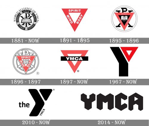
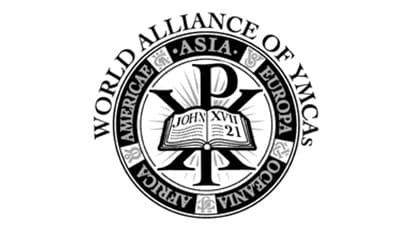
The very first logo for YMCA was created in 1881 and is still used by the organization as the secondary version. It is an ornate and detailed circular badge with the image of an open Bible in the center, enclosed in a thick brake frame with the “Americae Asia Europa Oceania Africa” inscription in a bold serif font placed on it. The “World Alliance Of YMCA’s” wordmark is written in black and arched above the badge.
1891 – 1895
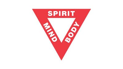
The logo, introduced in 1891 became a basis not only for the YMCA’s visual identity but also for its philosophy and values. It was an idea of Luther H Gluick, which was based on the importance of balance between spirit, body, and mind for every man. The logo featured a bold red triangle, pointing down, with the three words “Mind Body Spirit” written in white bold sans-serif on its sides.
1895 – 1896
The logo from 1895 was a combination of two previous versions — the red triangle was placed inside the circle, having an open Bible in the middle, drawn in white on a black background. The framing of the badge was simplified to two thin black circles, and the additional lettering was removed.
1896 – 1897
The bold black parts were removed from the emblem in 1896, which made the whole image lighter and more elegant. Also, a smaller double circle was added to the badge, filling the white space, and balancing the look.
1897 – Today
The “Spirit Min Body” lettering was removed from the red triangle, and replaced by a solid black rectangular banner with the white “YMCA” on it, crossing the triangle horizontally. This is the emblem, which is still in use by the association today.
1967 – Today
The redesign of 1967 brought a truly outstanding logo design to the YMCA. It was a stylized letter “Y”, with its upper-right bar replaced by a red triangle. The main body of the letter was drawn in black, so the image looked very powerful and modern. There was also a monochrome version of the logo, which was stricter yet not less powerful.
The version for the UK, which was also created in 1967, featured a bold sans-serif “YMCA” lettering with the red triangle placed between the two bars of the “Y”. This version was in use until 2014.
2010 – Today
The redesign of 2010 modified and softened the YMCA logo, introduced in 1967, changing its contours and keeping black as the main color. The lines of the “Y” were emboldened and the angles — rounded, while the triangle changed its color to black and not had no negative space in it. On the left from the emblem, there is a lowercase “The” in a rounded sans-serif, and the “YMCA” is written along the right side of the big “Y” bar, in smaller letters.
2014 – Today
The YMCA logo for the UK, designed in 2014, is also executed in monochrome and has only the wordmark, executed in a custom typeface with extra-thick lines and triangular shapes, placed on a white background. The upper part of the letter “A” has a small white triangle placed on it, pointing to the right and resembling a “Play” button.
Font
The simple san serif typeface, designed to embody the organization’s motto, seeks to foster an environment of friendships and unity. By employing a clean and straightforward style, it aims to communicate the eternal part of man, echoing the teachings of early Christians and the philosophical traditions of ancient Greece, including notable letters such as rho and chi. This approach is not just about aesthetics; it’s a nod to the rich tapestry of languages and scripts, from Greek verse to different languages, that have shaped communication. It’s a typeface that invites users to engage actively and warmly, resonating with the idea that, like the equal sides of the triangle, man’s essential unity is fundamental to the organization’s ethos.
Color
The current YMCA logo, developed through a collaborative process led by John Root and inspired by the vibrant culture of Geneva and the broader United States, offers a palette that reflects the diversity of communities the Y serves across America and beyond. From the serene blues that whisper the calm of Swiss lakes in July to the energetic reds that capture the fervor of activism in February, each color is chosen with the intent to honor the organization’s history and its global footprint. This versatility in color options goes beyond aesthetics; it’s a strategic choice to enhance the logo’s visibility in various media, from traditional print advertisements to modern digital platforms employing cookies for the best experience in web browsers and JavaScript applications. The logo’s adaptability in color speaks to the Y’s commitment to inclusivity and its ability to connect with different communities, embodying its role as a cornerstone for fostering a fandom lifestyle community where every infant, youth, and adult can find their favorite fandoms. The second ring of color choices symbolizes the Y’s expansive reach, from the local neighborhoods in the United States to the international community in places like Geneva, Switzerland, reinforcing the notion of unity and shared values. This design strategy ensures that the YMCA remains a high-quality, recognizable beacon for donations, support, and engagement, resonating with the xp (experience) of its members and the wider community.


