Wolt is a Finnish company, founded in Helsinki, 2014. This is a technology startup, developing logistics software. It is best known for its delivery services: customers from almost 180 cities from Europe and Asia can order a delivery of food and items from the shops, supermarkets, and restaurants, partnering with Wolt. The company has an official software, available on the main telephone operational systems, and a website. There are more than 12 million active users, operated by 4k office employees, 90k carrier workers, who transit the products of nearly 45k merchants.
Meaning and history

The company was registered in 2014 in Helsinki. The teams of six entrepreneurs aimed to develop the project and attract new investments. One of the members, Mika, was browsing the punk-like names and randomly selected the ‘Volt United’ nameplate. It was instantly turned to ‘Wolt’ and approved by everyone.
During the time between 2015 and 2020, Wolt has spread its operations across various European countries and also Japan. The worker number also grew consistently. They also developed pick up points, named Wolt Market. They attracted half a billion dollars as investments during 2021.
The 2022 brought another milestone in the Wolt’s history: they joined powers with American DoorDash company.
What is Wolt?
Wolt is a logistics business, started in 2014 in Finland. They create solutions which help people get their food products and merchandise via Wolt delivery system. There are delivery points in many cities of Europe and Asia. Wolt employs 4k office workers and 90k+ delivery workers in 23 countries of the world. In the list of Wolt’s partners, there are 45k+ retail stores and restaurants. Through the official Android/IOS application, customers (over 12 million users) can order a house or office delivery.
2014 – 2019

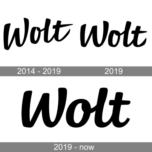
The logo of the company is done in a very similar style to the Walt Disney logo, which also has a similar sound of the name. It features cursive black letters that are all interconnected. The inscription is placed on a diagonal, which gives an impression of growth and progress. The black color is also a universal, timeless choice that creates a professional and powerful brand image.
2019

The logo was slightly redrawn in 2019. Mainly, the inscription was now placed straight and the “t” did not have such long strokes. This update was done to create less association with Walt Disney and create an image of a more serious and trustworthy company.
2019 – today

Their corporate icon depicts the name caption. On the website, they use just the nameplate without any background, while in the social media pages avatars they put it on a square or circular background.
Font

The inscription has a bold handwritten typeface. The initial ‘w’, which is capitalized, is not connected to the rest of the word.
Color

The official color code is represented in two major shades: white, used for the name, and blue for the background. In some cases, such as on the website, the name can be black. For the social media signatures, the marketers paint it white. It is suitable for the bright background, which can be solid blue or gradient blue and darker blue.


