Before Wachovia was purchased by Wells Fargo in 2008, it was known as the fourth-largest bank holding company in the US (based on total assets). At its height, it operated centers in 21 states and Washington, D.C., as well as 40 offices in different corners of the globe.
Meaning and history
Wachovia is not just the name of a bank that no longer functions, but an entire chapter in the history of the U.S. and global banking sector. One of the largest banking networks in the U.S. in the 20th century, it was taken over by Wells Fargo in 2008.
The bank was founded in 1879 in Winston-Salem. The name comes from the Austrian place name Wachau. Throughout the 19th and 20th centuries, Wachovia has been expanding and strengthening its reputation and influence in the United States, and by the beginning of the 2000th became truly tough for the financial monster.
In 2007 Wachovia decided to merge with another financial group, to strengthen its position. There was a choice of three: Morgan Stanley, Citibank, and Wells Fargo. Nothing worked with the first two, so in 2008 Wachovia becomes a part of Wells Fargo. The new company kept using the Wachovia brand until 2011, and today it is just history.
What is Wachovia Bank?
Wachovia Bank is the name of an American financial organization, which was established in 1889 and ceased all operations in 2008, with the Wachovia brand being still operational until 2011. The Bank was one of the four largest bank holding companies in the United States, before its acquisition by Wells Fargo in 2008.
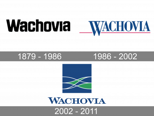
1879 – 1986
The old Wachovia Bank logo was pretty austere, and yet, it had a unique touch. There was nothing but the word “Wachovia” in black over the white background. What made the design unusual was the type. The most distinctive letters were probably the “A’s” with the unexpected gaps in the lower half.
1986 – 2002
In the fall of 2001, Wachovia officially merged with First Union. The updated logo featured a dark blue rectangle housing abstract green and white shapes and curves. They resembled waves.
According to the companies, the design “signified the successful merging of the two companies.” And yet, the updated logo did not bear much common with the brand identity of First Union. It did not take much from the previous Wachovia emblem either, although the new type echoed the shape of its predecessor. It was only the palette that reflected the old visual identities of the two parties.
The design was introduced by Interbrand, a New York-based brand identity company. Interbrand took into consideration 45,000 employee comments as well as opinions of the corporate leaders.
2002 – 2011
In late 2008, Wells Fargo purchased Wachovia. By the time the deal was closed, the tagline “A Wells Fargo company” was added to the logo. Eventually, the Wachovia brand was absorbed into the Wells Fargo brand by 2011.
Font
The type featured in the last Wachovia logo was a serif one. It had an obvious retro touch. The width of the stroke varied greatly within each of the glyphs.
Colors
The green on the logo was inspired by the old logo of First Union, while the blue was borrowed from the previous emblem of Wachovia.


