Club Penguin was a massively multiplayer online game introduced by New Horizon Interactive (now known as Disney Canada Inc.).
Meaning and history
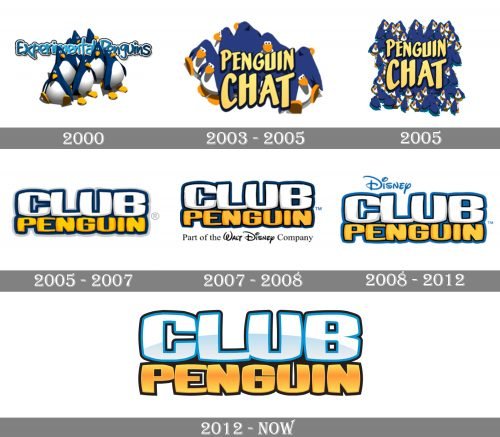
The modifications through which the Club Penguin Logo went since it adopted its current name were very subtle. Only a side-by-side comparison lets us trace its evolution. However, the older logos (of the Experimental Penguins and Penguin Chat era) were very different.
2000 (Experimental Penguins)
The roots of the project can be traced back to a game named Snow Blasters on which developer Lance Priebe was working in 2000. The game wasn’t finished but was used as a basis for another one, Experimental Penguins. It was released in July 2000 and went offline the following year.
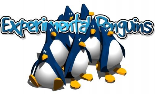
The logo of Experimental Penguins featured a group of eight penguins in blue, white, and yellow. The name of the project showcased a casual, laid-back typeface. It wasn’t very legible. As if to make matters worse, the wordmark was partly hidden behind the penguins.
2003 (Penguin Chat)
In early 2003, Penguin Chat was released, which was based on the Experimental Penguins.
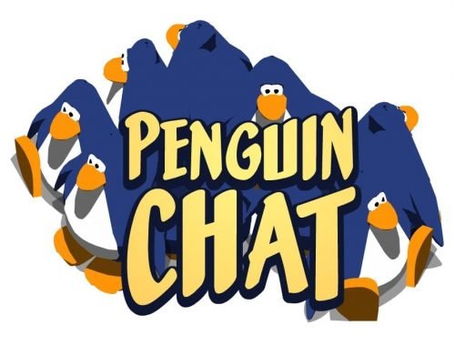
The logo was redrawn from scratch. The legibility was dramatically improved. To begin with, the type was larger and bolder. The letters were capitalized. The wordmark didn’t lose its relaxed and playful style, though.
The creatures in the background preserved their unique colors (although with a shift of the hues). However, their shapes and positions were different now.
March-October 2005
As the developers kept releasing new versions, they created a new logo, too.
The most notable update was that there were more penguins now. This reflected the growing popularity of the game.
October 2005 (Club Penguin)
The team that worked on the project settled on a name in the summer of 2005. The official release took place on October 24, 2005.
The Club Penguin logo went through a complete overhaul. The only thing that reminded the previous one was the palette. It was dominated by white and yellow with blue accents.
This time, there were no penguins and not a single other pictorial element, only the name of the game. The word “Club” featured white letters with a subtle bluish gradient creating an “arctic” effect. The letters were surrounded by dark blue shades adding some depth.
The word “Penguin” below was yellow and also had dark blue shades. Both the words featured the same type, which was playful and friendly. The letters appeared somewhat awkward – due to the rounded lower parts, they couldn’t properly “stand” on any horizontal surface. This awkwardness reminded you of the creatures after which the game was named.
2007
The three co-creators sold Club Penguin and its parent company to Disney.
The way the name of the game was featured on the logo remained pretty much the same, with only a couple of tweaks concerning the hues and the border of the letters.
A notable addition appeared below the wordmark – the lettering “Part of the Walt Disney Company.” While this addition was good at conveying the message (what the parent company was), it didn’t merge into the design. This problem was resolved in the following version of the logo.
2008
This time, instead of the lengthy lettering, there was only the word “Disney.” It was placed in a more prominent position, above the name of the game. Although “Disney” featured a dramatically different typeface, it merged into the logo due to the color (it was the same as the color of the shades around the letters in “Club Penguin”).
2012
There was more “ice” in the updated Club Penguin logo. In comparison with the previous one, it much better conveyed the “arctic” theme due to the brighter and more transparent palette. The game ceased to exist in late 2018.


