

![]() PAGCOR Logo PNG
PAGCOR Logo PNG
PAGCOR is the governmental corporation in the Philippines, which monitors and regulates all gambling processes and businesses. The corporation offers various types of licenses and authorized online gambling services.
Meaning and history
![]()
The modern gambling industry in the Philippines is booming and the country does everything to become a major player regionally and even globally. PAGCOR is the governmental organization, which regulates most of the Philippines’ modern gambling market. It controls a substantial percentage of offline casinos and betting companies, land-based stations, and online gaming in Manila. At the same time, PAGCOR’s authority does not extend to franchises and the area of authority of other bodies.
Gambling has been regulated in the Philippines since 1976. Previously, the market was illegal, with unlicensed casinos and underground betting companies opening throughout the country.
In 1977, the Philippine Amusement and Gaming Corporation (PAGCOR) opened the first floating The Manila Bay Casino, which operated on three decks of the MS Philippine Tourist liner off the coast of Manila Bay. But after a fire on the ship, PAGCOR shifted its focus and in 1979 opened its first land-based casino at the Philippine Village Hotel.
What is PAGCOR?
PAGCOR is an abbreviation standing for Philippine Amusement and Gaming Corp. This is a governmental organization, which was established in 1977, and operates under the Office of the President. The corporation regulates all gambling activities in the country.
In terms of visual identity, PAGCOR has been a very stable organization, having just one major redesign of its logo as of 2023. The original badge of the corporation was set in quite a dark color palette, and based more on graphics, while the newest logo looks more professional and bright.
1983 – 2023
![]()
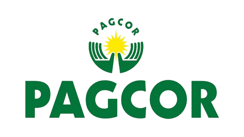
The first PAGCOR logo, designed in 1983, was set in a dark-green and yellow color palette and featured a stylized image of two hands holding the sun with many triangular peaks. This yellow sun resembled the yellow element on the national flag of the Philippines. As for the name of the organization, it was arched above the emblem in the uppercase of a bold geometric sans-serif typeface, also in green.
2023 – Today
![]()
The redesign of 2023 has introduced a completely new style of the PAGCOR visual identity. The new logo is based on a combination of blue and red, with the bright blue uppercase inscription complemented by a large sleek abstract emblem in two shades. The emblem looks like a stylized wing; with clean contours and sharp ends of the lines.
Font and color
The bold uppercase lettering from the official PAGCOR logo is set in a modern geometric typeface with distinctive contours of the characters. The closest fonts to the one, used in this insignia, are, probably, Gill Sans Heavy or Humanist 521 Std Extra Bold.
As for the color palette of the PAGCOR visual identity, it is based on the main colors of the national flag of the Philippines, red and blue, which make up a beautiful and contrasting image, evoking a sense of professionalism and confidence.


