Since 2009, the brand identity of the live streaming video platform Twitch has gone through two major steps. The original logo was replaced by a more distinctive wordmark in 2012, and a favicon was introduced to make the brand identity even more memorable.
Meaning and history
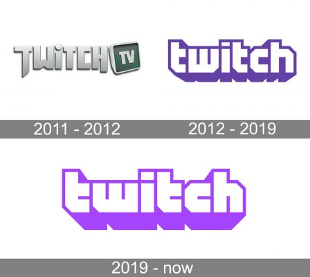
Twitch.tv was formed out of the gaming content category on Justin.tv. The founders, Justin Kan and Emmett Shear, decided to spin off the gaming content because it was the most popular category.
What is Twitch?
Twitch is the name of an online live-streaming platform, launched in 2011 and owned by Amazon. The platform is mainly focused on content, related to video games, yet there are some more categories of video available. Today Twitch operates worldwide, providing its users with the opportunity to watch live videos and on-demand issues.
2011 — 2012

When the project was launched, it used a wordmark emblem featuring the lettering “Twitch” in light grey. Due to the gradient, the wordmark had some dimension. The initial “T” had an elongated end, and due to it, the letter seemed to be placed lower in the line in comparison with all the other glyphs. A similar effect was applied to the “H,” although it wasn’t placed as low as the “T.”
Next to the lettering, there was the emblem “TV” inside a 3D square shape with rounded corners representing a TV screen. The box was filled with a dark grayish green, which was actually the most “color-rich” part of the logo. The Twitch logo was often placed over dark grey background, which made the metallic shade stand out.
2012 — 2019

In 2012, the brand identity went through a major update. Not only the palette and the shape of the logo were changed, even the name of the brand was slightly modified (the lettering “TV” disappeared).
2019 — Today

The current logo consists of two parts. For one, there’s a wordmark, which is often used as a standalone logo. Also, there’s a small icon, which is put above the lettering.
The wordmark features the text “twitch” in white lowercase letters with a purple outline creating a 3D effect.
Chatbox emblem
The icon was probably inspired by the “TV screen” from the original Twitch logo. The company claimed it’s their mascot called Glitch. If you take a closer look and try to figure out what it means, you’ll probably come to the conclusion that it’s a chatbox with eyes.
Font
We can find several fonts sharing something in common with the Twitch wordmark. For instance, the typeface called Dimitri also has the distinctive “cut” angles and the “t” without half of its top bar. And yet, there’re so many differences in the way the glyphs are drawn and in the overall style that we can’t even say for sure whether the Twitch logo designer was familiar with this type.
Colors
The color scheme consists of a distinctive shade of purple (Hex: #6441A4, PMS: 2665C), which is used on the white background.


