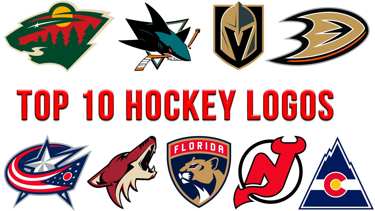
While ranking hockey logos, we took into consideration several factors:
- we searched for implied motion and power
- took into consideration how much the logo catches your eye
- examined whether its parts blend smoothly
- evaluated whether it works well at both smaller and larger sizes.
For a sports logo, one of the things evoking an emotional response is whether there is a living creature (mascot) and what creature it is. While we can usually see people in commercials and ads of all sorts of products and services, sports teams typically opt for an animal mascot, a bird, or a fish. So, while evaluating hockey logos, we paid attention at the choice of the main character (and whether such a character was present at all).
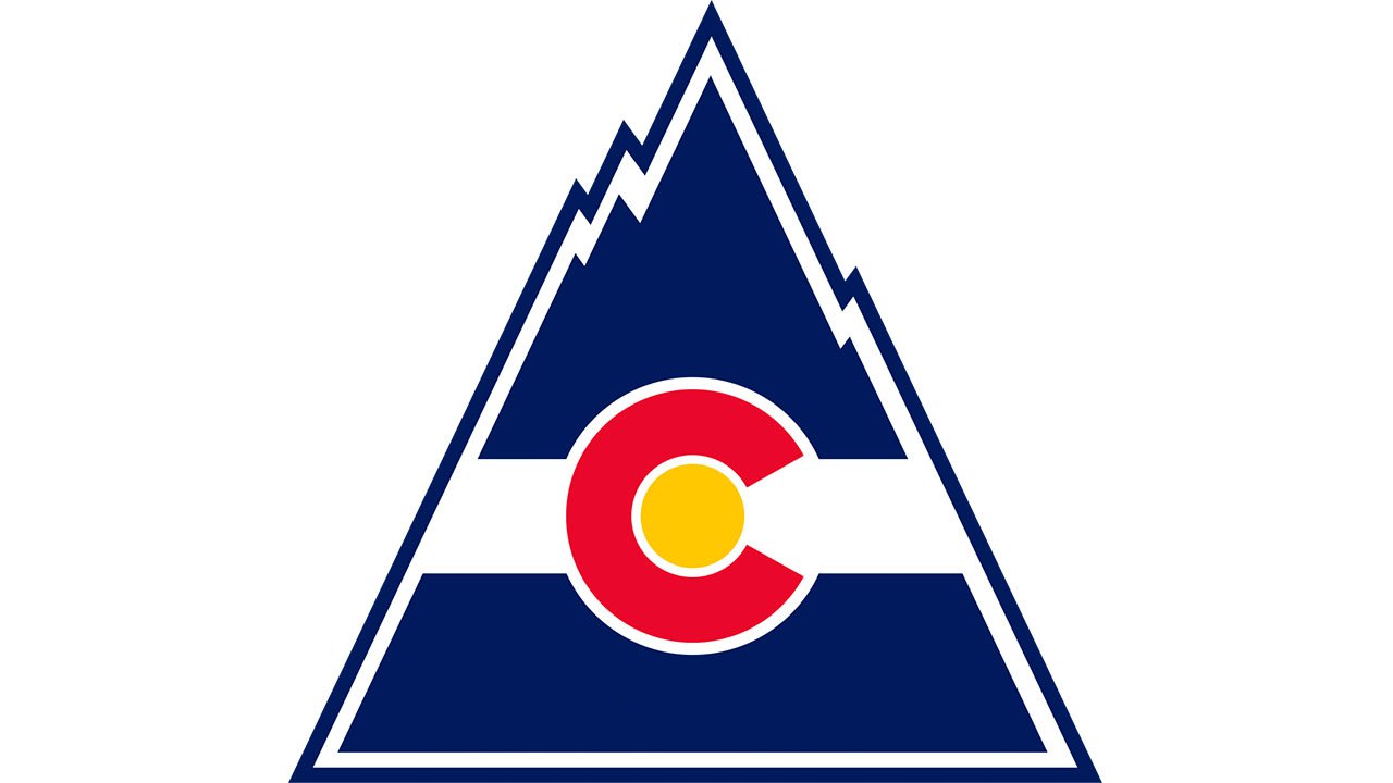
10. Colorado Avalanche
An avalanche is powerful, fast, and deadly hazardous. And yet, it doesn’t look deadly on this logo. Vice versa, one may even suppose it depicts peaceful skiing or snowboarding. Also, an avalanche is maybe too “big” and doesn’t contain the concept of a “pack,” which would be beneficial for a team logo.
Nevertheless, we should point out that the logo is incredibly dynamic. While blue and red are the colors used on logos of quite a few teams, the shades are unique here.
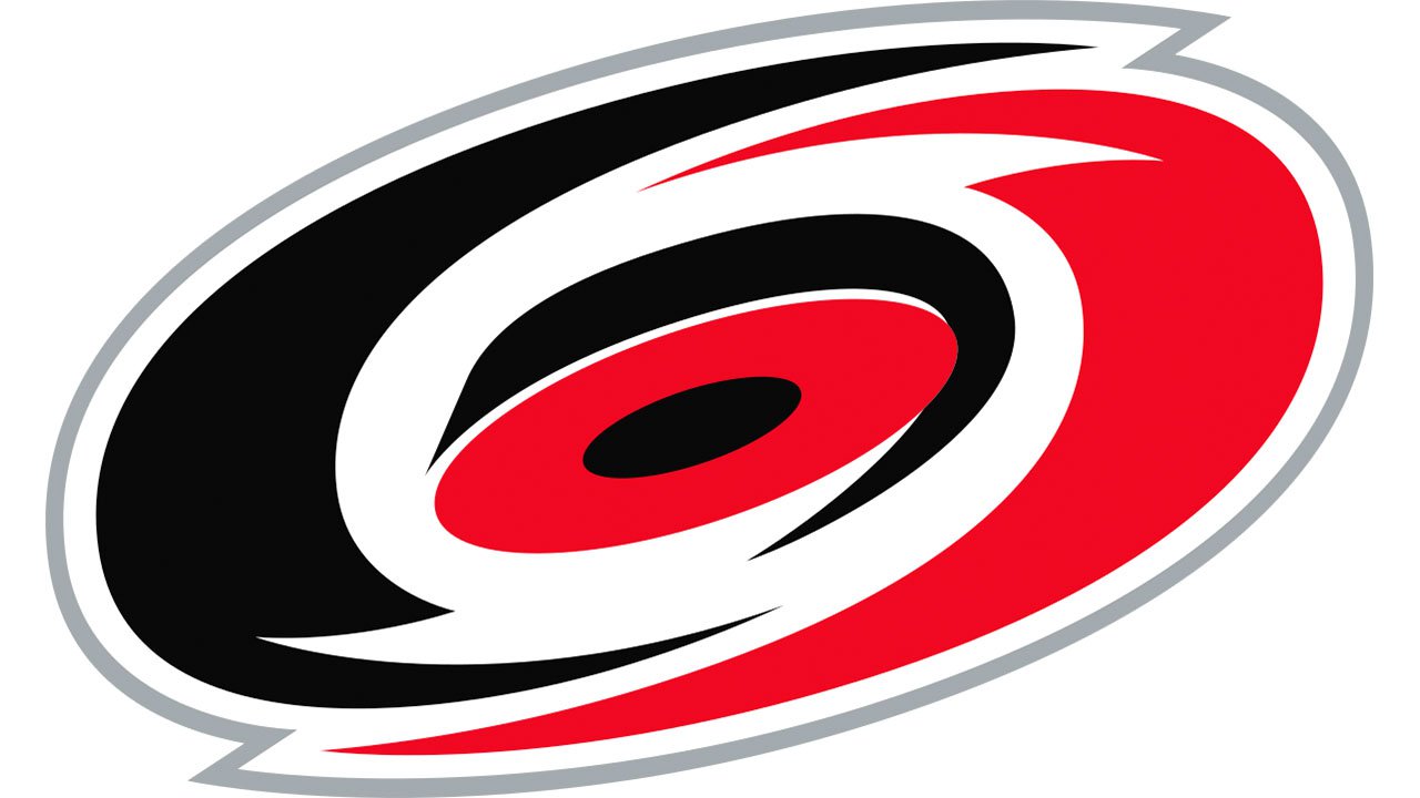
9. Carolina Hurricanes
Once again, we see the logo inspired by the power of a natural disaster. Due to the “eye” effect, there’s a bit more life here than in the Colorado Avalanche logo. And still, the shape and the palette are pretty generic.
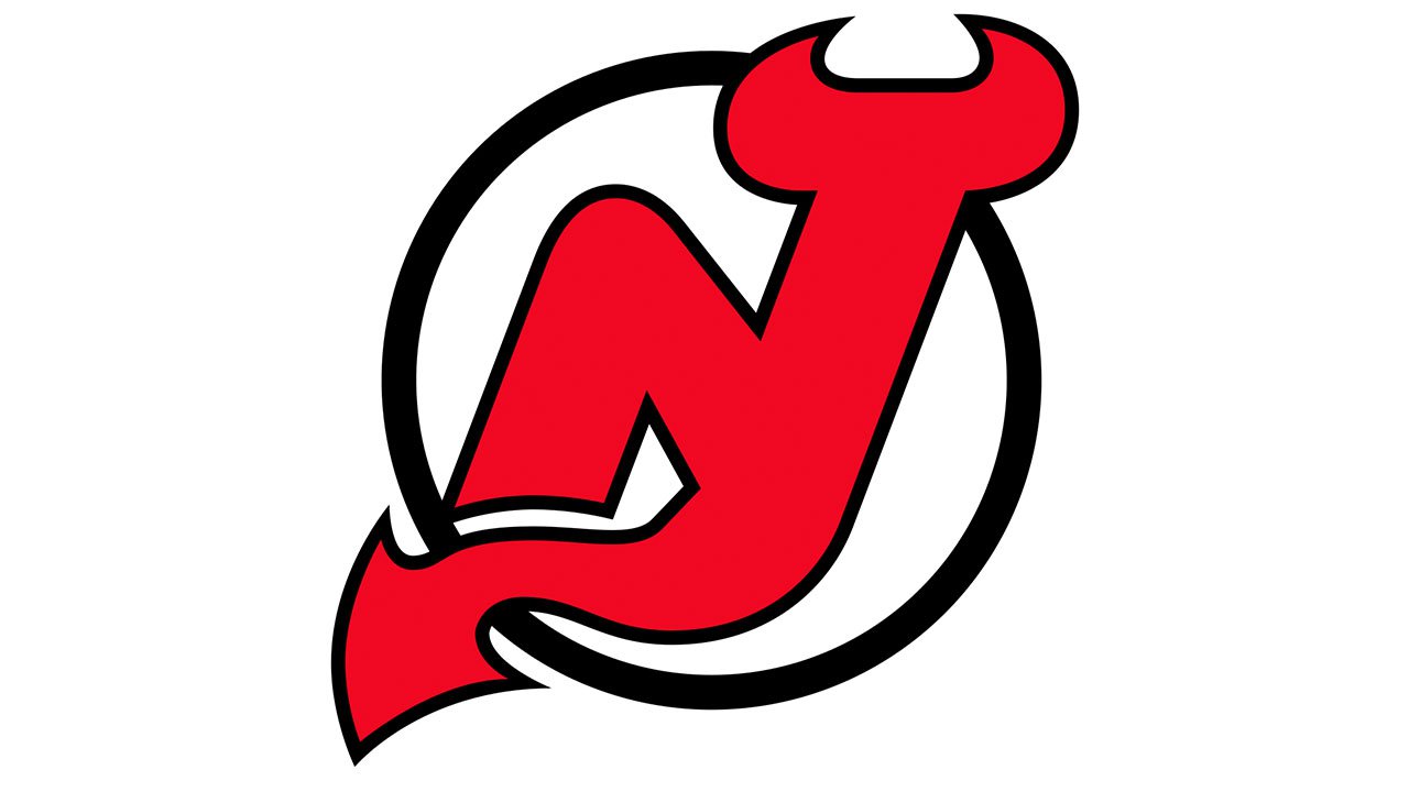
8. New Jersey Devils
This one may seem somewhat old-fashioned. It lacks life and dynamism. And yet, that’s a rather intricate and deep symbol merging a devil with the letters “N” and “J.”
7. Columbus Blue Jackets
While a sports logo with an inanimate object might attract less attention, this emblem is one of the best among the NFL teams. What’s its secret? To begin with, there’s a lot of depth and motion here. Moreover, the 3D effect is created not with the help of a gradient of some sort but with pure shape and shades, which is difficult.
Compare this one to the Dallas Stars logo. While both of them feature a star, the Dallas team has a rather static emblem, although there’s still some depth here.
Also, the flag, which appears to be moving at high speed, creates a link with the team’s home state.
6. Anaheim Ducks
Can a duck’s paw resemble a shield? It can. The two symbols merge seamlessly within a single logo. While a duck isn’t exactly a perfect sports mascot (too clumsy and even funny), the author of the design managed to draw your attention away from this fact – something that the designer of the Pittsburgh Penguins logo failed to do. Although the penguin looks as concentrated and sporty as a penguin possibly can, it still isn’t competitive enough for a logo of a sports team.
5. Arizona Coyotes
There’re a lot of positive things here – the depth, the organic and simple shapes, the motion and power. And, of course, there’s sound. The coyote is howling, which means he’s calling other animals to join him. In other words, this logo embodies the power of a whole pack of coyotes.
On the downside, the animal without any neck at all looks somewhat weak and fragile, in this case. Moreover, the picture can be interpreted as a dead coyote’s head floating in the air. While the designer was trying to depict a howling coyote, in reality, this resembles the open mouth of a dead animal. Possibly, it could work better if the creature’s eyes were visible and there was something of a neck.
4. San Jose Sharks
The way the shark has crushed the hockey stick shows the fish is ready to attack anyone. There’s implied motion here. Also, the triangle shape bears a symbolic meaning – it refers to the Bay Area trifecta of San Jose, San Francisco, and Oakland.
If you place this one side-by-side with the Vancouver Canucks logo, you may perceive the difference in the mood. The shark appears to be stronger and angrier, while this one is more on the cartoonish side.
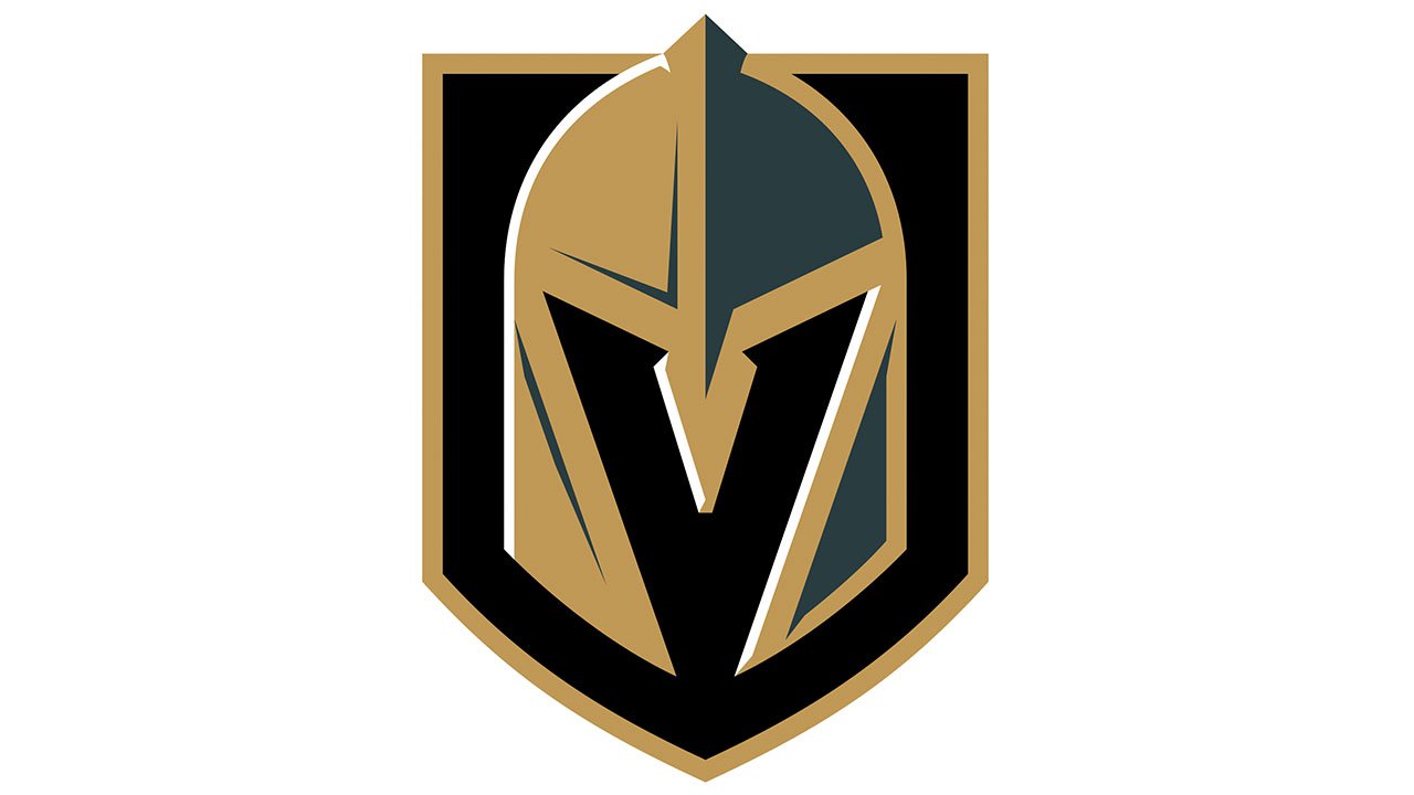
3. Vegas Golden Knights
The Vegas Golden Knights logo is minimalistic in a good way. While it manages to convey its message, there’s not too much going on here.
From the one hand, a helmet is an inanimate object. From the other, you can feel that it might be not just an empty helmet, there’s possibly someone hiding. You don’t know who the unseen enemy can be, how strong he is, and what to expect from him, which makes the logo rather ominous.
The color scheme was inspired by the darkness and the bright lights of a Vegas night.
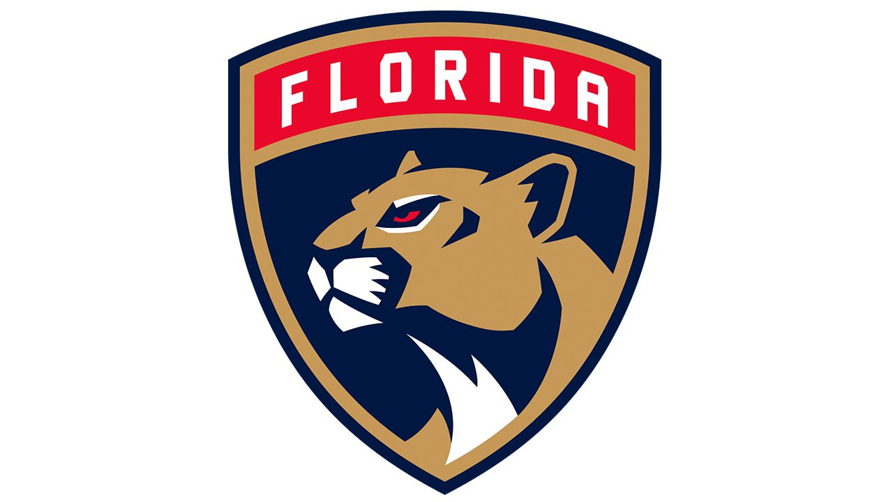
2. Florida Panthers
The panther looks exceptionally stylish and organic without being overloaded with details. Each part of the animal seems to be of a perfect shape and at a perfect place. The animal has a fierce and menacing look, and yet, it is attractive and gracious. What’s more, it fits the shape of the shield to the point that they look like a single whole. Also, the creature doesn’t look completely static – it seems like it’s going to attack.
The type echoes the outline of the panther (compare, for instance, the tops of the “A” and “O” with the top of the ear or the outline of the jaw).
On the downside, the logo isn’t even trying to be original. Both the core symbols – the panther and shield – are way too generic. There seems to be no hockey theme, either.
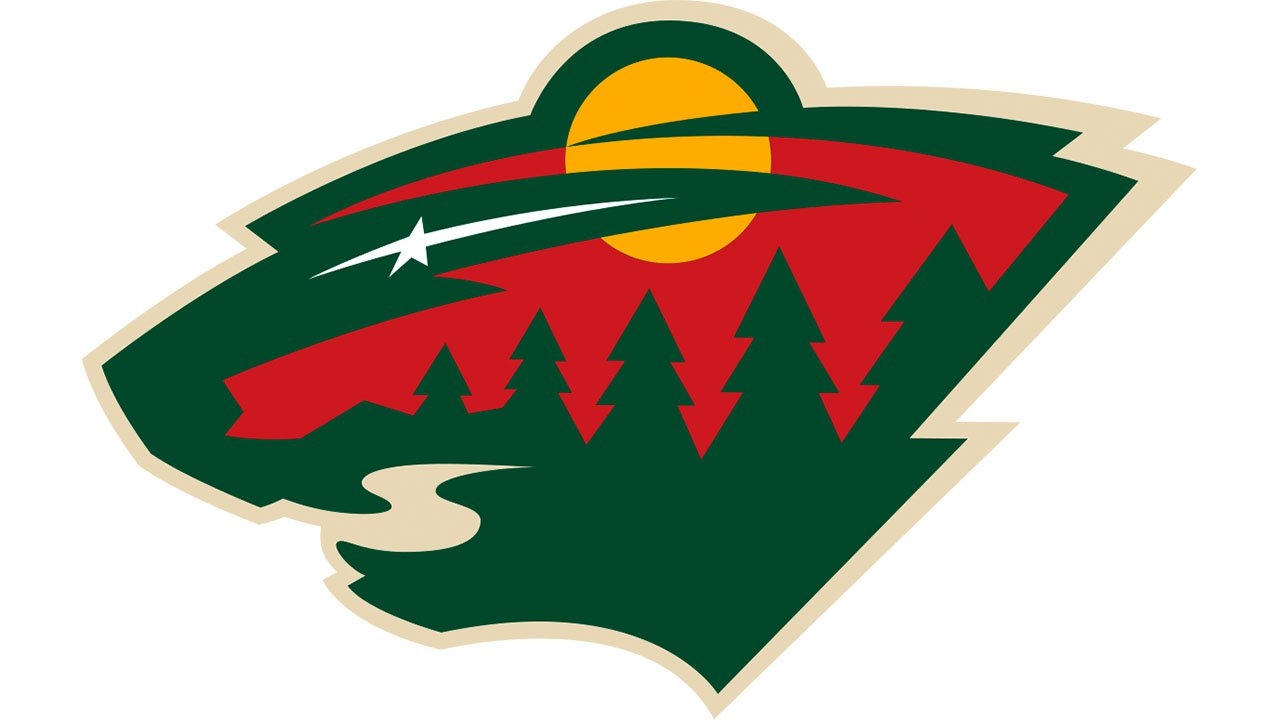
1. Minnesota Wild
While the very concept of this logo is mightily impressive, the drawing itself could have been a bit more clean and precise.
The Minnesota Wild logo has at least two equally important interpretations. When you look at it from a distance, you see the side view of the head of a wild creature. While it looks like a bear or a wild cat, the team refuses to comment on officially what animal the Minnesota Wild logo represents. Anyway, the strong, slightly jagged lines imply power and motion.
As soon as you come closer, you notice that there’s a forest landscape. A huge moon (or sun) and a star are floating above pine trees and a river. This is the North Star, which reminds of the fact that Minnesota is the North Star State.
This could have been the best NHL logo if it was a bit clearer. The “bear” interpretation should have been more apparent. The designer appears to have overdone with the number of details. The sun (or moon), which is also the wild animal’s ear, looks slightly too bright and because of this it pops out breaking the shape of the animal into parts. Anyway, creating a logo with two interpretations was a great challenge, so the designer faced several serious problems that don’t even appear in case of simpler emblems.


