Timex has the type of logo that does not need to be revisited again and again. For decades, it has preserved its simple and effortless style.
Meaning and history
 Timex Group USA, Inc. is a US manufacturing company known primarily for the watches. The brand’s roots can be traced as far back as to 1854 when Waterbury Clock Company opened in Brass City.
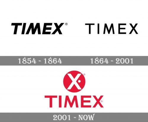
1854 – 1864
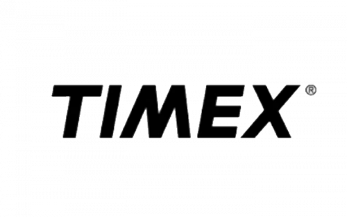
The very first Timex logotype featured an uppercase sans-serif lettering in black, with the letters slightly slanted and written in thick confident lines with straight distinct cuts and traditional contours. It was elegant and timeless.
1864 – 2001
The redesign of 1964 brought us an image the brand used for more than a century. It was still a monochrome logotype in sans-serif, but written in more delicate lines and with its uppercase letters set straight, with no inclination. The logotype was light and airy due to a lot of space inside and between the letters, though it still looked powerful and evoked a sense of expertise and reliability.
2001 – Today
The current Timex logo showcases the name of the brand in a sans serif font looking utterly minimalist. Each of the letters has a utilitarian, simple shape without any unnecessary details at all. They seem to be parts of a building, each having a clear and practical purpose. This is symbolic – it reflects the approach the company uses while designing its products.
One more reason for choosing such a simple design can be that it stays perfectly legible even when placed on the face of the watch.


