Energy drinks form a very popular segment of the beverage market, catering to the excessive demands on our activity and productivity that require constant maintenance of high energy levels. Many people find their solution in energy drinks, which offer a boost through various ingredients, including milligrams of caffeine, vitamins B, and sometimes even green tea extract for those looking for a healthier option.
Among the best energy drinks, certain brands stand out for their collaborations with athletes and celebrities, enhancing their appeal in the energy drink market. These beverages often come in various forms, from traditional drinks to energy shots, providing consumers with multiple options to meet their needs.
To cater to health-conscious consumers, several energy drink brands have introduced options containing zero grams of sugar, relying instead on the natural sweetness of juice or the subtle bitterness of green tea extract. This development reflects an ongoing trend towards healthier alternatives within the sector.
Moreover, the addition of vitamins B in these drinks promises not just an immediate boost but also a contribution to long-term health benefits, supporting overall well-being. With the energy drink market constantly evolving, consumers can expect to see more innovations, such as enhanced formulations that offer greater benefits and collaborations that bring new flavors and experiences to the forefront.
10. Arizona Rx Energy
The drink refers to a group of low energizing beverages. Moreover, initially even the logo had references to herbal extracts, which allegedly became the basis for the drink formula. The original logo of the brand was a white cross on a green background. Today, the logo has changed a lot – now it is a multi-colored and multi-complex structure, based on a stylized sun and a halo around it. The center depicts a two-color name, actually dividing the image horizontally into two equal parts.
9. AMP
This brand is not in the list of energy drinks banned for sale to adolescents; therefore, it enjoys a wide popularity among schoolchildren, who, in fact, is its main target audience.
The logo is two-color – it uses green and violet. It is interesting that the name of the brand represents a continuous line looking like a cardiogram. Indeed, sugar and caffeine contained in the drink contribute to increased cardiac and physical activity.
8. Cocaine
Amazing brand, which was banned because of its name (and critical dosage of caffeine and taurine) almost immediately after its appearance on the US market – in fact, it was banned by Office of Food Control itself. Nevertheless, you can still find the drink in online stores, and it enjoys a certain popularity, especially among students during exam sessions, as well as among those young people who try to combine work, study and active nightlife.
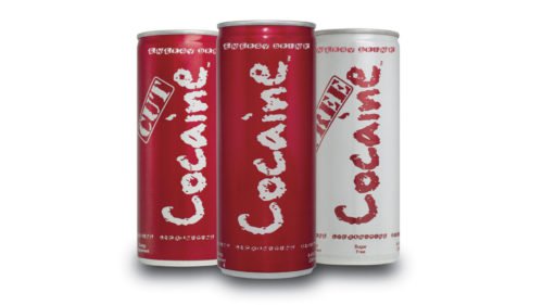
Interestingly, the brand logo is simply a special font resembling a powder rail. Which is quite understandable, given the name.
7. Nos
The creators of this brand did well without any additional graphic images. The only element is the arrow that extends the letter N, creating the finial for the brand name and pointing to the right. Movement and activity – these are two principal factors which the logo creators made an emphasis on. These factors are also highlighted by the colors – white letter with a black outline look very sharp on this red background.
6. 5-Hour Energy
For energy drink, this beverage contains relatively small dose of caffeine – just twice as much as in a large cup of coffee. The manufacturer positions this product as an everyday drink which keeps a person in tonus.
The logo represents a red glow on a black background. Against the background of its red center – the figure of a running athlete with a yellow outline and a similarly colored font. All together – the composition of the logo, and its color solution – creates a sense of tension and dynamics. Especially since the athlete is clearly heading towards the darkness.
5. Monster
The popularity of this brand had been growing steadily for several years until the drink was called the cause of the death of a young girl, which led to multiple lawsuits filed against the company. In several states the drink was banned, in others – it was banned from being sold to minors.
In the center of the logo, we can see a stylized letter “M“, which looks more like a bite mark from the clutches of an unknown monster. In addition, this bite mark has a clear glow. The font is also very aggressive – just like the name.
4. Rockstar
Being created for extreme sports fans, Rockstar drink fully performs its function, providing a short-term surge of energy and at the same time guaranteeing problems with metabolism in the distant future (too much caffeine, too much sugar, too many other stimulants).
The brand name inevitably found its reflection in the logo – the central sign is a yellow star with a triple (black, white and black) outline. The star also replaces the letter “A” in the font name. In addition, each letter acquired a special character – all of them are divided vertically into two parts, which gives additional dynamics to the entire logo.
3. Hype
One of the most durable energy drinks. The brand was created in 1990, and today it is among the top 5 energy drinks in almost 50 countries of the world. The logo is characterized by a specific minimalism – the letter “A” in the motto’s word “Maximum” lacks a crossbeam. A kind of appeal not to distract on unimportant little things and focus on the main issues.
2. Burn
The drink itself is a concentrate of caffeine and sugar. It is recommended to exclude it from the diet of minors, people with high blood pressure, heart disease, as well as pregnant and lactating mothers.
The logo is extremely concise – only two colors (red and black), only two objects – image and text. The image represents double ascending tongue of flame, emphasizing the “double force” of energy contained in a can of the drink.
1. Red Bull
Created in 1980 in Thailand, the Red Bull logo is a kind of declaration of constant movement and activity.
Raging bull in the center of the logo? The creators of the logo doubled the power of the impression. Standing against the background of the solar disk (we remember that the sun is also a very active star), the opponents are about to collide.
High competition among energy drink manufacturers requires them to create clear and concise logos, which would seem attractive for the consumers.
Conclusion
In conclusion, the exploration of the most popular energy drink logos and brands illuminates the dynamic and evolving landscape of the energy drink industry. These brands have mastered the art of appealing to a wide audience, from teens seeking a tasty boost to individuals leading an active lifestyle in search of functional beverages that complement their energy needs. The shift towards healthy energy drinks, highlighted by the incorporation of Vitamin B and Vitamin C, along with options that boast zero sugar and are sugar-free, reflects a growing consumer demand for products that support well-being without compromising on taste. The taste test comparisons underscore the importance of flavor, even in a market driven by the functional benefits of high caffeine content, which, while providing the desired energy boost, also prompts concerns over high sugar content in certain products. With energy drink sales soaring, it’s evident that companies, including giants like the Coca-Cola Company, are continuously innovating to offer products that meet the calorie and mg of caffeine preferences of their diverse clientele, catering to those in pursuit of both health and energy. This evolution signifies a bright future for energy drinks, as they expand beyond mere stimulants to become integral components of a holistic, energetic lifestyle.


