

Everyone knows that an owl is a bird, which symbolizes wisdom. Although this is not the only meaning of this amazing creature. Owl also stands for prosperity and wealth, hence placing it on the logo of your brand can bring a good luck in sales and financial aspects of your business.
Today we are going to agave a closer look at the world’s most famous logos, containing an image of an owl. Whether it is a sports club, or a famous restaurant chain, the image of this bight bird strengthens the badge of the brand and makes the company look confident and reliable. All names in the list are arranged in alphabetical order.
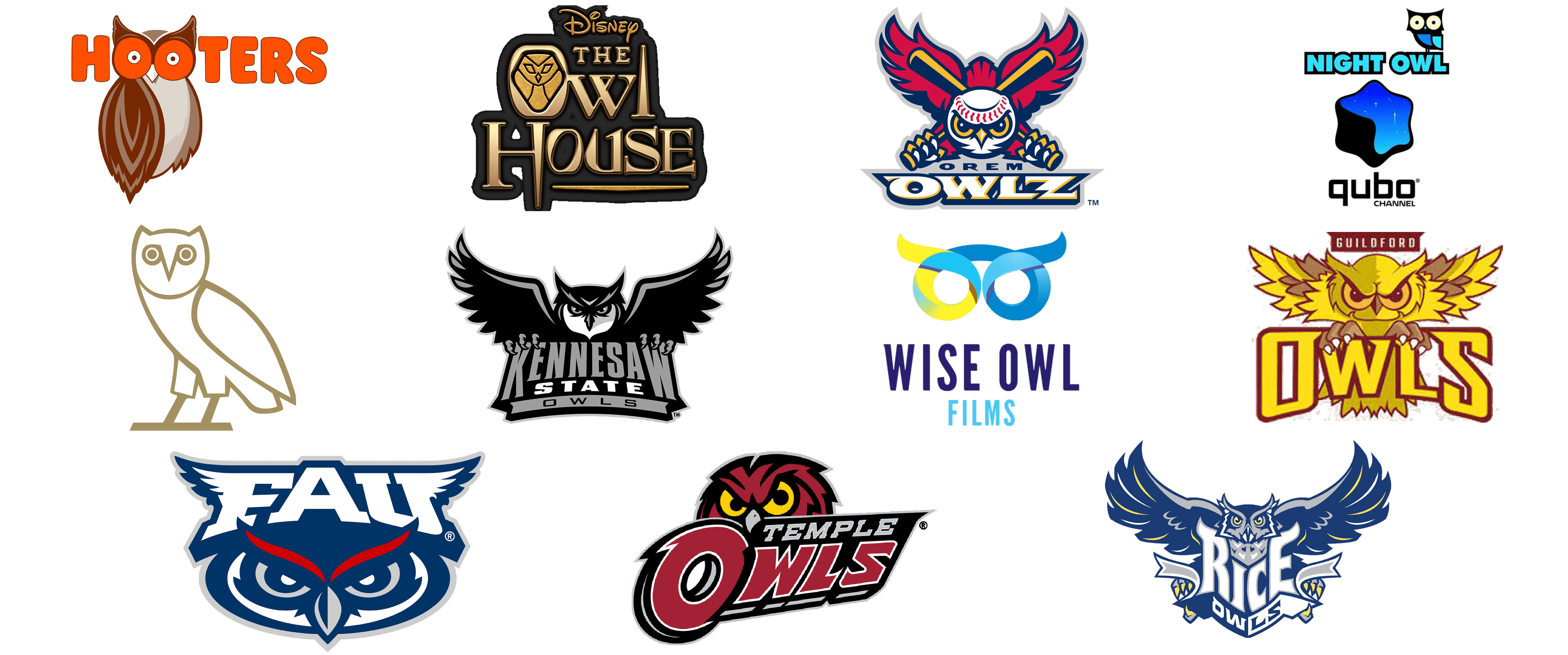
Florida Atlantic Owls
![]()
Florida Atlantic Owls is the name of an athletic program from Florida Atlantic University, which is composed of 18 men’s and women’s sports teams, competing in various disciplines. The logo of the program is based on the image of an owl, stylized and drawn in a blue, gray, red, and white color palette. The horizontally extended image of the owl is decorated with a bold white “FAU” lettering, forming a winged helmet on the bird’s head. The badge looks very modern and professional, representing the teams of the university as serious competitors.
Guildford Owls
![]()
Guildford Owls is the name of an Australian rugby club, which was established in the middle of the 1950s. The bright and powerful logo of the club is executed in a yellow and dark-red color palette, with the gluon owls drawn with sharp triangular elements on the wings, making it look strong and aggressive. The owl is placed behind the enlarged yellow lettering in a bold burgundy outline, with the uppercase characters set in a sleek custom font with softened angles and some lines decorated by sharp short serifs.
Hooters
![]()
Hooters is a famous chain of fast food restaurants, known for the provocative uniform of its waitresses. The accent in the restaurants of the chain is made not on the food, but on the shapes (especially breasts) of the staff. The women’s breasts are even drawn on the logo of the company, being inscribed into the two red letters “O” of the wordmark, which replace the eyes of a brown and beige owl, drawn behind the lettering. The owl here looks very surprised and funny, and the Hooters owl is definitely one of the most recognizable in the world.
Kennesaw State Owls
![]()
Kennesaw State Owls is the name of an athletic program from Kennesaw State University, located in Georgia, USA. The program consists of 17 men’s and women’s teams, which compete in various sports disciplines. The badge of the program is executed in the black and gray color palette, with the stylized owl drawn with its wings spread to the sides and the feathers elegantly curved up. The owl is placed above the three-leveled inscription in gray and white, set against a solid black background. The logo looks very powerful and edgy, reflecting the fighting spirit of the teams.
Orem Owlz
![]()
Orem Owlz is a professional baseball club in the United States, which competes in Minor League Baseball. The logo of the club is executed in a bright and intense color palette, consisting of red, dark yellow, and white, with blue and gray accents. The owl on this badge has its head stylized as a baseball, drawn in white, with the red stitch arched at the top, replacing the eyebrows of the bird. The owl has two baseball bats crossed behind its head. The composition is complemented by a sharply extended logotype in white, with a blue and yellow outline.
OVO
![]()
OVO is the name of a fashion brand, created by the famous Canadian rap musician Drake. The name of the label is an abbreviation, standing for “October’s Very Own”, and the logo is a stylized minimalistic image of an owl, without any additional graphics or lettering. The owl is drawn in its full size, in thick golden lines, which can be placed both on a white and black background, without losing its elegance and style. The image of an owl is very schematic and simple, and this is what makes the badge progressive and super cool.
Qubo Night Owl
![]()
Qubo Night Owl is a late-night program on the kids’ cable channel, Qubo, which was established in 2007, and closed in 2021. The badge of the program featured a combination of the main channel’s logo, with the bright blue uppercase “Night Owl” inscription in a geometric massive sans-serif font, followed by a stylized image of an owl, sitting in the letters “W” and “L”. The owl was drawn in a collage style, composed of several geometric elements in two shades of blue, yellow, and black. It looked very cool and worked well with the corporate Qubo emblem in blue and black.
Rice Owls
![]()
Rice Owls is the name of an athletic program from Rice University in Texas, which is composed of 14 men’s and women’s teams, competing in various sports disciplines. The owl here is drawn in a blue and gray color palette, with a lot of details, and looks pretty realistic. The bird has its massive blue wings spread up and to the sides, with curved sharp feathers decorated by thin white and yellow stripes. The image of the owl is decorated by a two-leveled I script n, set in a shape of a geometric crest, with straight sides and a triangular bottom line.
Temple Owls
![]()
Temple Owls is the name of an athletic program at Temple University in Pennsylvania. The program consists of 19 men’s and women’s teams, which compete in various sports disciplines. The badge of the program is executed in a powerful and aggressive dark-red and black color palette with delicate white and gray accents, which add some lightness to the massive elements. The dark-red owl with large yellow eyes and black outlines is placed behind the two-leveled lettering, with the bottom line enlarged, and set in red, with a thin white outline of the heavy uppercase letters.
The Owl House
![]()
The Owl House is the name of a fantasy tv-series, produced by Disney. The badge of the project is composed of three-leveled voluminous lettering in matte gold with black shadow and gradients. The lettering is set in a smooth custom typeface with interesting shapes of the letters, and the “O” is replaced by a golden medallion with the schematic abstract contour of the owl engraved on it. The logo looks sleek and elegant, with some Egyptian mood in it. On top, the badge is accompanied by the corporate Disney emblem in gold and black, and at the bottom — by a smooth gold horizontal line.
Wise Owl Films
![]()
Wise Owl Films is a subsidiary of the British Lime Pictures company, which is engaged in the production of television projects. The logo of the company is executed in a bright and vivid blue, yellow and green color palette, with the stylized abstract three-dimensional emblem placed above the two-leveled lettering in a narrowed and bold sans-serif typeface with straight geometric shapes of the letters. The emblem depicts owls’ eyes with recognizable curved eyebrows, drawn in one voluminous line, colored in gradients shades from yellow to blue (from left to right).
Tripadvisor
![]()


