

All sports – and sports teams – have their logos. But for the teams of the NFL, the logo seems to be even more important. They are iconic symbols of the teams and the very history of football.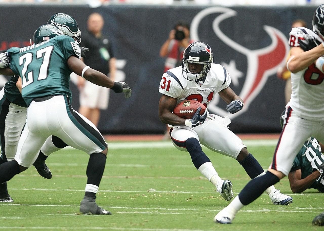
With Super Bowl LVI coming up this weekend, we thought it would be perfect timing to take a look at the logos of the NFL and pick out the best five – in our opinion, of course.
Miami Dolphins
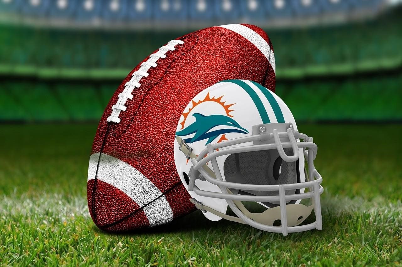 Everything about the Dolphins logo screams Miami and South Florida. The color scheme of aqua and orange is incredibly distinctive and the dolphin itself represents not only the team but also the entire region. Most animal logos in the NFL attempt to convey strength, but Miami’s is quite content with just representing this sun-kissed region.
The modernization of the logo in 2013 did away with a dolphin that was actually wearing a football helmet. As much as that image sums up the old style of football logo perfectly, the new version maintains the playfulness of the original while keeping up to date with design trends.
Atlanta Falcons
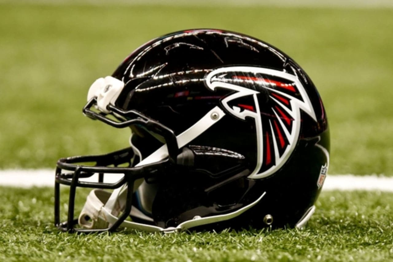 This is what we mean by fearsome animal logos in the NFL. The originally completely black falcon was updated in 2003 to include red and silver accents to stand out and to look more forceful. The shape of the flying bird was also tweaked to turn the shape into more of an ‘F’.
A lot of what is good about this logo comes from the dynamic color scheme. Red, black and white is always going to be an imposing selection and this logo definitely lives up to one of the basic requirements – of intimidating the opposition. There are a few bird logos in the NFL, but this is the best.
Houston Texans
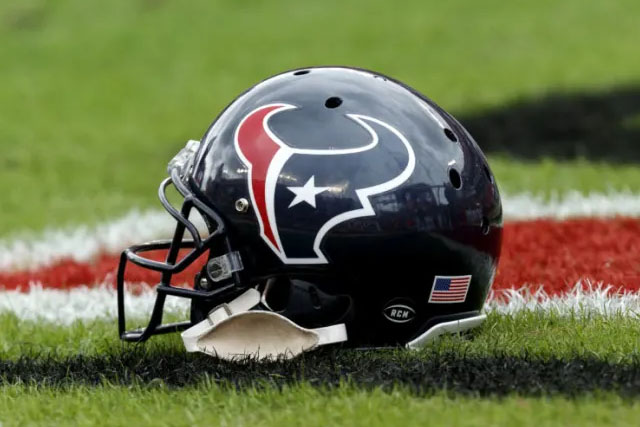
There is no real excuse for an expansion team to have a terrible logo – but it does happen. Just take a look at the efforts from the Baltimore Ravens and the Jacksonville Jaguars. But the Houston Texans got everything right with theirs, summing up the symbols and determination of Texas.
There will be some that prefer the classic Dallas Cowboys star, but the Texans logo is far more indicative of the state in our opinion. The red white and blue are evident in the head of a Texas longhorn. There is even a star for an eye, representing the Lone Star state. This logo is imaginatively designed and works brilliantly.
Los Angeles Rams

The LA Rams were the first NFL team to have a logo on their helmets after a player who worked as a commercial artist painted ram horns on the leather helmets back in 1948. The design has changed over the years – with the yellow switching to white and gold at times – but the general helmet logo design has remained the same.
The beauty of this design is in the way that the swirling ram horns work on the shape of the helmet. The yellow version is much preferable and the motif is even used again on the shoulders of the team jerseys. The opening of a new stadium in 2020 heralded another slight tweak to the horns – but the basic design has been kept in place.
Chicago Bears
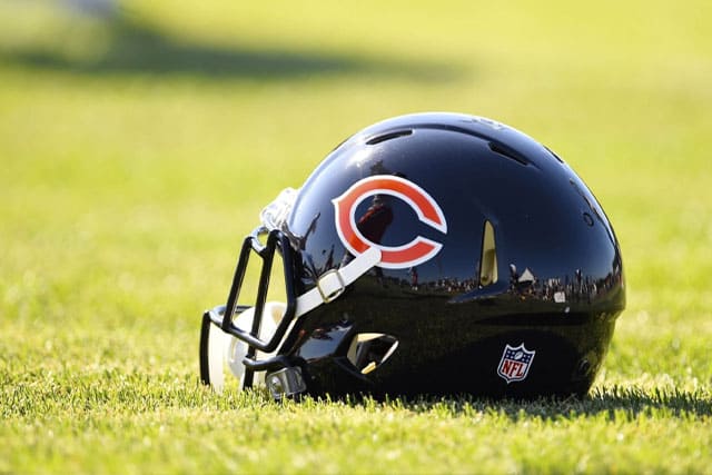
Sometimes simplicity is best. Expansion teams have attempted – and largely failed – to capture the ferociousness of a wide range of wild animals and rebrands and franchise moves have forced others to change traditional looks. But the Chicago Bears wishbone ‘C’ has remained a symbol of the team and the city since the 1960s.
The original white version was ditched in 1974 for the current orange ‘C’, bordered with white and blue. Although there was some early experimentation with an actual bear, the single letter is far more striking and it is noticeable that the organization has seen no reason to change or ‘modernize’ it for almost 50 years.


