

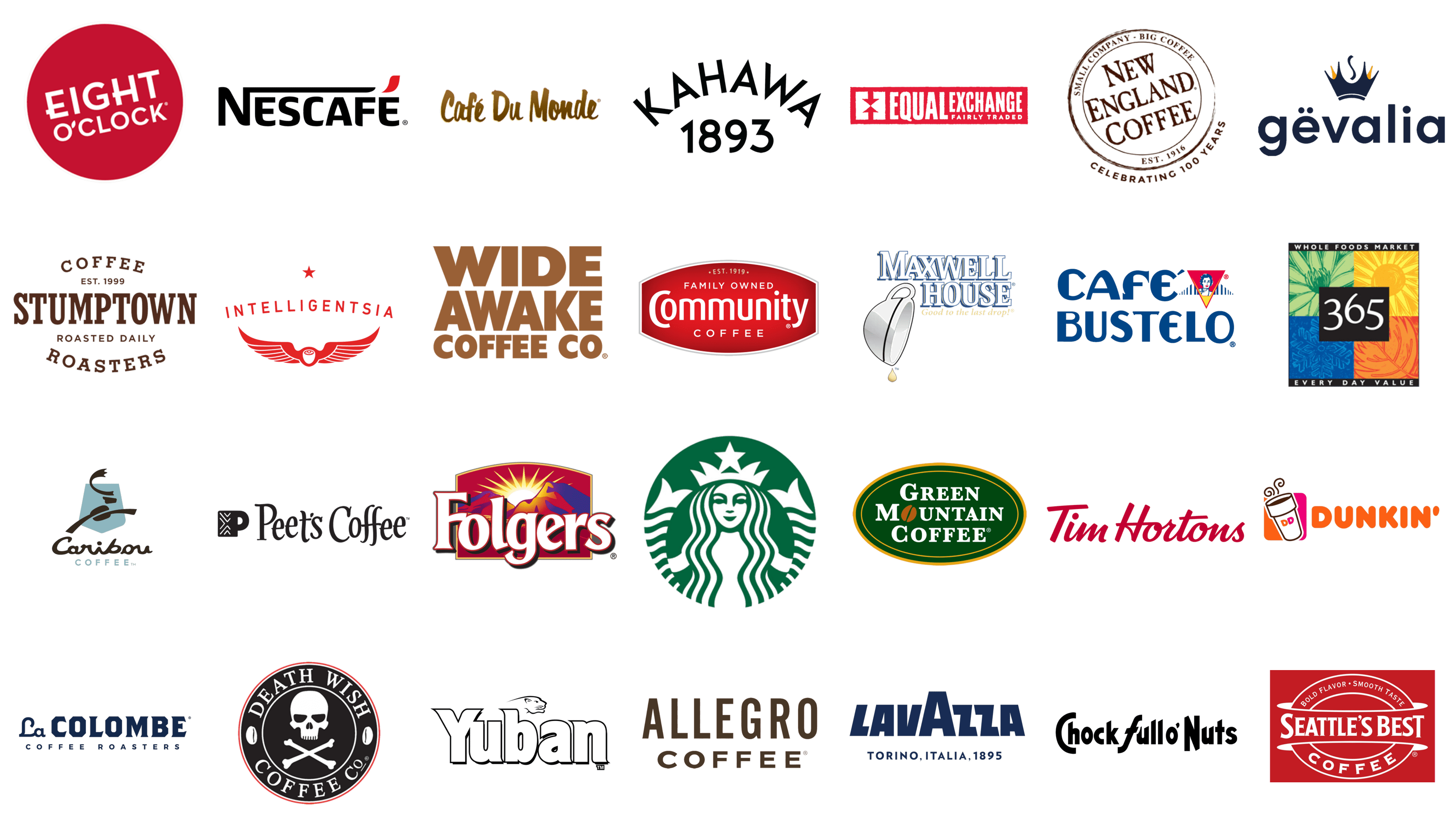
While on the subject of coffee, people all over the world remember not just the dozens of famous brands like Pele, Nespresso, Tchibo, Jardin, Jacobs, Davidoff, Keurig, Kenco, Millstone, Tassimo, Senseo, Julius Meinl, Illy, ItalCaffe, Carraro, and many others, but also the rich diversity of coffee experiences. From the deep bitterness of dark roasts to the subtle notes of caramel in single origin coffees, each cup offers a unique sip that speaks volumes about its origin. The types of coffee, ranging from robust whole beans found in grocery stores to the finely ground coffee perfect for a French press, highlight the global love for this beverage. Cold brews and medium roast varieties cater to those who appreciate a less intense flavor, often with hints of dark chocolate or cherry for an enriched tasting experience.
Each brand, while worthy of notice and inclusion in individual or regional ratings, contributes to a vast coffee culture that goes beyond their logos. The attractiveness of a brand’s graphic mark is significant, but the true essence of coffee lies in the quality and origin of its beans, the craftsmanship in its preparation, from the grind to the brew, and the variety it offers to every palate. Whether it’s a single-origin cup savored for its distinct taste or a dark roast enjoyed for its robustness, the world of coffee is as diverse as the consumers it serves. In our top best coffee logos and brands, we focused not only on the popularity of the brand and the attractiveness of its graphic mark but also on the connection these brands have with farmers, the guardians of coffee’s soul, and how they honor the journey from bean to cup.
Lavazza
![]()
Almost completely abandoning the symbolic images, Lavazza turned its name into a full logo. One element – the smoke above the letter “V” – turned the inscription into a cup of hot coffee. On looking at this logo and a sense of the smell of invigorating drink creates, which seems out there. Originally created as a premium brand, today Lavazza also offers products mid-range pricing.
Starbucks

Starbucks coffee has gained worldwide fame mainly due to its coffee houses. Nowadays the siren at the Starbucks logo, enclosed into the “lifeline” with the name of the brand, without any doubt is included in the five world leaders of the production of this invigorating drink.
At the start, the brand was focused on the proposal of the finished beverage in the coffee chains, but today you can to buy coffee of this brand in supermarkets. Although, without a doubt, one could enjoy the taste and aroma of this drink with the greatest comfort in the coffee house.
Folgers
![]()
Brand coffee Folgers – one of the most successful at the American market. The brand’s share of the coffee market varies from 12% to 14%. The Folgers logo shows the sun rising over the mountains. Indeed, the brand positions itself as the best variant to meet the morning. Focusing on the mountains, the creators of the logo placed a font name at their base. Thus, you can easily read the message – even the hardest morning will be more joyful with this brand of coffee.
Maxwell House
![]()
One of the top three coffee brands, Maxwell house logo is designed in two colors. The creators of the brand had decided that two colors era enough and have chosen blue and white. The original font used in the logo was designed for the brand at the very beginning of its history and has changed slightly. And the symbol – the upside down cup with the last drop – moved from the free space above the font directly into it, replacing the letter “O”. This holds true, because the glass of this coffee is always finished off – and this drop is relished with great pleasure.
Nescafé
![]()
Nestlé coffee brand is a leader in all world coffee ratings without exception. According to Kantar Worldpanel research (annually forming the top 50 FMCG brands, the number of families in the world who prefer the brand and the number of purchases of a particular brand), about 2 million families choose this brand. And this is the highest result among the brands of coffee producers in the world and the only one in the top 10 most purchased products.
This brand coffee of all kinds is sold – in grains, and ground, and instant, and encapsulated. Any segment – and especially the segment of such popular drink as coffee – is internal divided. Some brands are more popular among fans of ground or instant coffee, someone prefer coffee beans, someone – encapsulated. However, each brand has its own unique charm, taste and attractiveness of its logo.
Kirkland’s
![]()
Kirkland Signature is a proprietary brand of the famous Costco Wholesale chain, which specializes in retail trade. The brand was founded in 1995 and is very popular in the United States, where consumers know how to count their money and are best at saving money wherever possible. The name comes from the city where Costco was headquartered from 1987 to 1996.
The logo of this coffee brand is fully based on the corporate Kirkland’s identity, composed of a solid black rectangle with bold white uppercase lettering in a geometric sans-serif typeface. The white wordmark is overlapped by a chic red cursive “Signature” inscription.
McCafé
![]()
The best example of a major player in the coffee segment is, of course, McDonald’s and its McCafe. Coffee bars are essentially part of the “quick service world”. For more and more people, they have become an everyday treat, a small luxury that those can afford. Interestingly, sales of coffee drinks generate 65% of McDonalds’ total profits. Takeaway sales account for 28%. At the same time, the company does not sell coffee from drive-through car windows (McAuto).
As for visual identity, here everything is in the classic form of McDonalds color scheme – yellow and red. The brand name is written in a bold handwritten font, which looks juicy and warm.
Gevalia
![]()
Gevalia Coffee is a Swedish brand with production concentrated in several countries. The production of Gevalia coffee is used mainly in Arabica from Kenya, Guatemala, Colombia, and Costa Rica. The company’s assortment includes a large number of different blends, each of which is made by real professionals in their field.
The color of Gevalia packaging depends on the sales region. Yellow packs are supplied to the American market. On top of the solid yellow background is a lowercase logotype in a friendly and smooth sans-serif typeface. It is inscribed into a circular frame formed by additional lettering. The graphical symbol of the brand, a stylized crown with an element resembling a coffee smoke, is placed above the wordmark.
Seattle’s Best
![]()
Seattle’s Best Coffee – This is an American chain of roadside establishments designed for those who are used to having breakfast and lunch on the road. It is distinguished from classic coffee shops by its minimalistic interior, where everything is made of glass and plastic, the menu with bright pictures, as well as a small area of the hall and orientation on the sale of drinks and food for takeaway. The brand’s logo is bright and minimalist too.
Seattle’s Best Coffee brand has a 40-year history in America, and Starbucks Coffee Company has owned it since 2003. Coffee shops under this name were originally opened at bookstores. However, this strategy did not bring success, with the bankruptcy of the chain of bookstores Borders in the United States closing 450 establishments under the name Seattles Best Coffee. It was after this failure that the format of the establishment was revised and Seattle’s Best Coffee became a roadside cafe.
Eight O’Clock Coffee
![]()
The famous American brand Eight O’Clock, which sells 35 thousand tons of Arabica per year in the States market, was acquired by Tata Coffee from Gryphon Investors for $220 million. According to statistics, TGBL (Tata Global Beverages) is the world’s second-largest producer of various types of tea and has gained a well-deserved primacy in the production of beverages with health benefits.
The logo of this popular brand looks very confident and sleek at the same time, due to the use of an intense red-and-white color palette. The main hero of the composition here is the diagonally placed lettering in a very interesting geometric typeface.
Tim Hortons
![]()
Tim Hortons has been delivering quality coffee for decades, not only in Canada, its home country, but also to coffee lovers around the world. With over 5,600 locations, Tim Hortons goes beyond coffee to offer sandwiches, soups, and baked goods.
Tim Hortons is ranked as the sixth-best coffee brand in North America. More than 80% of Canadians visit Tim Hortons at least once a month, making it more than just a coffee brand – it’s a cultural touchstone.
In terms of visual identity, Tim Hortons is a very friendly brand. Its logo is based on a red and white composition of custom script lettering and a plain bright background.
Dunkin’
The Dunkin’ brand was born in 1950, and today it is considered an integral part of American culture. Over its more than 70-year history, Dunkin’ has become an iconic brand synonymous with quality, innovation, and great-tasting products. Beginning in America, Dunkin’ has gained popularity around the world.
Originally founded as a quick-service restaurant called Dunkin’ Donuts, after rebranding, the brand eventually evolved into the largest American beverage company under the name Dunkin’. As of January 2019, Dunkin’ Donuts eliminated the second part from the name. The move was justified by the fact that 60% of their revenue comes from beverages, especially coffee.
The Dunkin’ logo is one of the most colorful and playful in today’s list. It boasts smooth bold lines and intense shades, which make the wordmark look super friendly and welcoming.
Green Mountain Coffee Roaster
![]()
Green Mountain Coffee Roasters founded Keurig, a brand of disposable capsules that have become popular in the United States. The company sells K-Cup cups, which are shaped differently from Nespresso capsules but extract coffee in a very similar way.
Green Mountain Coffee Roasters is a company known for its commitment to coffee excellence and responsible suppliers. GMCR supports local and global communities by investing in sustainable coffee production and donating a portion of its pre-tax profits to social and environmental projects.
As for the visual identity, Green Mountain Coffee Roasters is a very traditional brand. The white serif lettering with the “O” in the “Mountain” replaced by a red coffee bean, set on a solid green background and enclosed into a double oval white frame looks very stable and evokes a sense of trustworthiness.
Death Wish Coffee Co.
![]()
American brand Death Wish Coffee promises customers the strongest coffee in the world and sells it mostly online.
CEO Mike Brown created the brand in 2012 specifically for coffee drinkers who like their coffee stronger. One mug of Death Wish Coffee can contain up to 650 milligrams of caffeine instead of the average consumer’s usual 250. This is thanks to a blend of Arabica and Robusta, a strong variety often neglected by newcomers.
The concept of the brand is adjusted to the brutality of the drink. DWC uses so-called explosive marketing, which is built on breaking social taboos. Similarly, the brand logo is a white skull with crossed bones, drawn on a black background and enclosed into a circular frame with the name of the company written around its perimeter.
Kahawa 1893
![]()
Kahawa 1893 is a specialty coffee company founded by Margaret Nyamumbo, a third-generation Kenyan farmer. The headquarters of the company is based in San Francisco, California. The name of the brand is a great depiction of its purpose and soul, as Kahawa is the Swahili word for “coffee.”
The company purchased coffee from African women workers who are often underpaid in other areas, thus showing its high social responsibility.
The brand has an incredibly interesting visual identity, full of colorful elements, but at the same time – very minimalistic and contemporary, with a strong feeling of the African heritage. The wordmark, set in a laconic sans-serif font balances the intensity of the graphical side of the badge.
Caribou Coffee
![]()
This coffee brand was founded in 1992 and is owned by the German holding company JAB. Caribou Coffee, known for producing exceptional coffee, uses the finest beans from around the world, roasting them in small batches to ensure a rich flavor. With 765 stores offering handcrafted coffee blends, Caribou Coffee is an integral part of the American coffee industry. According to many international rankings, Caribou Coffee is the best light roast coffee brand.
The Caribou Coffee logo is very creative and elegant. Using the light-blue and black color palette, the designers managed to warmth with cold, and abstract drawings with distinctive characters.
Peet’s Coffee
![]()
Emerging from the merger of Jacobs Douwe Egberts and Peet’s Coffee in 2015, JDE Peet’s Coffee is now the world’s largest pure-play coffee and tea company by revenue, operating in more than 100 markets. The company’s commitment to using the highest quality coffee beans, careful roasting, and blending ensures that customers enjoy a rich and flavorful taste.
The Peet’s Coffee logo evokes a sense of warmth and intensity. And it’s all due to the use of a black and white color palette with a delicate gold emblem balancing it. The main element of the badge is the elegant lettering, which uses a fancy custom font, while the emblem features a geometric shape of the “P” and small sharp ticks decorating its vertical bar.
illy Coffee
![]()
The name of the product bears the name of the founder Francesco Illy, who in 1933 in Trieste opened a coffee business. Till today the company producing high-quality ground and bean beverages is considered one of the best coffee brands in Italy and beyond, the production is thriving and still belongs to the family of the founder.
ILLY coffee beans contain nine different varieties of elite arabica grown in such countries as Brazil, Costa Rica, Ethiopia, Kenya, Guatemala, and Jamaica. The basis of the ILLY coffee blend is the Santos variety from Brazil. To increase the shelf life of coffee beans, inert gas pressure packaging was developed, thanks to which the beans do not lose their flavor properties for several years.
The ILLY logo is laconic and eye-catching. The white lowercase wordmark in a custom handwritten typeface, set on a solid red rectangle, is recognizable by coffee lovers from all over the globe.
Intelligentsia
![]()
Intelligentsia Coffee is a coffee company from the United States. It appeared in 1995 in the state of Illinois in the city of Chicago. It was founded by Emily Mange and Doug Zell. Intelligentsia is part of the so-called “Big Three of the Third Wave” together with Stumptown Coffee Roaster and Counter Culture Coffee. The company was at the origin of a new round of coffee industry development. It sets standards and principles that are commonplace these days. The company is engaged in the search for coffee beans, their roasting, and further realization. Many establishments across North America cooperate with Intelligentsia Coffee.
The brand is known for its bright packaging, choosing mainly warm reddish and orange shades, and a brutal geometric logotype, written in shadowed sans-serif characters and accompanied by an emblem, which resembles a logo of a car or aviation brand — the crest with two enlarged wings.
Stumptown Coffee Roasters
![]()
Stumptown Coffee is a Portland-based coffee company that originated in 1999 in the U.S. state of Oregon. Over the years, the company’s brand has opened coffee shops in Portland, New York, and Los Angeles and a large roasting facility in its home state. In 2015, founder Dwayne Sorenson sold the company – and Stumptown Coffee became part of Peet’s Coffee holding company.
In nearly a quarter century, Stumptown hasn’t just gone from a small roaster to a large and globally popular company. Over the years, it has caught quite a few changes in the industry and has even set trends itself. Stumptown Coffee is one of the “Big Three Third Wave Companies” along with Intelligentsia Coffee & Tea from Chicago and Counter Culture Coffee from North Carolina.
The Stumptown logo is somewhat classy and elegant. The logotype is written in bold serif capitals in gold, and arched above a fine traditional emblem depicting a horseshoe, which brings luck.
Café Bustelo
![]()
Cafe Bustelo coffee has an irresistible aroma and intense flavor. It is a delightfully versatile coffee that can be prepared in any way: drip, cappuccino, espresso, or iced cold to suit all tastes.
The intensity of the flavor of this coffee can be easily judged by its logo. The main colors of the Cafe Bustelo visual identity are yellow and blue. This combination reflects the Latin American roots of the coffee inside the package as best as possible. The main element of the logo is a wordmark, which is set in two lines on a plain yellow background. The lettering is set in a bold designer typeface with interesting shapes of the characters – some of the lines are rounded, while others are sharp enough.
The logotype is accompanied by an emblem in the shape of a triangle pointing down, with a red background and a contoured white and blue portrait of a lady in a pin-up style.
Whole Foods 365 Everyday Value
![]()
Whole Foods 365 Everyday Value, offers a wide variety of products including organic and non-GMO. Organic coffee is coffee that is grown without the use of chemical fertilizers, which means it is free of pesticide residues and other toxic substances that can harm your health. And all of this is reflected in the higher quality of the beverage. That’s why Whole Foods 365 Everyday Value coffee is so appreciated by coffee gourmets not only in America but all over the world.
As for the visual identity of the Whole Foods 365 Everyday Value coffee brand, it is very simple and modest. It is a pennant with a straight top line and a rounded bottom, which can change its color from black to green, depending on the sort of coffee and its packaging. The pennant boasts a three-leveled white inscription with the “365” significantly enlarged.
Equal Exchange
![]()
Equal Exchange is an American brand of coffee, cocoa, and hot chocolate that was founded in 1986. The company clearly follows Fair Trade rules, according to which raw materials for the production of products are purchased from small farms in poor countries. This ensures the “organic” focus of the brand. Equal Exchange coffee is not only organic but also kosher.
As for the visual identity of the Equal Exchange brand, everything is very sharp and brutal. Firstly, the color scheme of the logo – red and white – already reflects the power of the brand, but it is conveyed much more by the main elements of the composition. The emblem of Equal Exchange depicts two vertical arrows pointing at each other. The arrows are drawn in red on a solid white square, which is accompanied by bold narrowed sans-serif lettering, also in white.
Chock Full o’ Nuts
![]()
Chock Full o’ Nuts is a legendary American coffee brand that will soon be celebrating its centennial. For Americans, it has long been not just another coffee label, but a whole era and history. It is interesting that the logo of the brand has not changed since its foundation. This once again shows how the company honors its roots and heritage.
The Chock Full o’ Nuts logo is a bold designer lettering with the bodies of the characters colored in green checkers, and a bold black outline accompanying them. Even if today the typeface of the inscription doesn’t look very progressive — only the image, what kind of a next-generation design it was back in the 1930s when the logo was created!
Yuban
![]()
Yuban is another legendary brand of coffee from the United States. The cans with the Yuban logo can be found literally in each corner store across the country. This coffee brand is even older than Chock Full o’ Nuts because it was founded in 1905. And for more than a century of history, this coffee has not lost its popularity.
As for the Yuban logo, it consists of two parts – a stable and heavy title case logotype in a playful font with slightly expanded flared tails of the bars, and a graphical element, which is horizontally divided in two by the wordmark. The top of the emblem consists of four wavy lines in pink, yellow, orange, and teal, enclosing three brown coffee beans. As for the bottom of the composition — it is an image of three overlapping coffee cups in yellow and orange.
Community Coffee
![]()
Community Coffee is an American family-owned brand, which has been on the market for more than a century. The main feature of this brand is its adherence to tradition. For example, the best-selling Community Coffee blend is still produced according to the technologies that the company started using back in 1919.
As for the visual identity of the Community Coffee brand, everything is quite classic and elegant. Like many other coffee producers, the company chose for its logo a bright and warm combination of red and white colors, diluting them with fine gold details. The brand name is written in two levels inside a horizontal banner with arched top and bottom borders. The top part of the banner is decorated with a golden drawing of a family house, underlined by the white “Family Owned” tagline in small capitals.
New England Coffee
![]()
New England Coffee is another American coffee manufacturer with a more than a century-long history. The brand was established in 1916, and throughout the years only evolved and improved the quality of the coffee offered under its label.
New England Coffee has a huge number of different flavor variations in its line, which makes the brand very similar to the manufacturers of flavored teas. In addition to this similarity, there is another one. The fact that the brand logo is also very similar to the logo of the tea label. Why? First of all, by its old-style serif font. Secondly, by the composition – the lettering is set inside a circle with a double outline, which makes it look like a stamp. And, thirdly, the design of the packaging — where each different flavor is accompanied by a wide vertical stripe of a particular color.
Café du Monde
![]()
Established in New Orleans in the middle of the 19th century, the Cafe du Monde company still produces its coffees in its mother city. And this is how the brand shows its value of the roots and respect to the traditions. This brand is mostly known for its unique chicory roasting technology. You can read about it on every bright yellow can of Café du Monde.
The Cafe du Monde package design is very old-school which today makes it super stylish. The brand uses a very warm and pleasant brownish-burgundy and dark yellow color palette, which reflects the rich flavor and warmth of the brand’s signature coffee.
The central element of the logo here is a very detailed drawing of the first Cafe du Monde location in New Orleans, depicted on the city landscape background.
Wide Awake Coffee Co.
![]()
Wide Awake Coffee is quite a young American coffee manufacturer, which offers very intense and strong coffee blends, that can make you wake up after one cup. But this brand is known not only for the high quality of the coffee it offers but also for its very fun and memorable visual identity.
The brand’s symbol is a cool cartoonish owl, that has extremely enlarged eyes, depicted as two white circles with small brown coffee beans in their centers. And what could be a better depiction of feeling wide awake? The graphical emblem is accompanied by bold and massive lettering in the uppercase of a distinctive geometric sans-serif typeface, adding to the progressiveness of the brand.
Allegro Coffee
![]()
Allegro Coffe is the coffee brand owned by America’s renowned Whole Foods chain of supermarkets, which specializes in the sale of organic food products without artificial colors, preservatives, flavor enhancers, sweeteners, and trans fats. Hence, we can conclude, that Allegro Coffee is also an organic brand.
The company has been cooperating with small and medium-sized farms all over the country for over fifty years, which allows it to maintain a high level of quality of Allegro Coffee products.
As for the logo, it is quite simple, but there is a lot of elegance in that simplicity. The combination of the white-silver color of the inscription with the slightly metallic brownish color of the background of the packaging creates a very stylish look for the Allegro Coffee brand.
La Colombe
![]()
La Colombe is a progressive brand of canned coffee, which lately started becoming more and more popular. It saves time, doesn’t leave any questions about making the drink, and tastes really good. What else might we need in this busy active world? The cans of the La Colombe coffee look very stylish and fine, showing the next generation of the coffee brands’ visual identity.
The logo of La Colombe is a solid blue dove, flying above the dark blue wordmark, written in two styles — the elegant “La” in small size, and the brutal angular uppercase “Colombe” which is a bit enlarged. Both elements of the logo are placed on a plain white background, which is accompanied by banners in different shades, depending on the coffee flavor.


