TeamViewer is a software, used for remote control of any PC. The program also enables file and desktop sharing and is available for various operating systems, including Windows, macOS, and Linux.
Meaning and history

TeamViewer was launched in 2005 and, according to the official version, largely by accident. The developers of the company in Germany had to travel to their customers. But Thilo Rossmanit decided that it was hard and expensive to travel, so he began to look for other ways to communicate with customers, for example, to conduct presentations remotely. Thus, he developed his own program, which got the name TeamViewer. On September 25, 2019, TeamViewer went public. This IPO was the largest since the early 2000s.
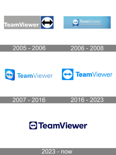
2005 – 2006

Right from the start, the company designed a logo that has stayed almost unchanged ever since. A blue square with a white circle featuring two connected arrows pointing in opposite directions became a sign that got strongly associated with TeamViewer. The name was printed in white on a light gray rectangle that was placed on the left, right next to the square.
2006 – 2008

The new logo also had a rectangular form done in a light gray gradient. The square emblem was now placed to the left of the name, which is more common and has stayed that way ever since. It was accompanied by the slogan “Give Your Desktop Wings”. It was printed in smaller white letters and reflected in the background as if the inscription was standing on glass.
2007 – 2016

The updated logo preserved the key elements of the previous version, doing away with the slogan and backdrop. To make the name stand out even on a light background, the white was replaced by a blue that matched the square on the left. The square emblem, by the way, now was placed at an angle to show that it has a three-dimensional form. The blue was vivid and stood for the freedom of communication the service was providing.
2016 – 2023

The TeamViewer logo is simple and laconic. Composed of a wordmark and the software’s icon on its left, it looks clean, neat and almost sterile.
The nameplate uses two different styles for two parts of the software’s name. “Team” is executed in a bold geometric sans-serif typeface, with traditional letterforms, while “Viewer” in thin lines looks modern and fresh.
The TeamViewer emblem in a square with rounded angles, which has a white circle with a two-sides arrow placed horizontally.
The blue and white color palette is the most common choice for the IT companies and their products, as this color combination reflects professionalism and evokes a sense of reliability and security.
The bright blue if the TeamViewer visual identity is also a reflection of a high-quality product, which was created for people and is in constant progress and research in order to make it faster, smarter and add new functions to the ones that already exist.
2023 – Today
The refinement of 2023 has kept the recognizable style and the design of the team viewer emblem, yet switched the color palette to dark blue and white and strengthened the contours of all elements, creating a more laconic, and hence, confident, image for the brand. The lettering is now written in one style, with the sans-serif title case characters having bars of the same thickness, and it adds a needed balance to the composition.


