The popular American chain of fast food restaurants serving Texas-Mexican cuisine has always been known for its innovative products and solutions. However, the company is more conservative in its visual identity. The core visual element, the bell, has been an essential part of the Taco Bell logo throughout most of its history. However, the emblem, as well as the wordmark, has been modified more than once. But since the beginning of the 1990s, those were all minor changes that only reflected the progress of the company and its ability to keep up with the times and current trends.
Meaning and history
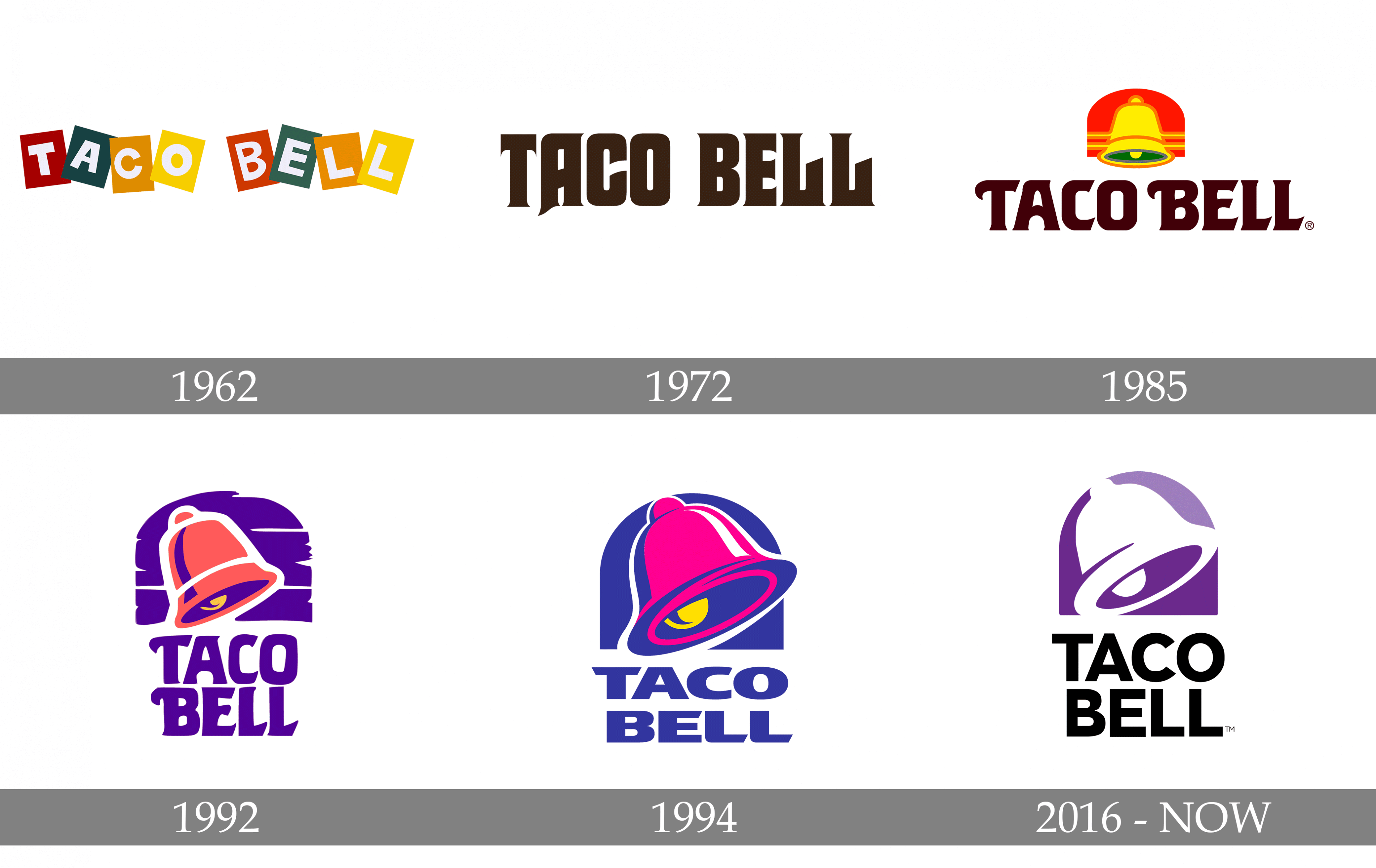
Though the famous Mexican cuisine fast-food chain was established in 1962 and its name has never been changed, the image of the bell was adopted for its official logo only in 1985, and the emblem we all can see today was first introduced in 1992, being slightly modernized by now.
What is Taco Bell?
Taco Bell is the name of a popular fast-food restaurant chain, which was established in the United Statesat the beginning of the 1960s, and is specialized in Mexican cuisine. Today the American company has more than 7 thousand locations worldwide.
1962 – 1972
The logo, created for Taco Bell in 1972 featured a bright and delightful composition, consisting of eight colorful squares, inclined to different widescreen with white sans-serif letters in each of them. The color palette of the emblem consisted of such shades as burgundy, green, yellow, and orange, reflecting the passion, energy, and the variety of ingredients the restaurant chain could offer to its customers. This badge stayed with the brand for ten years.
1972 – 1985
The redesign of 1972 brought a completely new style to the Taco Bell visual identity. The logo, introduced in that year and used by the brand for more than a decade, boasted a sleek monochrome inscription in all capitals of a custom typeface with elongated bold lines, diagonal cuts, and small yet sharp serifs colors which added progressiveness and elegance to the whole composition.
1985 – 1994
In 1985 the bell emblem appeared on the logo. It was executed in red, yellow, and green color palette and placed above the bold black lettering, written in a fancy custom typeface with elongated rails of the first letters of the wordmark and sharp diagonal cuts of the letter-lines. This version of the logo was used by the company for almost ten years along with the secondary version, created in 1992.
1992 – 1994
The secondary emblem was designed for Tao Bell in 1992 and featured a different color palette, which later became the official one. The enlarged pink bell was placed on a purple background, composed of a solid arched figure with several white lines on it. The wordmark, executed in the same typeface as on the primary version, was colored purple and placed in two levels, under the emblem.
1994 – 2016
The redesign of 1994 refined the contours of the previous version and elevated its color palette to brighter and more intense shades of pink and purple. The typeface of the wordmark was also changed and now the capitalized inscription was written in an extended and bold sans-serif font with diagonally cut letter ends. This badge stayed untouched for more than twenty years.
2016 – Today
In 2016 the Taxi a bell logo was redesigned again, and the color palette was simplified to purple, white, and black, where the whole bell is placed on a purple background, above the strict black nameplate uniform a bold yet neat sans-serif typeface with clean traditional contours.
Font
The sans-serif, all-cap type looks clean and minimalistic.
Color
The bell itself features a combination of two shades of purple, light and dark, while the wordmark is given in black.
What is the meaning of the Taco Bell Logo?
The Taco Bell logo depicts a large bell, drawn above the stable modern lettering, executed in purple and white. The bell is here as the graphical interpretation of the company’s name, and also as a symbol, that catches attention, and calls people in.
What is the Taco Bell slogan?
The slogan of the Taco Bell fast food restaurant chain is “Live Mas”, where “Mas” is in Spanish, and is translated into English as “More”. This slogan was introduced by the company in 2012, replacing the “Think Outside The Bun” lotto, which had become iconic by that time. Along with these two, Taco Bell has had such slogans as “The Cure For The Common Meal”, and “Yo Quiero Taco Bell”.
When was the Taco Bell logo created?
The predecessor of the logo of Taco Bell we all know today was designed in 1992, and the current version is a result of the redesign by Lippincott Studios, which took place in 2016. As for the very first logo of the famous Mexican cuisine chain, it was introduced in 1962 and stayed active for almost ten years.
What does the Taco Bell logo symbolize?
The Taco Bell logo is a graphical representation of the company’s name, with the enlarged bell as the main hero of the emblem. Although some people see a stove damper contours in the base of the emblem, the central part is still just a bell.
Where did the Taco Bell logo come from?
The logo of Taco Bell represents the name of the brand, which in its turn was named after Glen Bell, the founder of the company. So the enlarged purple and white bell we can see on the badge of the fast food chain stands not only for the brand but also honors the roots of the company, and the man, standing behind it.
Why did Taco Bell choose its logo?
The company has chosen the Bell as its symbol because it is the best representation of the chain’s name, which is easily memorable and recognizable. The simple element is known by people from all over the globe and doesn’t need any explanations.
Why did Taco Bell choose purple?
The current version of the Taco Bell logo is set in purple and white with no additional shades. The combination looks cool and stylish, making the badge of the fast food chain stand out in the list of its competitors. The purple here is a representation of the brand’s progressive approach and young vines in its philosophy.


