Sunwing Airlines is a Canadian leisure airline based in Toronto, Ontario. It is owned by Sunwing Travel Group and operates scheduled and charter flights to various vacation destinations. The company specializes in providing affordable travel options for sun-seeking travelers, offering flights to popular resorts in Mexico, the Caribbean, Central America, and the United States. With a fleet of modern aircraft, Sunwing Airlines ensures a comfortable and enjoyable travel experience for its passengers, making it a preferred choice for vacationers looking for convenient and budget-friendly flights to their dream destinations.
Meaning and history
Sunwing Airlines, founded in 2005 by Colin Hunter, is a Canadian leisure airline specializing in vacation travel. The airline has achieved significant milestones over the years, expanding its route network to popular vacation destinations in the Caribbean, Mexico, Central America, and the United States. It has garnered a reputation for its exceptional in-flight service, comfortable seating, and complimentary amenities. Currently, Sunwing Airlines continues to thrive as a leading leisure airline, offering affordable and convenient travel options for vacationers across North America. It remains dedicated to providing an enjoyable and stress-free flying experience for its passengers.
What is Sunwing Airlines?
Sunwing Airlines is a Canadian leisure airline that specializes in vacation travel. With its founding in 2005, the airline has established itself as a prominent player in the leisure travel industry, offering flights to popular vacation destinations in the Caribbean, Mexico, Central America, and the United States. Sunwing Airlines is known for its emphasis on customer satisfaction, providing a comfortable flying experience and a range of amenities to enhance the vacation experience for its passengers.
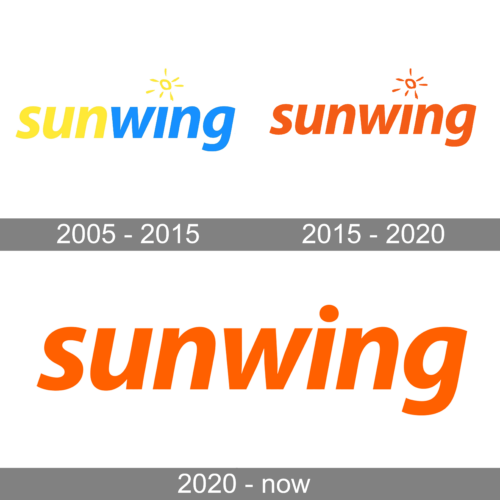
2005 – 2015
The original Sunwing logo looked very friendly and simple. It was a lowercase lettering in a slanted sans-serif typeface with the first part of the wordmark written in yellow, and the second — in blue. The blue “Wing” was decorated by a small yellow sun image above it.
2015 – 2020
The redesign of 2015 has played with the color palette of the Sunwing logo, redrawing yellow and blue elements in orange. The style of the inscription and the small emblem above the “I” remained untouched.
2020 – now
In 2020 the logo of the air carrier was simplified, with the graphical element removed from the composition. The lettering got a bit enlarged, and the orange color palette remained the same.


