Sunbeam is a now-defunct British automaker, initially part of Sunbeam Motor Car Company Ltd., established in 1905. It was most active in the early to mid-20th century and became known for its luxury cars and racing achievements. Eventually, the brand became part of the Rootes Group. The company was headquartered in the United Kingdom and had a global outreach, including sales and motor racing activities in Europe and the Americas. Its production ceased after going through multiple ownerships, and the brand is currently dormant.
Meaning and history
Sunbeam Motor Car Company Ltd. was established in 1905 by John Marston, a British industrialist initially known for bicycles. The company gained prominence in the early 20th century for producing high-quality luxury cars and had considerable success in motor racing, including setting land speed records. Headquartered in the UK, Sunbeam was one of the members of the Sunbeam-Talbot-Darracq (STD) conglomerate before being acquired by the Rootes Group in 1935. Significant achievements include winning various Grand Prix races and creating aviation engines during WWI. The brand faced multiple ownership changes and eventually became part of Chrysler Europe in 1967. As of now, the brand is inactive and remains a historical legacy in the automotive world.
What is Sunbeam?
Sunbeam was a British automaker founded in 1905, known for manufacturing luxury cars and participating in motor racing. It was part of the Sunbeam Motor Car Company Ltd. and later acquired by the Rootes Group. The brand is currently dormant after undergoing various ownership changes.
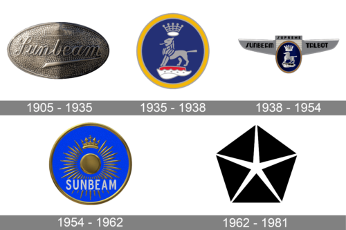
1905 – 1935
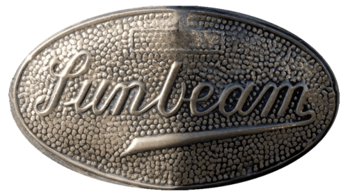
The original Sunbeam logo, designed in 1905, featured a horizontally-oriented metallic oval with the voluminous script lettering on it. The last letter of the inscription had its tail elongated and bent under the wordmark, finishing under the lowercase “N”. The logo stayed active for thirty years.
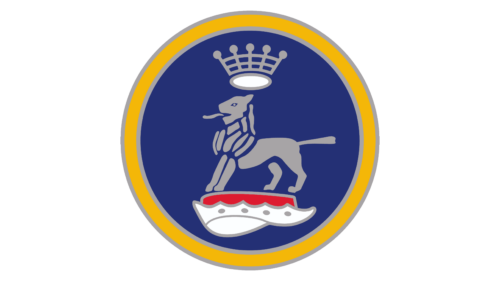
1935 – 1938
The redesign of 1935 has introduced a completely different version of the Sunbeam logo, with just graphical elements, and no lettering. It was a solid blue roundel with the gray heraldic image of a lion and a crown. The lion was standing on a red and white platform, which made up the brightest spot of the composition.
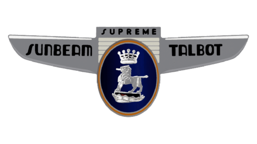
1938 – 1954
In three years the logo was redesigned again, with the blue roundel in a shiny metallic frame, set between two stylized geometric wings, also in silver. The “Sunbeam Talbot” lettering was set in the wings, executed in bold uppercase characters. The red and white element from the previous logo was redrawn in blue and white and became less eye-catching.
1954 – 1962
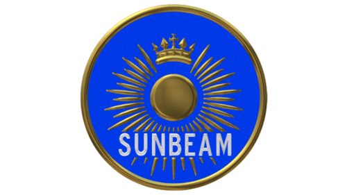
The redesign of 1954 has surprised everyone with the new logo. It was also a roundel, but with a bright blue background, and a golden image of a stylized sun with thin sharp rays coming out of it at some distance. The uppercase wordmark was written along the bottom part of the logo in white sans-serif capitals.
1962 – 1981
For the last twenty years of its existence, the Sunbeam brand has been using a minimalistic geometric logo of Chrysler, the Pentastar. It was a solid black pentagon, divided into five triangles with the white five-pointed star in the middle. The badge was not accompanied by any lettering and looked very solid and stylish.


