Sun Microsystems is an American brand of computers and software design and distribution company. It was founded in 1982 in California and acquired by Oracle in 2010. The brand is one of the worlds leaders in innovative technologies research.
Meaning and history
The Sun Microsystems logo is one of the most outstanding designs in the history. It is composed of a wordmark and an ambigram emblem.
What is Sun Microsystems?
Sun Microsystems is one of the fastest-growing American companies of the 1980s, which developed the SPARC processor architecture and the Java programming language. Sun Microsystems ceased to exist in 2010 after it was taken over by Oracle.
1982 – 1983
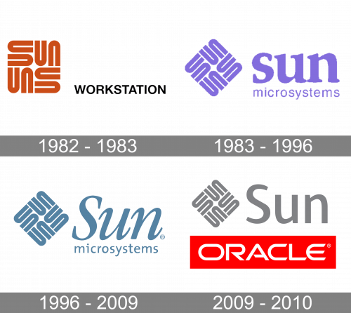
The very first logo of Sun Microsystems was introduced in 1982 and already had the iconic emblem as its main element. The Square, composed of eight U-shaped elements, which formed “SUN” wordmarks, was set in dark orange and placed on the left of the “Workstation” inscription in black capitals of a traditional sans-serif typeface.
1983 – 1996

The emblem was created in 1982 by Vaughan Pratt, professor of computer science. The icon is a rhombus formed of eight U-shaped figures, that make four mirror copies of the word ‘sun’ with the letter “S” broken into two parts. It is a celebration of symmetry and clever design.
1996 – 2009

The Sun Microsystems logo is unique and is considered to be one of the masterpieces of the brand visual identity design. It is simple and inspiring.
The Sun Microsystems logo was changed twice, and it was only color and wordmark replacement, not the emblem.

2009 – 2010
The last logo of the Sun Microsystems company was created in 2009 and depicted an acquisition of Sun by Oracle. It was a medium-gray composition with the iconic emblem followed by a straight sans-serif “Sun” lettering in a title case of a traditional and elegant medium-weight sans-serif font, and a bright red rectangular banner, placed under the gray part and having a bold white “Oracle” lettering set across it.
Color and font
The first version of the logo was executed in red and black, reflecting the brand’s passion and power. In 1983 the color scheme became purple, evoking a sense of creativity and sophistication. The wordmark was in all lowercase classic serif sans font, using the same color as the emblem.
The last version of the logo was created in 1996. The calm blue color palette is showing the brand as confident and reliable. The wordmark is italicized, which adds elegance and timelessness to the logo.


