Stradivarius is a Spanish fashion brand, focused on production of casual wear for a young audience. It was established in 1994 and was managed by one family until 1999, when it was bought by Inditex group. Today the brand is well-known worldwide.
Meaning and history

The brand got its name after a famous violin maker, Antonio Stradivari. This name is a symbol of excellence in the world of music. That is what Inditex wanted for their brand in the fashion industry.
What is Stradivarius?
Stradivarius is the name of a popular fashion brand, which was established in Spain in the middle of the 1990s, and is known for its affordable clothing and accessories for men and women omen: the fast-fashion label has grown into a really reputable brand with thousands of stores worldwide.
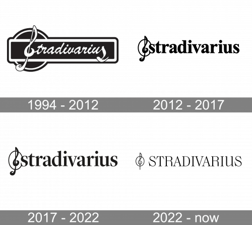
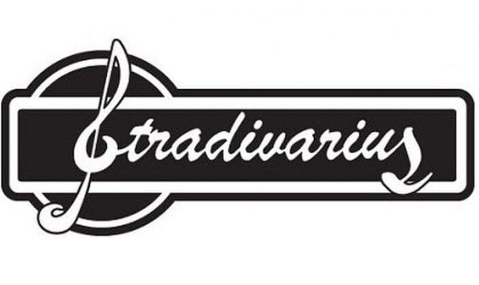
1994 – 2012

The original Stradivarius logo is composed of a wordmark enclosed in a rectangular frame with rounded angles, which is overlaid on a round-shaped figure.
The wordmark is executed in a cursive typeface with a treble clef replacing the first letter “S” and a beautifully curved last “s” of the nameplate.
2012 – 2017

The logo has grown cleaner without losing its identity. The rectangle with rounded corners is gone, while the cursive script has been replaced by a serif font. It still looks elegant, though, with its strokes of varying thicknesses.
Also, the treble clef doesn’t replace the “S” anymore but stands beside it. This makes the name better legible.
2017 – 2022

The Stradivarius logo has grown slightly more elegant without changing its overall style. The difference in the thickness of the strokes has grown slightly more prominent. Also, smaller details on the letters have been refined (note, for instance, the decorative serifs on the “d” and “i,” the top of the “a’s,” etc.
The monochrome palette of the logo makes it look sophisticated and timeless. It represents elegance and finesse.
This is a very memorable logo, which is delicate and refined, as well as modern and strong, showing the brand’s creativity and style.
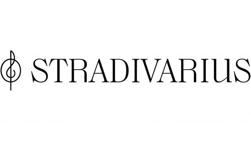
2022 – Today
The redesign of 2022 has refined the Stradivarius logo, switching its lowercase lettering to uppercase in a fancy and sophisticated font. The rethought wordmark is executed in thin elegant lines, supporting the delicate contours and mood of the emblem, which became more fraught and graphical than in the previous badge.
Font and color
The elegant uppercase lettering from the redesigned Stradivarius badge is set in a custom designer typeface; which is based on one of the following fonts: URW Heisei Mincho Regular, Chamberi Headline Light, or Voire Extra Light, but with most of the contours modified.
As for the color palette of the Stradivarius visual identity, it is set in thin black lines against a white background, but due to the thickness of the bars, it looks more gray, than black, evoking a sense of tenderness and sophistication, and allowing to place the badge on any background, without losing its uniqueness.


