Starbucks is one of the world’s top coffee makers ☕ and retailers. Founded in Seattle in 1971, today, Starbucks has a presence in more than 85 countries and more than 38,000 coffee shops worldwide. Such an impressive number of coffee shops was achieved quite quickly. After all, for ten years from 1990 to 2000, Starbucks opened a coffee shop every single day. Starbucks has made strong roasting of coffee, a caring attitude to customers and released of seasonal, limited edition drinks its brand features. And, of course, we should not forget about the cool logo of the brand, which for millions of people around the world today is associated with high-quality coffee.
Meaning and history
Not much has changed in the Starbucks logo since the creation of its original version in 1971. The badge of the coffee house, which today is definitely one of the most recognizable icons in the world, is a celebration of the company’s roots and traditions, though it looks fresh, modern, and very stylish.
Who is on the Starbucks logo?
Although the Starbucks logo has gone through many updates, it has always been consistent in its core character, a siren. The siren is a mythological creature known for her sweet songs, which lured sailors to shipwreck. According to Steve Murray, creative director of the Starbucks Global Creative Studio, the siren “is the biggest symbol of our brand.”
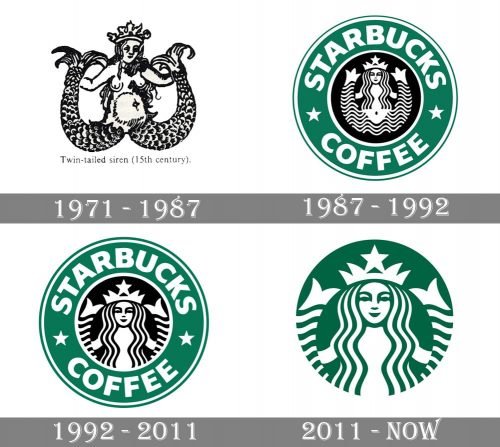
1971 – 1987
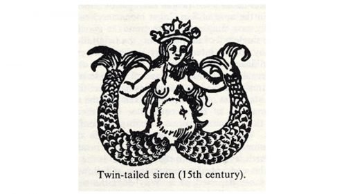
The initial logo, designed for Starbucks in 1971 and used by the brand for more than fifteen years, comprised a monochrome circular badge with an image of a siren with two tails in the middle, and a wordmark around the badge’s perimeter. The siren was drawn with a lot of small accents and looked very traditional and ornate, while the inscription, written in white clean capitals, was executed in a simple and modern sans-serif typeface, which balanced the detailed drawing and made the emblem look professional and strong. The upper part of the frame had a “Starbucks” inscription on it, while the bottom one featured “Coffee Tea Spices” in the same font. Both parts of the wordmark were separated by two solid white dots.
1987 – 1992
The contours of the badge were refined and modernized in 1987, and the color palette of the badge gained a new hero — green color, which was used for the wide rounded frame of the image of the monochrome siren. The wordmark around the frame was simplified to “Starbucks Coffee”, while its typeface became bolder and the letters — larger. Another thing that was changed — two white dots were replaced by two five-pointed stars, also in white.
1992 – 2011
The image of the sirens was enlarged in 1992, and now only the ends of her tails were visible. The typeface was also slightly modernized, making the letters wider and more massive. The logo from these years is probably the most recognizable among all the Starbucks emblems.
2011 – Today
In 2011 the Starbucks logo has undergone another redesign, and the emblem we all can see today is a simplified yet brightened version of the previous badges. Now it is composed of a white siren’s image placed on a solid green background color without any framing or lettering around it. The siren repeats the contours of the previous badge but looks a bit different due to the new color combination and absence of black details.
Why is there a mermaid on the Starbucks logo?
The Mermaid, or Siren, has been on the Starbucks logo since the very beginning. The original version of the emblem was designed by Terry Heckler, who got his inspiration from Moby-Duck and the nautical theme, as the name of the brand was taken from the famous novel by Henry Melville.
Emblem and conspiracy theories
If you turn the 1971 logo upside down, it resembles a goat’s head, a satanic symbol used by the Illuminati. The 2011 Starbucks logo features a star at the place where another Illuminati symbol, the all-seeing eye, is typically placed. Anti-Semitic groups claim the mermaid symbolizes Queen Esther, which shows the company participates in Zionist plots.
Symbol colors
The most recognizable of the colors used on the Starbucks symbol is the specific shade of green. In the Pantone system, it is listed as 3425C, while its hex code is #00704A. Black (hex: #000000) and white (hex: #FFFFFF) are used as supplementary colors.
Font
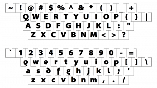
In its logo, Starbucks has used the Freight Sans font. It is quite in keeping with the Starbucks logo design trend, which is observable in all its logo versions.
What is the meaning behind the Starbucks logo?
The iconic green and white Starbucks badge feature an image of a mermaid, which not only makes the badge of the brand stand out but also “evokes coffee’s allure and its seafaring tradition”, according to the company. The Mermaid also explains the name of the company, which was taken from “Moby Dick”, supporting the sea theme.
Who is the Queen on the Starbucks logo?
The lady on the logo of the famous coffee house chain depicts a Mermaid in the crown. So we can call her the Queen of the Sea.
Is the Starbucks logo a mermaid?
Yes, the iconic Starbucks logo is a Mermaid. An elegant and stylish picture supports the origins of the company’s name, Starbucks, which was adopted from one of the characters of “Moby Dick”.
Is Medusa a Starbucks logo?
No, the Starbucks logo depicts a Mermaid, not a Medusa. The famous badge with the Medusa belongs to the Versace fashion house.


