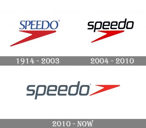
Speedo is one of the few lucky brands whose old emblem was so successful that it has survived over the years. The Speedo logo has always featured a boomerang design. The emblem symbolizes the clean cut of swimmers through the water and their fast return on the following lap. However, there have been some updates to make it meet the requirements of modern design trends.
Meaning and history
Speedo is a legendary brand, which is known all over the globe. Created in 1914, the company is still at the top of the global ranking in swimwear design and production. Speedo was founded by Alexander MacRae, in Sydney, asa label at MacRae Knitting Mills, a company, which produced underwear.
Originally called MacRae Hosiery Manufacturers, the company changed its name to MacRae Knitting Mills when MacRae added swimsuits to its product range. The modern name, Speedo, appeared in 1928 when the company launched the Racerback silk swimsuit.In 1956, the company launched nylon swimsuits, and this is when the new era of swimwear production began.
In the 1970s the company developed and introduced into production the lycra fabric, which even today is the most popular fabric of suits for swimming.
What is Speedo?
Speedo is the name of the world’s most famous swimwear manufacturer, which was established in 1914 in Australia. The company is known for its sport-oriented garments for the whole family and is known as the leading provider of swimming equipment for professional sportsmen.
1914
Alexander MacRae, the Speedo founder, emigrated from Scotland to Sydney, Australia, in 1910. In 1914, he established his company and called it MacRae and Company Hosiery. The name “Speedo” was introduced as a result of a naming contest in 1928. The brand was named “Speedo,” while the company, which now sold swimwear, was renamed Speedo Knitting Mills.
On the older versions of the logo, the boomerang is not as sharp as on the original one. This is especially noticeable on the ends on the left side, although the right end is also more rounded. The word “Speedo” in the older emblem was positioned inside the boomerang.
Later, the designers made the right ends of the boomerang longer and moved the word “Speedo” out of its borders. The company name was blue and featured a decorative type with a retro touch.
2004
The boomerang went gold, while the brand’s name went white. Both elements were placed inside a black rectangle. The type was now a simpler, more dynamic lowercase one.
2010
The Speedo logo grew simpler and better legible. The black rectangle disappeared, while the company name moved to the left side. The boomerang became smaller.
While originally, the name of the brand was gray, the designers later colored it red.
Font and Color
The dynamic lowercase lettering from the primary Speedo badge is set in a clean and distinctive modern sans-serif typeface with slanted letters, which evoke a sense of motion and energy. The closest fonts to the one, used in the Speedo insignia, are, probably, Vipnagorgialla Italic or Nebulosa Black Italic, but with some minor modifications.
As for the color palette of the Speedo visual identity, it is based on a medium-dark shade of gray and intense red hue, which together create an image of power and dynamic, evoking a sense of professionalism and confidence.


