 South Atlantic Conference Logo PNG
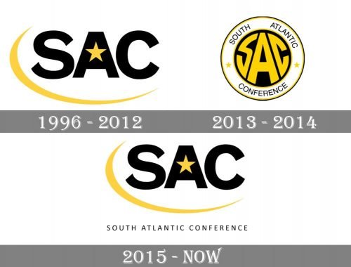
For most of the time since 1996, the South Atlantic Conference logo has looked the same, with the exception of a short period in 2013-2014.
Meaning and history
The South Atlantic Conference was inaugurated in 1975, born from the vision of its founding members who aimed to foster athletic excellence in the southeastern United States. This conference, initially comprised of a small group of like-minded institutions, has grown in stature and significance over the years. Its main achievements include the expansion of its sports offerings, significant improvements in the competitive levels of its teams, and a growing reputation for academic and athletic excellence among its member institutions. Currently, the South Atlantic Conference stands as a prominent NCAA Division II league, comprising multiple institutions that emphasize a balance between athletics and academics. Its current position is not just as a sports conference but as a beacon of comprehensive development for student-athletes.
What is South Atlantic Conference?
South Atlantic Conference is the American sports intercollegiate organization, which was established in 1975, and today consists of 13 college members from the southeastern states of the USA, which compete in 20 sports disciplines. The Conference is affiliated with the second division of the National Collegiate Athletic Association.
1996 – 2012

The old logo introduced in 1996 featured the abbreviation “SAC” in black. There was a gold star inside the “A” and a yellow curve going around the letters. In this form, without any notable modifications, the logo has been used ever since.
2013 – 2014

However, the logo used in 2013-2014 was different. While it also featured the lettering “SAC,” the letters had distorted proportions to fit the black circle in which they were placed. The roundel was encircled by the full name of the conference.
2015 – Today
The redesign of 2015 brought back the original South Atlantic Conference logo, created for the organization in 1996, but slightly refined and modified it. The main difference between the original and the new versions of the emblem is in the lightweight uppercase tagline with the complete name of the conference, set under the bold black “SAC” abbreviation, underlines by a smooth yellow orbit. The size of the letters got a bit smaller, which made the whole badge looks balanced and more professional.
Font and color
The logo of the South Atlantic Conference uses two different fonts: the simple and bold sans-serif for the “SAC” abbreviation, which is pretty close to such fonts as Venus SB Bold Extended and Standard SC Ext Bold, and the more modern and lightweight sans-serif typeface for the “South Atlantic Conference” in all capital. The typeface of the tagline is very similar to Tara SC Regular, but with more space between the letters, which makes it look cleaner and more stable.
As the color palette of the South Atlantic Conference, it is based on a combination of black and yellow, which looks bright and powerful, evoking a sense of professionalism, power, and motivation. The yellow details do not take much space on the badge, which makes the whole look very strict and balanced.


