

![]() South African Airways Logo PNG
South African Airways Logo PNG
The evolution of the logo of South African Airways shows how a brand’s heritage can be successfully used to build a new, modern visual identity. At first glance, the original emblem may look totally different from the current one. And yet, if you trace the history of the design, you will make sure each of them shares something in common with the original one.
Meaning and history
![]()
1934
![]()
The earliest South African Airways logo featured a winged antelope. The mythical creature seemed to have just taken off the ground and was in flight. It was white with smaller black patches.
1948
![]()
While the logo still featured the flying antelope, it was redrawn from scratch. The result was more streamlined and dynamic. The animal was primarily black and looked slimmer than its predecessor.
1971
![]()
The new design was dominated by the abbreviation “SAA.” Each of the letters was housed inside a dark blue box. The antelope was now just a small part of the logo. It was placed in the fourth box, which was red.
Below, there was the writing “South African Airways” in light blue. Although the type was a pretty clean one, the lettering was not perfectly legible at smaller sizes.
1997
![]()
This is when the modern era of the South African Airways logo started. The winged antelope from the previous logos merged with the triangular design of the flag of the Republic of South Africa to form a dynamic, streamlined design with pronounced symbolism.
You could hardly guess the antelope theme was still there unless you had seen the previous version. Now, the stylized sun was the most apparent symbolic and emotional theme. It was housed in the red field conjuring up the images of beautiful sunsets seen out of an aircraft.
![]()
2003
![]()
While the image remained mostly the same, the overall shape changed. Instead of the square, the emblem now had the shape of an aircraft stabilizer. The name of the company grew smaller. It now included a horizontal bar separating the word “Airways.”
2006
The pictorial part stayed almost unchanged, except for the 3D effect and the gray trim, which added a final touch. The typography grew cleaner. The result was achieved by removing the horizontal bar.
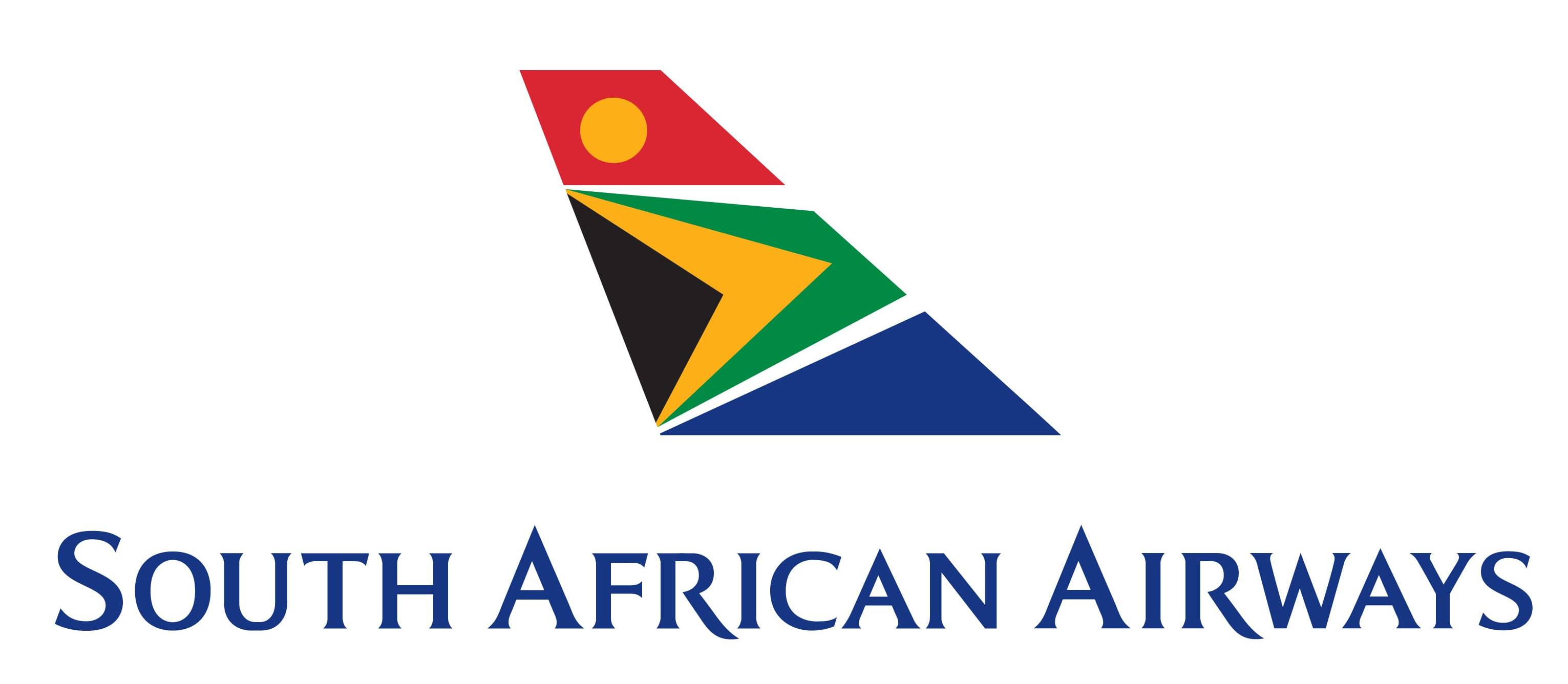
Current logo
The gray trim is not used in the primary emblem anymore. The main version includes the lettering “A Star Alliance Member” under a thin blue horizontal bar.

Font
The type featured in the South African Airways logo is clear and perfectly legible yet distinctive. The most memorable details are the high and sharp ends on the “A’s” and the elongated ends of the “R’s.” The glyphs are rather light and elegant, with delicate serifs.
Company overview
South African Airways was established in February 1934. Its hub is O. R. Tambo International Airport (Johannesburg), while its focus city is Cape Town (International Airport). The airline is the flag carrier of South Africa and belongs to the state.


