SoFi is a finance company founded in San Francisco, USA, by a group of Stanford business school students. Headquartered in San Francisco, SoFi serves millions, revolutionizing personal finance with innovation and a commitment to empowerment. Sofi aims to provide a one-stop shop for personal finance needs, leveraging technology to offer streamlined, user-friendly services. Its creation was driven by the founders’ desire to provide more accessible, lower-cost financial services.
Meaning and history
Social Finance embarked on its journey in 2011, born within the hallowed halls of Stanford University by an innovative group of students. They were driven by a vision to redefine personal finance, making it more accessible and less burdensome for graduates grappling with student loans. From these modest beginnings, SoFi has grown monumentally, diversifying into a powerhouse that offers a comprehensive suite of financial products. These range from refinancing student loans to providing personal and mortgage loans, wealth management, and investment services. SoFi’s ethos of leveraging technology to simplify and demystify finance has catapulted it into the forefront of the fintech revolution.
With its headquarters in San Francisco, the company has broadened its impact, serving millions, by transforming the very essence of personal finance through innovation, customer focus, and a relentless pursuit of financial empowerment for all.
What is SoFi?
SoFi, a fintech leader, has revolutionized finance with services that empower individuals. From its roots in student loan refinancing, it has blossomed into a multifaceted platform, offering everything from investment opportunities to personal lending, all aimed at forging a path to financial independence for its users.
2011 – 2016
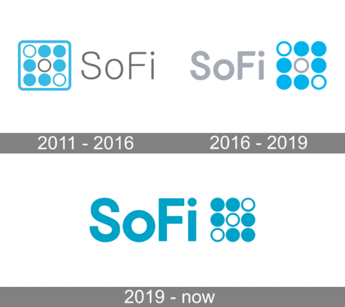
The logo presents a modernistic motif, featuring a matrix of circles in various sizes, creating a pattern within a square. The circles are colored in a calming shade of blue, symbolizing unity and stability. Adjacent to this geometric design is the brand name “SoFi” in a sleek, sans-serif typeface, exuding simplicity and sophistication. The dot of the ‘i’ is strategically detached, adding an element of visual interest and suggesting a forward-thinking identity.
2016 – 2019
The SoFi logo displays a striking dichotomy of color, with a soft grey for its name and a vivid blue for the symbol. The lettering is clean and modern, with a friendly lowercase ‘o’ and ‘i’, while the ‘S’ and ‘F’ stand tall in uppercase. The accompanying symbol is a playful array of circles, varying in size and creating a dynamic visual rhythm. The solitary grey circle subtly breaks the pattern, hinting at innovation within uniformity. This design embodies a balance of professionalism and approachability.
2019 – Today
The SoFi logo has undergone a vibrant transformation with a refreshing shade of cyan, infusing it with energy and approachability. The ‘SoFi’ text now boasts a uniform color, fostering a sense of cohesion. This logo iteration speaks to a modern, interconnected financial experience, highlighting SoFi’s dynamic and inclusive approach.


