Singapore Airlines is the name of one of the world’s largest air carriers, which was established in 1972 and is based in Singapore. Today the airlines operate from Singapore Changi Airport and have flights to more than 60 destinations worldwide.
Meaning and history
Singapore Airlines is the national carrier of the city-state of Singapore with its home port being Changi Airport. It is not only the largest airline in its country but one of the world’s largest airlines. From its hub, Singapore Airlines flies to more than 60 destinations in 35 countries on six continents.
The air carrier is a member of the Star Alliance, the most reputable international organization in its segment. But it is not the only title of the company, as Singapore Airlines is one of only seven airlines with a 5-star rating, according to the authoritative auditing agency Skytrax. Also, since 2007, Singapore Airlines confidently holds itself in the top 3 of the “Best airlines in the world” ranking.
The airline has codeshare agreements with about 10 other companies. Singapore Airlines operates wide-body aircraft in four classes of service: Suite, First Class, Business Class, and Economy Class. The airline has three types of lounges for premium passengers. The SilverKris Lounge is offered at 15 airports. In addition, The Private Room and KrisFlyer Gold Lounge are located at Changi Airport.
What is Singapore Airlines?
Singapore Airlines is one of the most reputable and large air carriers in the world, which operates to destinations across the globe from the Singapore Changi Airport. The airline keeps its place in the “Best 3 Airlines in the World” ranking since 2007.
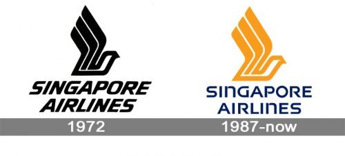
In terms of visual identity, the air carrier has been pretty consistent and conservative. While the history of Singapore Airlines is rather long – it was founded in 1972 – the logo has not changed much, undergoing just one redesign, which is better to call a refinement.
1972 – 1987
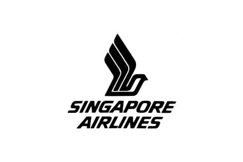
The original Singapore Airlines logo showcased a stylized bird in black bold lines, which looked very geometric. To be precise, there was only the upper half of the bird. You could see its wings lifted. Under the graphical emblem the lettering “Singapore Airlines” was set in an italicized yet very stable and strong sans-serif typeface. The angle of the letters’ inclination was exactly the same as the thin white diagonal lines on the bottom part of the bird’s wings, and this created a great balance and a sense of motion in this simple monochrome badge.
1987 – Today
With the redesign of 1987, the overall structure of the logo has remained unchanged, but the color palette and the typeface of the wordmark were refreshed. It is especially obvious in the case of the font, which is unique and distinctive, yet still legible. The new style of lettering uses mixed case, with all letters but both “N”s capitalized. The palette is now composed of gold or calm yellow (for the bird) and dark blue (for the wordmark).
Font and color
The modern and unique lettering from the Singapore Airlines visual identity is set in a custom typeface with visible stencils. The letters have both smooth and square elements, which elevates the whole look and shows the approach of the company to everything it does. This custom font has some resemblance with FM Bolyar Sans Pro 700, but with most of the contours modified.
As for the palette of the Singapore Airlines badge, it uses bright colors, but in their calm and deep shades, softening the bold lines of the emblem and adding distinction to the lettering. The combination of yellow and blue here stands for the sun and the sky, but yellow is also a color of energy and movement, while blue is the commonly known symbol of protection, reliability, and trustworthiness.


