Looking at the logo of the now-defunct neobank Simple, you cannot say that it is as minimalist as the name of the bank suggests. That said, it is still a pretty austere and futuristic design, which isn’t cluttered with multiple unnecessary details.
Meaning and history
The company was established in 2009 under the name of BankSimple.
What is Simple?
Simple was an online bank (neobank) headquartered in Portland, Oregon, US. Through this company, US citizens could acquire FDIC-insured checking accounts.
2009 – 2011 (prelaunch)
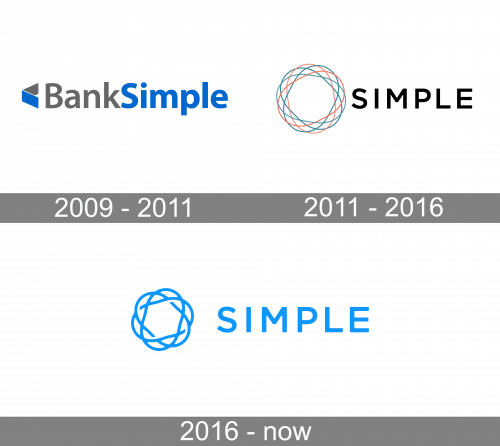
The earliest Simple logo was dominated by the name of the company. Here, the first part (“bank”) was dark gray, whereas the lettering “Simple” was blue. Also, the second part of the wordmark was bolder. In a way, it was the centerpiece of the design, while the word “bank” was there mostly as an explanation of what services the company provides.
There was also an emblem, which was fairly small and placed to the left. The emblem looked abstract and dynamic. It could be interpreted as either a triangle or an angular version of a swoosh. The two colors used for the wordmark could be seen in the emblem, too.
2011 – 2016
The second logo was a radical departure from the original visual brand identity. Here, the word “bank” was already dropped leaving a shorter, and therefore easier to grasp, name. It was now set in an all-caps sans with plenty of breathing space. The letters weren’t bold, and the overall effect was lighter.
There was more breathing space in the emblem, too. It now had a more futuristic and rounded style. You could see three overlapping ellipsoids (in orange and two shades of teal) creating a dynamic and complex, yet neat pattern.
2016 – present
While originally the company operated through a partnership with The Bancorp Bank, it was transitioned over to BBVA USA in 2016.
In the updated Simple logo, all the colors have been replaced by a vivid and light shade of blue, which is placed over the white background. As a result, the word “simple” became more applicable to the design.
Also, the ellipsoids in the emblem have slightly tweaked and now look as if they are intertwined, thus resulting in a more dynamic and “connected” feel. Other than that, the design has remained the same.
Colors and font
The blue tint chosen for the logo is pretty light, which could have damaged the legibility and even visibility. That’s why designers decided to opt for an extremely bright, almost neon, hue. In addition to enhancing the visibility, this color also adds a futuristic, innovative touch – it has something to do with the cold light of the stars and the icy breath of outer space. Taking into consideration that Simple did break the new ground in banking, this color fits perfectly.
As for the font showcased in the Simple logo, it is totally in line with the name of the company: an austere sans with clean and classic glyphs.
The company was started in 2009 in Brooklyn and moved to Portland in two years.


