Sensodyne is the name of an oral care brand, which was established at the beginning of the 1960s, and is owned by the famous GlaxoSmithKline company. The brand is known for high-quality kinds of toothpaste and mouthwash products, along with toothbrushes and accessories for tooth care.
Meaning and history
Sensodyne is a GlaxoSmithKline brand of toothpaste and mouthwash intended for people with sensitive teeth. The brand offers different products, which aim to help people with sensitive dents and teeth without any damage.
Sensodyne’s first toothpaste for sensitive teeth went on sale in the United States and Great Britain back in 1961. Today, the brand is the number one manufacturer recommended by dentists and the best-selling brand for sensitive teeth in many countries around the world, trusted by millions of people.
The Sensodyne line of dental and oral care products has a proven effect in reducing pain caused by tooth sensitivity and provides long-lasting protection against pain. Although, compared to the early years of the brand, its portfolio now is much wider, and includes not only the sensitive-line, but also some whitening products.
What is Sensodyne?
Sensodyne is the world’s number one manufacturer of oral care products for sensitive teeth and dents. The brand, which today is owned by GlaxoSmithKline, was established at the beginning of 1961 and started its career in the USA and UK, and today the kinds of toothpaste of Sensodyne can be found in pharmacies and supermarkets all over the globe.
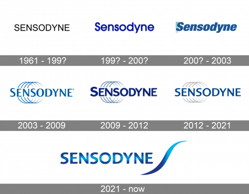
As for the visual identity, the Sensodyne logo has undergone several major redesigns, since the introduction of the original version, in 1961. Although, the main distinctive feature of the brand’s logo, its blue color palette, has been present on almost all emblems of Sensodyne.
1961 – 199?
The original version of the logo, designed in 1961, featured the word “Sensodyne” Written in the uppercase of a very simple and straight sans-serif typeface. The wordmark was set in black and placed on a white background. Professional, strict, trustworthy.
199? – 200?
The first redesign of the Sensodyne logo brought blue color to the badge, and since then the color could change its shades but never left. The logotype of the 1990s was executed in the title case of a modern sans-serif font, with bold lines and full contours of the letters. The shade of blue, used in this version was intense and deep, close to electric-blue.
200? – 2003
At the beginning of the 2000s, the badge of the toothpaste manufacturer was redesigned again. The shade of blue was lightened up and softened, and the typeface was switched to an italicized sans-serif with extra-bold lines of the letters. The logotype was still set on a white background, but now there was a light-green element in the upper right corner of the banner. Also, the lettering was slightly shadowed, adding even more freshness to the badge.
2003 – 2009
The green color was removed from the Sensodyne badge in 2003, and the logo was redrawn in blue again. It was a completely new concept, with the uppercase logotype in a fancy and smooth sans-serif typeface, with elegant lines and rounded angles. Behind it, there was an emblem consisting of four blue rings, drawn in thin lines with open contours, in the same shade of blue.
2009 – 2012
The redesign of 2009 keys the graphical part of the Sensodyne logo untouched, but changed the color and style of the logotype. The inscription was now set in a darker shade of blue, with the sand-serif typeface getting bolder and more stable. It was a very contrasting bright and strong badge, which stayed with the toothpaste manufacturer for almost three years.
2012 – 2021
The ring grew grey, while the shade of blue grew lighter, compared to the previous version. As for the style of the lettering, it was now something in between the badges designed in 2003 and 2009. The initial “S” was no longer larger than the other letters. The width of the strokes was more even, so the overall look of the badge was harmonized and balanced now.
2021 – Today
The four-ring emblem was removed from the Sensodyne logo after the redesign of 2021. The new concept comprises a gradient blue uppercase logotype in bold sans-serif, accompanied by a smooth wavy line, placed on the right from the inscription. The new color palette is composed of dark, close to purple, the shade of blue on the top and bottom of the letters, with the brighter and lighter shade in the middle.


