SATA Air Açores is an airline operating in the Azores, Portugal. It offers scheduled passenger and cargo services within the archipelago. The company is owned by Grupo SATA, a regional airline group. With its headquarters located in Ponta Delgada, SATA Air Açores plays a vital role in connecting the nine islands of the Azores, providing essential transportation services for both residents and tourists in this picturesque region of the Atlantic Ocean.
Meaning and history
SATA Air Açores is an airline based in the Azores, Portugal. It was founded by the Portuguese government in 1941. The airline operates domestic flights within the Azores archipelago and connects the islands with mainland Portugal.
Throughout its history, SATA Air Açores has achieved several milestones. It expanded its route network, offering reliable air transportation for residents and visitors alike. The airline played a vital role in promoting tourism and facilitating travel within the Azores region. It has maintained a strong safety record and has been recognized for its commitment to passenger satisfaction.
Currently, SATA Air Açores continues to serve as a major air carrier in the Azores, connecting the islands with regular flights. It operates a fleet of modern aircraft and strives to provide efficient and comfortable air travel services. The company remains an essential link for both local residents and tourists, contributing to the development and connectivity of the Azores archipelago.
What is SATA Air Açores?
SATA Air Açores is a regional airline based in the Azores, an archipelago of Portugal. The airline operates domestic flights within the Azores, connecting the various islands, as well as providing inter-island air transportation services. It plays a vital role in facilitating travel and transportation for both residents and tourists visiting the Azores.
1941 – 1987
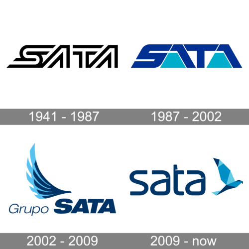
The original SATA logo was designed at the beginning of the 1940s and stayed in use by the air carrier for almost half a century. It was a stylish minimalistic badge in monochrome, with the massive outlined lettering set in the uppercase of a designer typeface.
1987 – 2002
The redesign of 1987 has switched the color palette of the SATA logo to electric blue and sky blue. The contours of the previous version were kept, but the lettering was redrawn in solid geometric elements, which made it look stronger and more intense.
2002 – 2009
In 2002 the new logo of SATA Group was introduced. The bold blue lettering with a lightweight complementing wordmark on the left was decorated by a chic stylized bird, set in two shades of blue, with the dark element overlapping a light one. This badge stayed in use for seven years.
2009 – now
The redesign of 2009 has created a modern geometric composition, with the lettering set in the lowercase of a modern sans-serif typeface, and the emblem redrawn with a triangular pattern in several shades of blue. The geometric bird looks very cool and brings some volume to the badge.


