SAT (Scholastic Assessment Test) is the name of the test, which was developed by the College Board in 1926, and today is used all over the world for college admissions after school. SAT is composed of two sections, and each of them gives a maximum of 800 points, plus an essay.
Meaning and history
The Scholastic Assessment Test (SAT) was founded by the College Board, a non-profit organization in the United States, in 1926. Originally developed to standardize college admissions, the SAT has evolved significantly over the years. In its early stages, it primarily served as a test for students in the northeastern U.S. seeking admission to elite colleges. However, its scope and influence expanded rapidly, with major revisions to the test format and content over the decades.
Among its key achievements, the SAT became a critical tool for assessing student readiness for college-level work, with millions of students taking the test annually. The test underwent significant changes in the mid-20th century, including the introduction of standardized scoring, and later, adaptations to reflect changing educational standards. The SAT also played a pivotal role in promoting educational access and diversity, becoming a standard component in college applications across the U.S.
Today, the SAT holds a prominent position in the landscape of American education. Despite facing competition from other tests like the ACT, and the evolving debate over standardized testing, the SAT remains a major factor in college admissions. The College Board continues to revise and update the SAT to align with current educational standards, ensuring its relevance and utility in assessing student capabilities and potential.
What is the SAT?
The SAT is a standardized test widely used for college admissions in the United States. It measures proficiency in critical reading, writing, and mathematics, serving as a common benchmark for comparing applicants. Administered by the College Board, the SAT plays a key role in the college application process.
1980 – 1990
 The previous version of the SAT visual identity was composed of a sleek sans-serif wordmark in extra-thick lines, with the letter “A” modified and its horizontal bar arched. Above the inscription, there were four bold blue dots.
1990 – Today
SAT is a serious testing system, which aims to give the school graduates a way to further education, by leveling their knowledge and giving them a better understanding of their strong and weak points.
The test used different variations of its visual identity, but they were all discreet and laconic, to emphasize professionalism and seriousness. The blue and black color palette, chosen by SAT in the 1980s, is still used today for the secondary version of the logo, while the primary use a softened, blue, white, and gray combination, which is not that bright but evokes a sense of reliability and expertise.
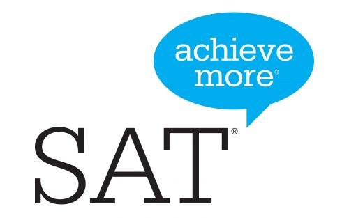
The logo was redesigned in the 1990s, and today it boasts a light gray serif inscrip-tion with the dialogue cloud on its right, where the “Achieve more” slogan is written in the lowercase, using white color.
The secondary version of the test’s logo features a strict geometric badge, where the horizontally stretched rectangle is divided into two parts — the large black one on the left, and the smaller one in bright blue on the right.
The “CollegeBoard” logotype with its corporate emblem is set in white on a black background, while the blue part constrains the “SAT” inscription in a bold white serif font.
Font and color
The current SAT logotype is executed in an old-style rounded serif typeface, which is very similar to such fonts as Glypha Pro 45 Light, URE Egyptienne, and Serifs SB Light. It looks calm and modest, yet evokes a sense of a fundamental and traditional approach, which is also progressing and changing with the needs of the modern world.
The slogan, written inside the blue cloud, is executed in the same typeface, but due to the lowercase letters and the white color cut looks lighter and fresher, making the whole logo look friendly and welcoming.
The blue color is known to be the best choice for technological and educational companies, as it points to quality and professionalism, and when accompanied by gray and white, it represents transparency and authority, along with loyalty and re-sponsibility.


