The Santander Group names internationality, leadership, and strength among its core values. Therefore, the Santander logo is supposed to represent these values, as well as provide a unique international positioning.
Meaning and history
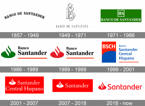
Santander is a bank with a very rich history, and its visual identity evolution is a reflection of all the milestones and significant moments. Established as Banco de Santander in 1857, it merged with Banco Central Hispano in 1999, forming the Banco Santander Central Hispano, which has birth to the modern Santander in 2007.
1857 – 1949
The very first logo for the famous Spanish bank was introduced in 1857 and featured an elegant arched inscription with ornaments and vignettes. The logotype in monochrome looked elegant yet strong and stayed with the bank for almost a century.
1949 – 1971
The redesign of 1949 changed the composition of the bank’s logo and now it was a sophisticated intertwined “BS” monogram placed above the delicate lightweight wordmark in a narrowed serif typeface. The white letters of the monogram featured a thick black outline, which made the smooth and curved lines look stylish and chic.
1971 – 1986
In 1971 the logo was simplified but gained a new green and white color palette. The symbol of growth and success, green became the most eye-catching element of the Banco de Santander visual identity. The elegant monogram was replaced by two bold serif letters enclosed in a thin square frame; and the wordmark changed its typeface to a thicker and wider one.
1986 – 1989
With the name change of the bank, the logo was redesigned again in 1986. The “Banco Santander” wordmark was part of two levels and executed in a light-gray bold serif typeface on the right from the new emblem. The smooth green emblem was composed of a horizontally stretched solid oval with two white and two green curved lines coming out of it diagonally.
1989 – 1999
The color palette of the logo was changed to black, red, and white in 1989. The red and white emblem starts looking more dynamic and powerful, while the black logotype added a sense of stability and professionalism to the bank’s main qualities.
1999 – 2001
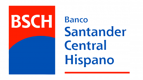
After the merger with Banco Central Hispano the logo was redesigned again in 1999. The completely new composition included a vertically placed rectangular emblem, split into two parts by an arched line, and a wordmark set in four levels and underlined by a red line.
The upper part of the emblem featured a solid red background with a white “BSCH” lettering on it, while the bottom part was plain blue.
As for the wordmark, it was written in blue using a traditional bold typeface with elegantly extended ends of the letters.
2001 – 2007
The bank decided to come back to its logo from 1986 in 2001. Removing the word “Banco”, and placing the thin white “Santander Central Hispano” on a red background with a white and red oval emblem on the left.
2007 – 2018
After the name of the bank was switched to Santander in 2007, the lettering on the logo was shortened and gained thicker lines and more distinct serifs. The inverted version with the red wordmark and emblem on a white background was also in use by the bank during this period.
2018 – Today
The redesign of 2018 changed the typeface of the Santander logotype to a more modern one. The sans-serif lettering today features rounded shapes of the letters with their horizontal bars arched and vertical ones — straight. As for the emblem, it remained almost untouched, just slightly enlarged and cleaned.
Flame symbol
The emblem itself is based on a stylized flame. It goes up out of a white oval. This symbol is used for two reasons. First, it resembles the letter “S”, which is the first letter in the name of the company. Also, it is supposed to convey some of the concepts that are important for the Santander. The official brand guide states that the flame is used as the symbol of triumph, leadership, and dynamism.
Wordmark emblem
The wordmark is placed next to the symbol (on the right), the first letter being slightly shorter than the flame. “S” is the only capital letter, all the others are lowercase. The combination of the wordmark and the flame is put inside a red rectangular shape.
Font
The type featured on the Santander logo resembles Berstrom DT Bold. It can be described as a French Oldstyle serif font. Its author is Malcolm Wooden.
Color
Red has been chosen as the dominant color because it symbolizes such values as strength, energy, and determination. The secondary color is white.


