 Royal Flying Doctor Service of Australia Logo PNG
The Royal Flying Doctor Service of Australia is an aeromedical organization that provides emergency medical and primary healthcare services to remote and rural areas of Australia. It is owned and operated by a non-profit organization. The company operates in various locations across Australia, including remote outback regions, indigenous communities, and small towns, ensuring that medical assistance reaches those in need regardless of their geographical location.
Meaning and history
The Royal Flying Doctor Service of Australia (RFDS) was founded by Reverend John Flynn in 1928. This iconic organization has played a pivotal role in delivering vital medical services to remote areas of Australia. The RFDS operates a fleet of aircraft, equipped with medical facilities, to provide emergency care, medical evacuations, and primary healthcare services to people in isolated regions. Over the years, the RFDS has saved countless lives, bridging the gap in healthcare access for those living in the vast Australian outback. Today, the RFDS continues to expand its services, employing advanced technology and telehealth solutions to reach even more communities. Its commitment to improving healthcare outcomes for rural and remote Australians remains unwavering, making it a true national treasure.
What is Royal Flying Doctor Service of Australia?
The Royal Flying Doctor Service of Australia (RFDS) is a renowned aeromedical organization that provides vital healthcare services to remote and rural areas across the vast Australian outback. It operates a fleet of specially equipped aircraft staffed by skilled medical professionals, delivering emergency medical assistance, primary healthcare, and patient transport to communities where access to medical facilities is limited. The RFDS is an essential lifeline, ensuring that people in remote regions receive timely and critical medical support when they need it the most.
1934 – 1942
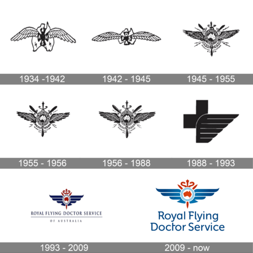
The first logo of the Australian service was created at the beginning of the 1930s and looked very traditional for its times. It was a black-and-white drawing with the bold black cross enclosed between the two hand-drawn wings. The cross featured an abbreviation in white, while the winged composition has two black lighting bold symbols at its bottom part.
1942 – 1945
The redesign of 1942 has refined the contours of the logo, making the cross a bit more compact, and the wings — narrowed, yet longer. The lighting bolt icons were removed, while the white letters in the cross got bolder and more readable.
1945 – 1955
The logo, used during the 1940s, was very ornate and had many heraldic elements, which emphasized its “Royal” part. It was a black roundel with a white contour of the country on it, enclosed between the two large black wings, with sharp crossed elements on the background and an additional rounded frame.
1955 – 1956
In 1955 the logo was refined and cleaned up, with all elements remaining in their places, but getting more laconic and modern. This version stayed in use for just a few months.
1956 – 1988
Another refinement of the heraldic badge happen in 1956, with the lettering around the central medallion getting more readable and the contours of all elements getting stronger and brighter.
1988 – 1993
The redesign of 1988 introduced an interesting minimalistic logo, with the bold black cross overlapped by a stylized wing at the bottom part. The wing was colored in solid black, and decorated by thin horizontal white lines, adding air and motion to the composition.
1993 – 2009
In 1993 the logo got colored blue and red, with the composition dramatically changed. It was a modernized version of the older badge, with the red contour of Australia set on a white background and enclosed into a blue circular frame between two blue stylized wings, and underlined by a two-leveled inscription in blue. The lettering was set in an elegant serif typeface.
2009 – now
The redesign of 2009 has cleaned up the contours of the elements, making up the blue and red shades lighter and adding some smooth gradients to them. The lettering got enlarged and rewritten in a modern sans-serif typeface with small elements on some of the capital letters.


