Royal Air Maroc is the name of the largest and oldest air carrier of Morocco, which was established by the government of the country in 1957. The airline is based in the Mohammed V International Airport and has its flights to more than a hundred destinations all over the globe.
Meaning and history
The main Moroccan air carrier today still uses the logo, created in 1957, right after the establishment of the company. Of course, the badge was refined several times throughout the years, and its lines have been strengthened and given a modern touch, but the concept and color palette remained introduced, being a celebration of the Royal Air Maroc legacy and history.
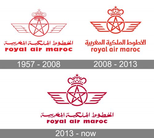
1957 – 2008
The original logo of Royal Air Maroc, introduced in 1957, was composed of several red elements, placed on a white background. The main part of the badge was taken by the delicate yet chic emblem, where the five-pointed star, enclosed into a thin circle, had two wings coming out of it to the sides and a crown on top of it. The ornate crown and smooth lines it was drawn with was balanced by the Arabic lettering, placed under the emblem and above the Karin wordmark with the name of the air carrier.
2008 – 2013
The redesign of 2008 made the lines of the Royal Air Maroc visual identity bolder and more distinctive. All the elements were refined and strengthened, and the Latin lettering, set under the graphical part of the logo changed its typeface to a neater and more modern one, and now was written in a slightly narrowed and bold sans-serif with smooth lines and traditional cuts of the letters.
2013 – Today
The redesign of 2013 was made to celebrate the membership of Royal Air Maroc in the Oneworld sky alliance, which was a truly important date, as the company was the first African carrier to join this international reputable alliance.
Though the composition of the logo remained untouched, its color palette was made a bit darker, which made the image look more expensive and professional. The wordmark was also rewritten, and now it is set in the lowercase of an extra-bold traditional sans-serif typeface with classy contours of the massive letters, adding a timeless feeling to the whole visual identity of the airline.


