Rowenta is a German brand of domestic appliances, established in 1884 by Robert Weintraud. When it was founded, the company specializes in manufacturing of office supplies, lamps and clocks. Now the brand is one of the world’s leaders in production of vacuum cleaners and a range of small household appliances.
Meaning and history
The Rowenta story begins in 1909 when German entrepreneur Robert Weintraub founded Weintraub& Co. and registered the Rowenta trademark. The first household products that Rowenta later specialized in were produced in 1920.
Today Rowenta offers its consumers about 90 products. The most relevant items are the products that most interest women, and girls: hair dryers, devices specifically for hair styling, manicure sets, unique and fashionable mirrors, as well as whirlpool baths. But also under this brand today produce irons, heaters, air cleaners, vacuum cleaners, and fans. In addition, the firm is expanding its product range day by day.
What is Rowenta?
Rowenta is a European brand of small electric appliances manufacturing company, which roots can be traced back to the end of the 19th century. Today the company has its products, such as hairdryers, irons, and vacuum cleaners, distributed all over the globe.
1920s – 1970s
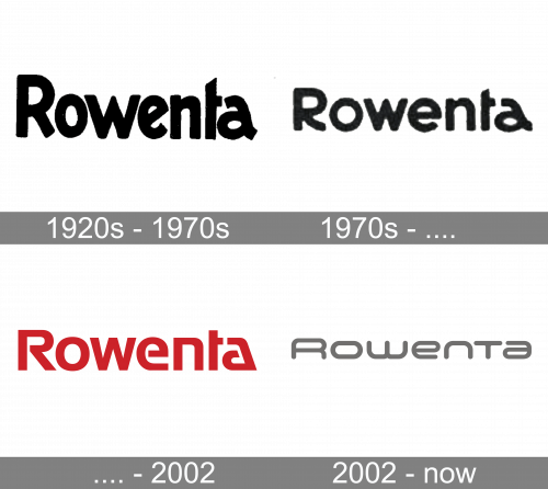
The very first logo for Rowena was created in the 1920s and stayed untouched for about four decades. It was a bold title case logotype in solid black, executed in a modern sans-serif typeface with the letters slightly condensed and placed very close to each other. The bar of the lowercase “E” was set diagonally, adding playfulness to the heavy inscription.
1970s
The redesign of the 1970s has kept the minimalistic black-and-white color palette of the Rowena visual identity but changed the typeface of the title case logotype. The new font featured more rounded shapes of the letters and softer lines. The inscription got more air both inside and between the characters. The badge stayed in use for several years.
Before 2002
The Rowenta visual identity design, introduced in 1970, featured a minimalist and laconic logotype which looked very powerful and memorable due to the use of thick lines, massive shapes, and intense red color. It was a logotype with all the letters but first in the lowercase, executed in a bold and modern sans-serif typeface with the contours of “R”, “E” and “A” open. The letters of the inscription looked solid and futuristic, and the dark red color, used for the logotype, made it elegant and exquisite, evoking a sense of power and professionalism.
2005 – Today
The brand’s name Rowenta is composed of its founder’s name’s letters, RObert WEiNTrAud.
The Rowenta logo is a modern wordmark framed in a rectangular with rounded angles.
The strict gray color of the icon adds elegance and style to it, while the futuristic rounded lettering reflects the brand’s innovations and technologies. The Rowenta gray evoke the sense of professionalism and expertise.
The Rowenta motto is “Enjoy Technologies” and the company does its best to provide its consumers with the latest products of the highest quality and excellent design.
Font and color
The futuristic and soft sans-serif typeface of the Rowenta visual identity looks unique and evokes a sense of progressiveness and style. The inscription is written in the title case, but the first letter does not differ in size from all the following much. The font, used for the Rowenta badge is something in between Space Colony Semi old and Consilio Bold typefaces.
As for the color palette of the Rowenta visual identity, it is based on a light and a strict combination of gray and white, which looks airy, yet powerful and professional, showing the company as one focused on quality and reliability of its products.


