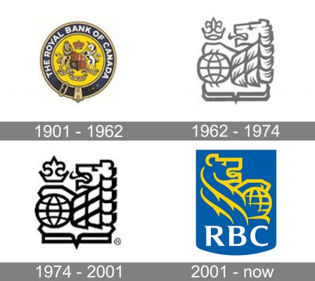
As a company with a more than 155-year history, the Royal Bank of Canada (RBC) has gone through several logo redesigns. However, there’s been a recurrent motif: every version of the RBC logo since 1901 has featured a lion.
What is the symbol of the Royal Bank of Canada?
The symbol of the Royal Bank of Canada is a stylized lion, keeping its paw on a globe. The animal has been present on the bank’s badge since the beginning of the 20th century, while the globe appeared only in 1962. As for the meaning of the elements, the lion stands for strength and authority, while the globe represents the international presence of RBC.
Meaning and history

he earliest logo (1869) reflected the original company name, the Merchants Bank of Halifax, and was given in black and white.
What is RBC?
RBC an abbreviation, standing for the Royal Bank of Canada, is a financial institution, which was established in 1864 in Nova Scotia, and by today has grown into the largest bank in its country. RBC operates worldwide, serving more than 15 million clients from different countries across the globe.
1901 – 1962

The 1901 version added new colors, the new name, and a more complex crest.
It looked like a medieval coat of arms with a lion and a stallion, a shield, a crown, and multiple elaborate details. This approach emphasized the company’s heritage.
1962 – 1974

In 1962, the emblem was simplified. Now, it featured a lion holding its paw on a globe, above which a crown was placed.
1974 – 2001

As the result of the 1974 update, the emblem grew cleaner.
2001 – Today
The 2001 redesign brought about dark blue and yellow, as well as the text “RBC,” while the lion’s muzzle was turned to the right.
Font and color
The bold uppercase abbreviation from the primary badge of the Royal Bank of Canada is set in a sharp and elegant custom typeface with thick yet sophisticated lines and pointed elements, adding uniqueness. The closest fonts to the one, used in the RBC insignia, are, probably, Aviano Serif Black or Sava SemiBold, but with some significant modifications of the characters’ contours.
As for the color palette of the RBC visual identity, it is composed of a bright combination of blue and yellow, with an addition of white lettering, which adds a professional and confident touch to an energetic and progressive mix.


