Agribank is a Vietnamese state-owned bank, which was established in 1988 and by today has grown into the largest and the most reputable financial organization in its country. The bank has over 40 thousand employees and a wide net of branches and ATMs across Vietnam.
Meaning and history
The visual identity of one of the most famous Vietnamese banks was first introduced at the beginning of the 2000s and kept its original style and colors until today. The main thing, that was changed throughout the years was lettering, but it didn’t affect the brightness and recognizability of the insignia, just made it bolder and more modern.
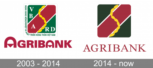
2003 – 2014

The original Agribank logo had a square emblem. The base color is dark green, but they drove a thick red line through its diagonal, outlined it in black and added a braid of golden leaves entwined it. There were also white serif letters scattered along the left and bottom sides: ‘VBARD’ (Vietnam Bank for Agriculture and Rural Development). The same name in Vietnamese was written in green letters along the same two sides.
There was also a wordmark. It used red letters that were typical for the most part, except for the two ‘A’ letters. These were horseshoe shapes with triangles in the middle.
2014 – Today

They severely simplified it in 2014. The emblem got rid of all written elements and changed the color scheme to a less saturated, darker combination. The wordmark also became a stricter, much thinner version of itself. It now used serif letters with a likewise darker shade of red.
Font and color
The solid and bold traditional typeface of the Agribank inscription looks unique and young due to the letters “A”. Though the main part of the lettering is executed in a sans-serif typeface which is very similar to Zurich Std Ultra Black Extended and Iwata Gothic Old Pro Heavy fonts.
The green and pink color palette of the Agribank logo stands for wealth, success, and passion, while yellow and white additional elements add loyalty and reliability to the bank’s characteristics, making the whole image look friendlier and kinder.


