Purdue University has several basic identity elements: the wordmark, seal, institutional colors, and typefaces.
Meaning and history
Before 2018, Purdue had a tradition to allow its academic and administrative units to modify the main wordmark replacing the text “University” with the name of the unit. However, eventually the school’s design team came to the conclusion that this had a detrimental effect on the visual integrity of the logo, so these versions are now not allowed to be used officially.
What is Purdue University?
Purdue University is the name of an American educational institution, established in Indiana in 1869. Today the public research university, based in West Lafayette, has almost 50 thousand students and more than 3 thousand academic staff. Purdue University is famous for its engineering program.
???? – 2020
The first logo represents Purdue University, a prominent public research institution known for its engineering, technology, and agricultural programs. This logo features a strong and minimalist design with a bold, black “P” prominently placed in the center. The “P” is designed with a sleek, modern font, giving it a contemporary and forward-looking appearance. The black color of the “P” symbolizes authority, power, and elegance, which are qualities that Purdue University embodies through its academic excellence and leadership in research. The surrounding golden outline adds a touch of sophistication and prestige, reflecting the university’s rich history and tradition of innovation. The overall design of the logo is clean and straightforward, emphasizing Purdue’s commitment to clarity, precision, and excellence. This logo encapsulates the spirit of Purdue University, highlighting its status as a leader in higher education and its dedication to shaping the future through knowledge and discovery.
2020 – Today
The new logo for Purdue University showcases a refined and professional design, emphasizing the institution’s heritage and its role as a leading academic and research powerhouse. This logo features the full name “Purdue University” written in a bold, serif font that conveys tradition, stability, and academic rigor. The serif font choice adds a touch of classical elegance, suggesting a deep-rooted history and a strong foundation in education. The large, stylized “P” on the left side of the logo is bold and impactful, designed with a combination of black and gold colors. The black signifies strength and sophistication, while the gold symbolizes excellence, achievement, and prestige. The “P” has a contemporary look, aligning with Purdue’s modern approach to education and innovation. The overall design of this logo is balanced and authoritative, reflecting the university’s mission to provide world-class education and foster groundbreaking research. This logo effectively communicates Purdue University’s values of excellence, innovation, and leadership in the academic world.
Symbol
The main Purdue emblem features the word “Purdue” in black above the word “University” in gold. The two parts of the logo are separated by a gold horizontal line. Both of them are given in capitals, in a highly legible serif type.
Seal
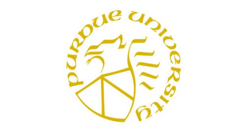
The seal was officially introduced during the school’s 100th anniversary in 1969. Although the design itself was new, it incorporated elements of the old emblems that were used throughout the university’s history without acquiring the status of the official seal.
The Purdue University logo comprises a griffin, which was borrowed from medieval heraldry as the symbol of strength, and a shield consisting of three parts. Each of the parts has a meaning of its own; they symbolize education, research, and service.
Athletic emblem
Old versions of the Purdue Boilermakers logo are all about trains. The 1983 version, for instance, features a black train overlapping a gold rhombus. The following logo, introduced in 1996, sports a modified train without the rhombus.
In 2003, the university got rid of the intricate emblems and stuck to the minimalistic “P” design. That’s exactly what is currently depicted on their helmets. There’ve also been a series of mascot emblems and wordmarks.
Basketball
The men’s basketball team of Purdue University has competed in the NCAA Tournament 31 times (as of 2019). They reached the Final Four in 1969 and 1980. They became the Pre-tournament Premo-Porretta Champions in 1932. In addition to it, they have played in the National Invitation Tournament on eight occasions. Their only appearance in the College Basketball Invitational took place in 2013.
The women’s team has been equally successful. They became the NCAA Tournament Champions in 1999. The total number of the NCAA Tournament appearances has reached 26. The current head coach is Sharon Versyp.
Football
The football program of Purdue University is pretty old – its history officially started in 1887. The current head coach is Jeff Brohm. The home games take place at Ross–Ade Stadium. The team plays in the NCAA Football Bowl Subdivision of college football.
The Boilermakers were retroactively selected national champion by Parke Davis, an NCAA-designated major selector, in 1931. They have played in 19 bowl games.
Font
While the university has a variety of recommended fonts, in fact, the official logo guidelines don’t mention the type their wordmark uses. Because of this, it makes sense to treat the logo as a custom artwork rather than try to reproduce it with the help of any of the existing fonts.
Color
The primary palette of the Purdue University logo includes only two colors – old gold (Hex Code: #C28E0E) and black. The two institutional colors can be complemented by several additional ones. The primary colors were chosen because they “represent the traditional hammer-and-anvil strength of Boilermakers and other talented blacksmiths,” according to the official explanation provided by the University.


