

![]() Purdue Boilermakers Logo PNG
Purdue Boilermakers Logo PNG
The Purdue Boilermakers are a group of individuals who share pride in their name. All students who wear the Purdue University’s black and gold do so with joy. The sports teams consistently prove themselves brilliant and fierce competitors. Purdue Pete is a widely recognized mascot that stands in for the institution and its athletic teams. Being the owner of the locomotive, Purdue University gained recognition and embraced the Boilermaker Special as its main mascot.
Meaning and History
![]()
The first-ever Purdue team was formed in 1887 and only got to play one game that year. The Purdue University football team didn’t become well-known until 1891 when they defeated Wabash College 44-0. This is when the Purdue sports team got the name Boilermakers. The football team was very successful and beat the opposing teams to a great deal, which was greatly discussed in newspapers. One of them had the heading “Wabash Snowed Completely Under by the Burly Boiler Makers from Purdue” and the name stuck. The university’s sports teams were known as “corn huskers,” “blacksmiths,” or “cornfield sailors” prior. Purdue University is proud of its other sports teams, including baseball, basketball, soccer, softball, tennis, and others.
What is Purdue Boilermakers?
Purdue Boilermakers is the name that the sports teams of Purdue University have had for almost as long as they existed. A model of a locomotive from the Victorian era served as the Boilermakers’ official mascot and was part of their logo for over thirty years.
1950 – 1970
![]()
Purdue Pete appeared back in 1940, when Art Evans drew a muscular tradesman with a mallet, had, and a grin to complete the look for the bookstore at the university. The character underwent multiple modifications. The most noticeable was done in 1963 when big eyes and fat cheeks appeared. In this logo, the athlete is sporting a small, square hat of a yellow color and a geometric “P” on the chest. There is another detail worth noting – a sledgehammer with a yellow handle in Pete’s right hand. A human Pete was first seen at a pep rally in 1956.
1970 – 1980
![]()
The image of Purdue Pete was completely redone. The image of this character acquired proportions that are closer to the realistic body shape of an athlete. He is wearing the same square hat and a T-shirt of the same color. The player holds a sledgehammer in his right hand and fixes his hat with the other. The designers were able to achieve an image of a strong, hardworking, and goal-oriented team.
1980 – 1994
![]()
When first seeing a locomotive as a logo of a sports team, one might be puzzled. There is a reasonable explanation for it. A model of a locomotive from the Victorian era serves as Purdue University’s official mascot. It was created in the 1930s by a Purdue student to represent the university’s background in both engineering and agriculture. As a sports team representing Purdue University, it was logical to use a symbol already associated with the university itself. In this version, the locomotive looks like a flat and basic black-and-white drawing with a “P” for “Purdue” on its side.
1994 – 1996
![]()
A more realistic drawing of the locomotive for the logo was presented in 1994. It is now accompanied by steam and lines that create a feeling of movement. The “P” moved to the front of the machine. The logo also has two lines for the full team’s name. The “Purdue” line is placed on a black banner, while the next line is printed in black on a white background. The designer also brought back a golden color seen in the earlier logo version with the Purdue Pete character.
1996 – 2012
![]()
The logo underwent a redesign but still featured a black locomotive with golden details. The full name was replaced by the “Purdue” inscription that was placed on the cowcatcher (pilot) of the train. This gave the logo more dynamics and created a more cohesive image. The logo looked more powerful and even more impressive.
2012 – Today
![]()
A very minimalistic design was introduced at the beginning of the new century. There is no more Purdue Pete or Purdue Special locomotive. Instead, the logo features only an italicized, bold “P” with bracketed serifs. the latter is done in a golden tan color that was already used in the earlier logo. The letter has a silver outline with a thicker black line on the outside. The color palette allowed the team to have a new logo that had something in common with all the other logos used earlier. At the same time, the tilt of the letter gives the logo dynamics, which was also present in other versions.
Font and Color
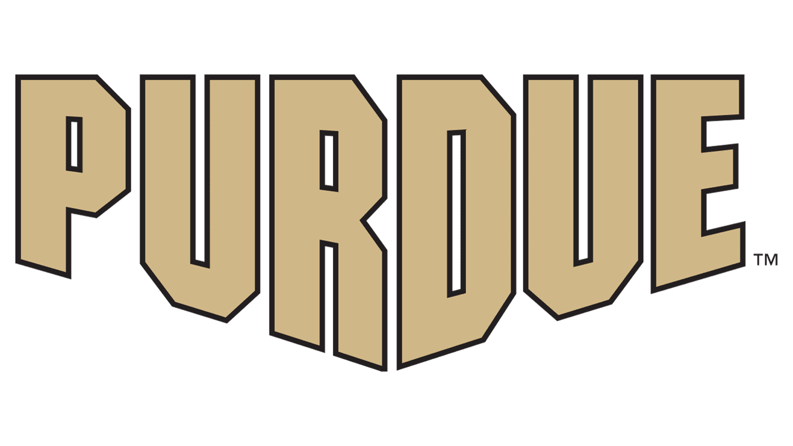
Throughout all the years, the Purdue Boilermakers used the same color palette, adjusting only the shade of the golden color. The other two colors are black and white, reflecting the team’s power and strength. Originally, the logo featured canary and dijon shades of yellow. Later, it was closer to an oat shade of tan.
For most of the logos, the university used a bold font with slab serifs for an impactful design. This further enhanced the image of a strong team and created a masculine feel. For a few years, the logo used a font with spur serifs instead of thick, blocky serifs. The italicized letter used since 2012 has added a feeling of movement to the logo.


