Prudential Financial is the biggest American company in the insurance segment. It was established in 1875 and today takes the leading position in national rankings, having its subsidiaries in almost 50 countries across the globe.
Meaning and history
Prudential Financial, a monumental name in the world of finance, was founded by John F. Dryden in 1875. Initially launched as The Prudential Friendly Society, its inception marked a pivotal moment in the insurance industry, particularly with its innovative approach to providing life insurance to the working class. Over the years, Prudential evolved, not only expanding its insurance products but also venturing into various sectors of financial services.
The company’s journey is marked by several noteworthy achievements. In the early 20th century, Prudential was among the first to issue industrial life insurance in America, making it accessible to average citizens. This democratization of financial security was a significant milestone. Later, Prudential’s expansion into international markets and diversification into real estate and securities further solidified its standing. The company also played a pivotal role during major historical events, such as offering substantial support to the war efforts in both World Wars.
Today, Prudential Financial stands as a global financial powerhouse. With its headquarters in Newark, New Jersey, the company has spread its influence worldwide, offering a wide range of financial products and services. These include life insurance, annuities, mutual funds, pension- and retirement-related investments, and asset management, among others. Prudential’s enduring commitment to financial stability and growth for its clients ensures its position as a leader in the global financial arena.
What is Prudential Financial?
Prudential Financial is a global financial services leader specializing in insurance, investment management, and other financial products. Renowned for its legacy in life insurance, it has grown to offer a diverse array of services, catering to individual and institutional clients worldwide.
1860 – 1875
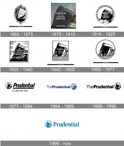
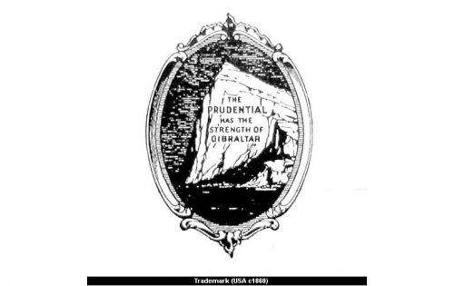
The Prudential Financial logo is timeless and instantly recognizable. The company’s symbol, the Rock of Gibraltar, was chosen in the 1860s and the first logo was designed with the drawing of it and an inscription “The Prudential Has the Strength of Gibraltar”.
1875 – 1910
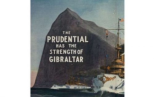
There were nine major redesigns of the Prudential Financial logo, but all of them contained the image of the rock, symbol of strength and security, the main characteristics of the company.
1910 – 1920

The 1910 emblem is very similar to their previous brochure. It’s the same image, except turned black-and-white, cut into a round form and framed by a ribbon that says the name of who founded the business.
1920 – 1940
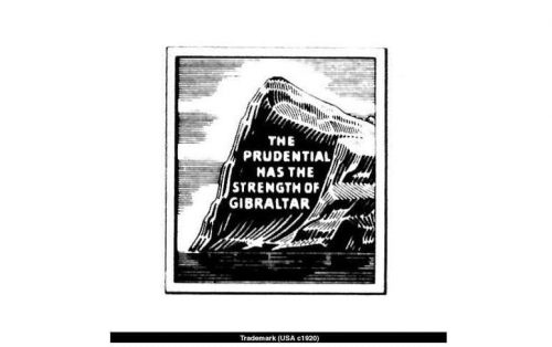
In 1920, they took the same monochrome picture of the Gibraltar Rock, but cut into a rectangle shape and with a bit more nuance.
1940 – 1950

The following design is largely the same, except the frame is solid black, and there are now several horizontal lines with an ‘r’ trademark in the middle.
1950 – 1977

In 1950, the rectangular shape of the logo was updated to a circle. The text inside was scrapped, but, other than that, nothing else really changed.
1977 – 1984

The Prudential Financial logo from 1977 featured a modern slanted logotype with a thick underline, placed on the right from the iconic emblem. The emblem was enclosed intro a thin circular frame, which complemented the smooth lines of the sand-serif logotype typeface. Under the thick horizontal line, there was a thin narrowed “Life. Health. Auto. Home.” The tagline, showing the directions of the company.
1984 – 1989

The concept of the logo was changed in 1984, and this is when the blue and white color palette was adopted. The new logotype was set in a traditional sans-serif font with “The” in thin lines and “Prudential” in bold ones. The two-part of the inscription were placed without any space between them and set on the left from the modern blue and white emblem, where the iconic shapes were redrawn in a more contemporary way. The mountain was still enclosed into a circular frame.
1989 – 1996

In 1999 the monochrome color palette was brought back by the company, though all other elements remained almost untouched. The only big change of these years was about the emblem, where the stylized geometric image was replaced by a more detailed and recognizable one.
1996 – Today
The current Prudential Financial logo was created in 1996 and is composed of a rectangle with a wordmark and an emblem on its left. The inscription is written in a classic serif typeface, which is Prudential Roman, created by Doyald Young in 1996.
The emblem is enclosed in a circle and features confident lines with sharp angles.
The blue and white color palette of the Prudential Financial logo evokes a sense of reliability and stability. The logo shows the company as powerful and influential.


