Pos Indonesia is a provider of a comprehensive range of postal services in Indonesia. The company, which is owned by the state, traces its history to 1906. In its current form, it was created in 1995. Today, it has eleven regional divisions in different corners of the country.
Meaning and history
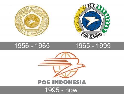
The Pos Indonesia logo has been redesigned several times. And yet, a bird in flight and the globe have remained its centerpiece in spite of all the modifications.
What is Pos Indonesia
Pos Indonesia is a company offering postal services in Indonesia. It belongs to the Government of Indonesia. It boasts 3,700 post offices nationwide. The headquarters are in Bandung.
1956 – 1965 (Pos & Telekomunikasi)
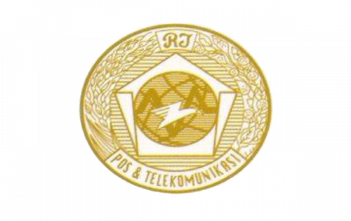
One of the best-known older logos was introduced in 1956. It is dominated by gold and resembles a coin.
The globe and a flying bird are already there. The bird looks dynamic due to the multiple parallel lines forming the feathers. What looks strange about the globe is the way it is tilted. The background combines an element looking like a paper pentagon. There is also a ribbed pattern.
Above the emblem, there is a monogram “RJ” in a cursive script. Below, the lettering Pos & Telekomunikasi in an elongated all-caps sans can be seen. We can also notice a botanic pattern on the left-hand and right-hand sides.
1965 – 1995 (Pos & Giro)
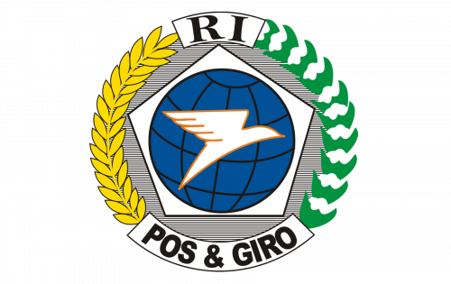
While the structure remained the same, all the elements were simplified. The result didn’t resemble the coin anymore.
The bird has grown larger and better visible due to the darker background. The globe was rotated a couple of degrees counterclockwise. This made it resemble the Earth’s axial tilt. The pentagon lost its curled parts, which also resulted in a cleaner look.
The type used for the monogram was now a simpler serif one. The lettering in the lower part of the design was shortened to “Pos & Giro.”
The leaves in the wreath became larger, which made it easier to understand what they are. In the previous design, conversely, you could hardly figure it out at first glance. You needed to take a closer look, and the emblem had to be enlarged.
1995 – present (Pos Indonesia)
The designers made another step towards simplicity. In spite of losing the majority of its elements, the Pos Indonesia logo seems more meaningful and evocative now.
Once again, the bird has grown larger. This time, it is in actuality bigger than the globe. The feathers in its wing have grown longer, which enhanced the dynamic effect.
The globe has lost its tilt and now stands straight, with the parallels being strictly horizontal and the central meridian being strictly vertical. On the one hand, this made the design less realistic. On the other hand, it looks neater and more symmetrical, which is a plus.
Colors and font
The colors of the elements in the 1995 logo were also modified. The outline of the bird from the previous logo was chosen as the starting point. It was made slightly darker, to stand out over the white background, and is now dark orange. The outline of the globe is of the same color, whereas the parallels and meridians are of a lighter hue. The lighter orange was used lest the lines on the globe overshadow the bird. Also, it added some depth.
The wordmark is given in an unobtrusive gray color, which was also used in the previous Pos Indonesia logo.
The typeface is rather bold, to compensate for the light color. As a result, the wordmark is highly legible. The simple sans serif type also contributes to the legibility.


