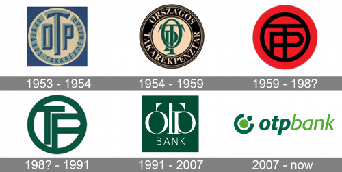
The OTP Bank logo has been modified at least six times over its long, almost 70-year history. The circle shape inspired by the letter “O” has been present in all the versions so far, though.
Meaning and history
OTP Bank is the largest bank among financial institutions in Hungary, the leader of the Hungarian banking market with a market share of almost 25%. The Bank was founded in 1949 in Hungary as the National Savings Bank, which started lending and deposit-taking activity, gradually enlarging the list of its services, expanding the client base, and increasing its market share.
Today apart from Hungary, OTP Bank Plc. is present in ten other CEE countries (Ukraine, Albania, Slovenia, Bulgaria, Moldova, Romania, Croatia, Serbia, Russia, and Montenegro), serving the needs of customers who are served in more than 1,500 banking institutions.
What is OTP Bank?
OTP Bank is the name of the largest Hungarian bank, which was established in 1949. Today the bank has grown into one of the strongest European commercial financial organizations, with its branches located in eleven countries in Western and Central Europe.
1953
The original logo featured a circle containing the lettering “OTP” in green and blue. The central “T” was larger than the two letters on the sides, while its top bar was arched. The monogram was encircled by the writing “Országos Takarék Pénztár” (National Savings Bank). The roundel was placed inside a dark blue square.
1954
Both the versions used during this period had the same structure as the earliest logo. In both of them, the three letters in the center overlapped and were barely legible due to this. However, the palette and the shape of the letters were different.
In one version, the monogram in green was encircled by the full name of the bank in white inside a black ring. In the other version, the monogram was black, while the full name of the bank was red. Here, the roundel was housed in a square broken down into a red field (top) and black field (below).
1959
This time, the monogram was black inside a red roundel. The square was black. While the type used for the abbreviation “OTP” was simpler, the way the letters overlapped still resulted in a legibility issue.
1980s
The logo went simpler as the “O” merged with the ring. The letters “T” and “P” were placed inside. The abbreviation was dark green on the white background.
1991
The company eventually gave up the idea of intricately interlaced and overlapping glyphs. This time, each of the letters, the “O,” “T,” and “P,” followed one another. However, their size was different, which still resulted in a legibility issue. It was worsened by the shape of the “p.” The glyph had a disproportionally large top and a tiny “leg.” So, while it somehow resembled the “o” and thus added an illusion of symmetry, it also made the design more difficult to read.
This was the first version of the OTP Bank logo not based on a circle. However, the circular theme was still very pronounced due to the “o” and “p.”
2007
The design was redrawn from scratch. The result was dynamic due to the italicized type, simple, and distinctive. Also, the name of the bank was perfectly legible.
The unique touch was added by the emblem inspired by the circle shape that has been an essential part of the bank’s visual brand identity starting from the original logo.
Font and Color
 The elegant and delicate lowercase lettering from the primary badge of OTP Bank is set in a fancy custom sans-serif typeface with sharp slightly flared ends of the bars. The closest fonts to the one, used in this insignia, are, probably, Romanica Medium Italic, or Senlot Sans Extended Medium Italic, but with some modifications of the characters’ contours.
As for the color palette of the OTP Bank visual identity, it is based on two shades of green — a vivid light one, and a deeply serious one. Green is the color of wealth and prosperity, a symbol of growth and development, which suits the needs of the Bank better than any other color.
The current OTP Bank logo is based on a clean italicized sans. One of its distinctive features is the drop-shaped bodies of such letters as the “p,” “a,” and “b.”
Company overview
The history of the OTP Bank Group started in 1949. Today, it is among the largest independent financial services providers in Central and Eastern Europe. It works in 10 countries, has over 36,000 employees and 13 million clients (as of 2019). The number of branches exceeds 1,500.


