The Orange brand appeared in 1990 in the UK following the creation of “Microtel Communications Ltd”. Today it belongs to the French multinational telecommunications corporation Orange S.A. The company has a distinctive logo, which helped to maintain a consistently clean, contemporary, and impactful brand image despite of the fact that it has changed owners more than once.
Meaning and history
The Orange logo is believed to have been created by the brand consultancy Wolff Olins. The company based in London, New York City, and San Francisco designed not only the wordmark itself, but also developed the brand values, while the famous slogan was created by the advertising agency WCRS. The logo has a rectangular shape, which, according to some sources, is supposed to eliminate any associations with the namesake fruit.
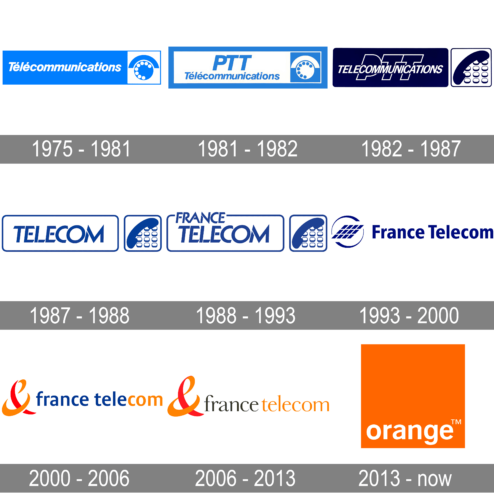
1975 – 1981
The original badge of the Orange brand was created in 1975 and comprised the first name of the company, “Telecommunications”, written in white slanted characters of a classy sans-serif typeface, over a bright-blue horizontally-extended banner with the white square attached to its on the right. The square has a circular blue emblem with a stylized image of a phone disc on it.
1981 – 1982
The redesign of 1981 has kept the initial idea of the company’s badge, but reversed the colors, and now the lettering (which got the “PTT” additional line above the “Telecommunications”) was set in blue on a white background, framed in a thick blue rectangle, and the emblem was drawn on a blue square.
1982 – 1987
In 1982 the logo was changed again, with the color palette darkened up and intensified, and the contours of all elements refined and modernized. The new lettering was set in the uppercase, with the solid white “Telecommunications” overlapping an enlarged contoured “PTT”. The emblem was also redrawn, with the solid blue phone drawn on a background with phone buttons.
1987 – 1988
In 1987 the company was renamed Telecom, and it was followed by the logo redesign. The new wordmark was written in the uppercase of a geometric sans-serif font in medium-blue lines over a solid white horizontally-oriented banner with rounded angles, outlined in blue, with an additional outlined square with rounded angles, where the emblem was drawn. The emblem remained the same as in the previous version of the badge.
1988 – 1993
Another rebranding happened to the company in 1988, with the name switched to “France Telecom”. The additional word was added to the composition, introduced in 1987. The “France” was written in smaller capitals, above the “Telecom”, overlapping the upper line of the banner’s frame. The word was slightly shifted to the left.
1993 – 2000
A completely new concept of the France a telecom visual identity was introduced by the company in 1993. The new banner featured a lm abstract minimalistic emblem, composed of twelve solid parallelograms, standing for phone buttons, enclosed into a rounded frame with an open contour, and followed by a bold title case lettering in a traditional sans-serif font. All elements were set in the same deep shade of blue.
2000 – 2006
The redesign of 2000 has dramatically changed the France Telecom logo, adopting a new orange and red color palette, with blue remaining for the main part of the lettering. The geometric emblem got replaced by a stylized two-colored ampersand, which was followed by the lowercase sans-serif wordmark in blue, with just the “com” part set in orange.
2006 – 2013
In 2006 the France a telecom badge was changed again, and this was the last version of the logo, used by the company before it got renamed to Orange. The emblem remained untouched, but the I script got rewritten in an elegant serif font, with the “France” part set in black, and the whole “Telecom” — in orange.
2013 – Today
After the huge rebranding of 2013 the company got the new name, Orange, and its visual identity was radically rethought. The badge of the brand is composed of a solid orange square with the white lowercase lettering in a simple sans-serif font written along the bottom part of the composition. It looks very minimalistic and progressive, with the color palette reflecting the energy and positive approach of the company.
Font
The designers who created the Orange logo used the classic sans-serif Helvetica type as a base. A couple of modifications they applied helped to make the emblem more unique. The color goes incredibly well with the company’s slogan “The future’s bright”.
Color
Taking into consideration the name of the company, it’s hardly a surprise that it chose orange as the main color for its logo.


