AMD is an American brand of computer processors manufacturer and designer, which was founded in 1969 by Jerry Sanders. The company is focused on production of technologies for business and consumer markets.
Meaning and history
AMD is one of the largest manufacturers of central processing units and graphics processors in the world, which was established at the end of the 1960s. The idea to found AMD, which stands for Advanced Micro Devices, came from eight people at Fairchild Semiconductor, one of the strongest semiconductor manufacturers at the time.
One of the first investors for AMD was Robert Noyce, who was the head of Intel at the time.The main amount of investment was raised by private investors from Capital Group Companies.
As early as November 1969, the first product was introduced and it was the Am9300 4-bit register chip.The completely in-house developed product was introduced in 1970 and was the first Am2501 binary/hexadecimal logic counter.
Since its inception, AMD has closely monitored the quality of its products and in 1976 became the only integrated circuit company to be certified for military and space class quality.In further years AMD mostly produced microprocessors under an Intel license, but with its improvements.
What is AMD?
AMD is the name of a computer processor manufacturer, which was established in the United States in 1969. The name of the company stands for Advanced Micro Devices, which fully explains the field of business activity. AMD operates worldwide.
1969 – Today

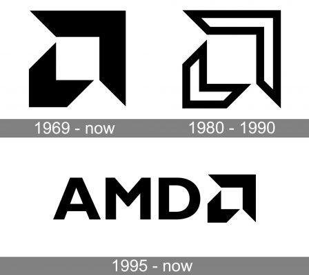
The company has been pretty consistent in its visual brand identity. Although the original AMD logo was introduced more than half a century ago, it is still part of the current one.
The original emblem was a combination of two arrowheads, a smaller one and a larger one. They could also be described as two square angles. They were oriented in two opposite directions. The arrowheads were solid black on the white background.
1980 – 1990

For a decade, the brand used a slightly different version. Here, the arrows weren’t solid black – they were white with a bold black outline. Also, the arrows from the previous logo appeared slightly bolder.
1995 – Today
AMD is an abbreviation of Advanced Micro Devices, and its logo is composed of all-caps wordmark and an emblem.
The wordmark’s typeface is clean and strict with geometrically perfect lines. The letters are balanced and look confident and masculine.
The AMD famous emblem is an Arrow, composed of two smaller arrows. The AMD Arrow is placed after the nameplate and looks upwards and to the right, which symbolizes movement and progress.
The monochrome palette of the logo reflects the brand’s stability and authority and shows its consumers that the company can be trusted.
The AMD logo is modern and minimalistic, it has a a unique style and celebrates harmony of the lines and design excellence. The logo evokes a sense of confidence and power, respect and expertise.
Font and Color
The stable and brutal lettering from the primary AMD logo is set in a modern geometric sans-serif typeface with solid characters and distinctive contours. The closest fonts to the one, used in this insignia, are, probably, Gill Sans Bold or Humanist 521 Bold with their classic confident letter shapes.
As for the color palette of the AMD visual identity, it is based on a combination of black and dark green, with the calm deep shades standing for professionalism and stability, and evoking a sense of trustworthiness and loyalty.


