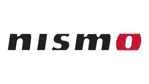
The Nismo logo has been updated at least three times during its almost 50-year history. While the typography has been modified, the brand’s name has always remained legible.
Meaning and history
Nismo is Nissan’s division specializing in tuning, motorsports, and performance. It was formed in 1984. The word “Nismo” has been made up out of five letters taken from the words “Nissan Motorsports.” And yet, while the name of the brand shows the link with Nissan, the logo is completely independent – it has always had its own style.
1984
The original logo featured the word “Nismo” in black. The type was a creative, unusual one. The letters had distinctive square corners. The “S” and “M” had unique triangular elements.
1998
Although the typeface was still pretty heavy, it grew more rounded. While in the previous logo all the letters were capitalized, here there were only lowercase glyphs. They were also italicized. The final letter, the “O,” was replaced by a red circle.
2008
The current Nismo logo looks pretty much like its predecessor, apart from the final character. The red circle was replaced by a glyph that is similar to the other letters. It has stayed red, though, which makes it stand out.


