Veg NI is an agricultural cooperative in Northern Ireland founded by four farmers to better market their products amid growing import competition. Recently, the company has updated its visual identity, aiming to strengthen its position and increase the awareness of local vegetables.

Veg NI’s new image was developed by Jack Renwick, a design studio from London. Based on a concept called Parful Produce, the branding has to covey the positive effect of Northern Irish food products on people’s health and economy. Seasonal vegs here are indeed fresh and nutritious. Plus, this is a more sustainable way of consumption, compared to imports, with less waste and emission in supply chains.
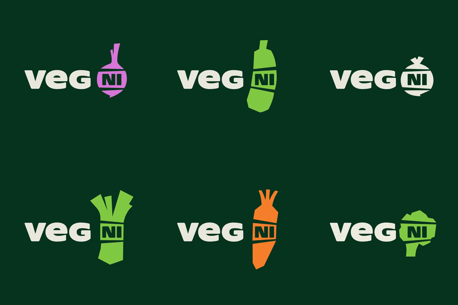
The logo of Veg NI includes a depiction of a chopped vegetable with “NI” inside. Placed in this way, the acronym standing for Northern Ireland seems to confirm that the cooperative’s products are locally sourced. The Unicase typeface used for the wordmark is inspired by the traditional Celtic script. Featuring a bit rounded ends, it is distinguished by a relatively short height, and the letters are perceived to be spread in the area. And this design looks rather contemporary.

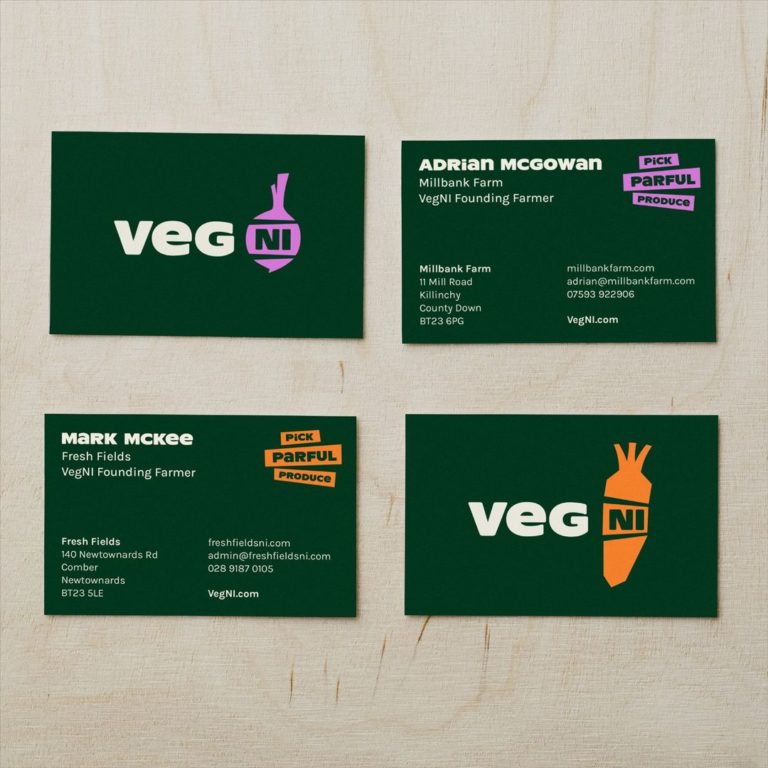
Again, the “NI” in a vegetable silhouette reflects the activity of the brand and provides certain flexibility and playfulness. Five versions are offered, with carrot, squash, radish, asparagus, and broccoli. While dark green is designated as the main brand color, an additional color for promotional materials will be selected accordingly to the displayed vegetable.
Using different graphic means to represent veg, the visual identity tries to reflect the specialization of each farmer in Veg NI. Promotional photographs demonstrate an inexpensive and easily adaptable approach, where colorful vegetables are depicted along with messages.

To support the company and increase the recognizability of the brand, local groceries, coffee shops, and restaurants can add special stickers to tell they store, sell, and serve the products of Veg NI.


