CSS Insurance, the largest insurance company in Switzerland, has updated its look. While currently being on the rise, the company is seeking to accent its new role as a partner of health care institutions, using its new visual identity.
Established in St. Gallen in 1899, CSS now provides its services to over 1.6 million people. As the company claims, it is the leader of the Swiss insurance market. A few days ago, the enterprise announced it would act under a new logo and brand identity, aiming for continuous changes. According to a press release, CSS initiated its transformation from “a payment agent to a comprehensive service provider” as early as 2018.

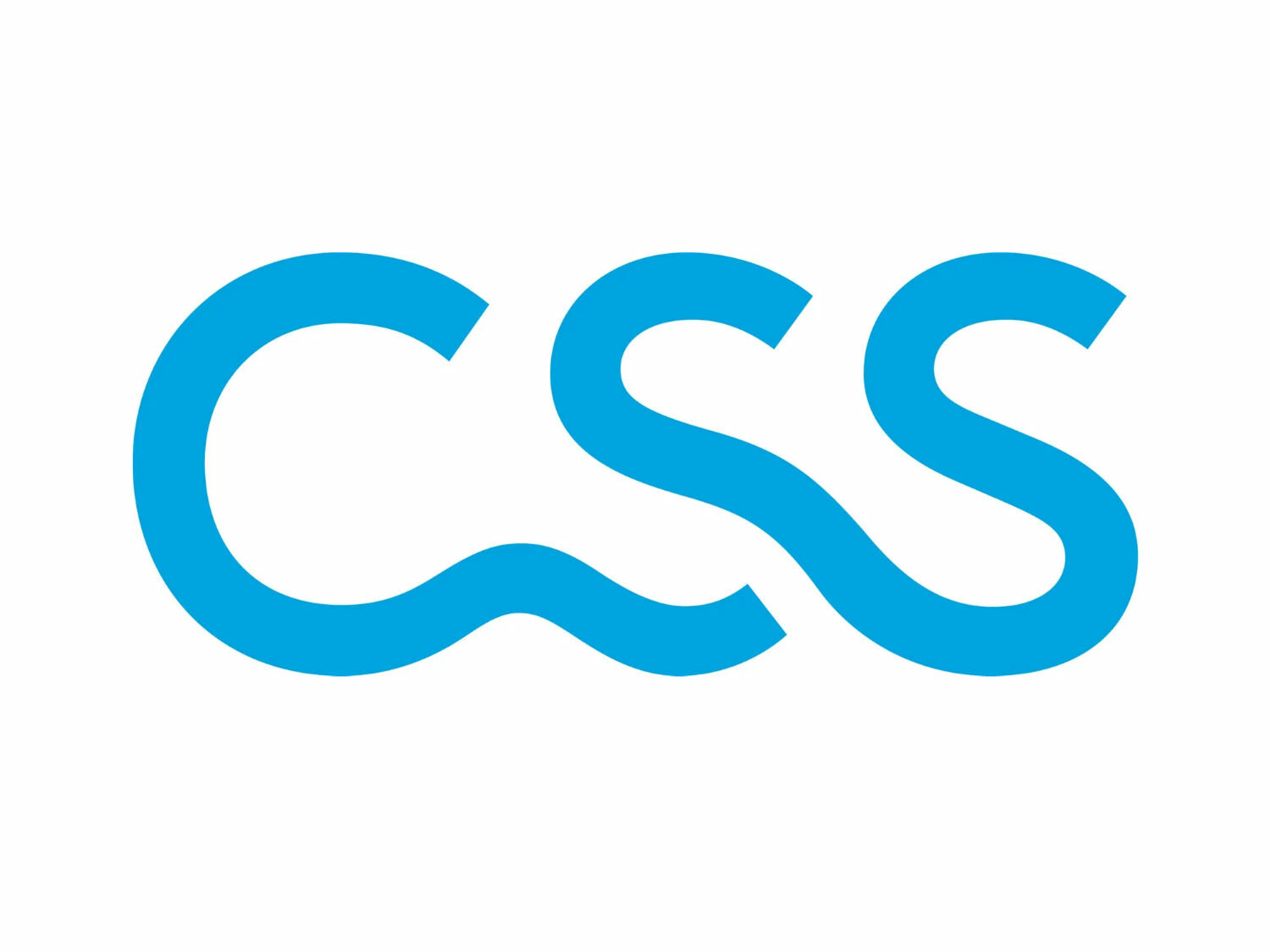
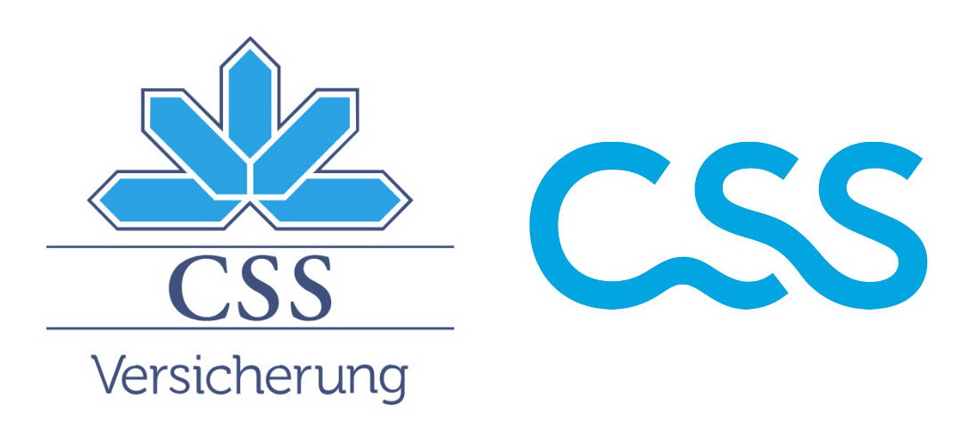
So, the company changes the blue crystal it’s been using since 1987 to a pure wordmark. Ditching the abstract image, CSS also removes the graphics for its insurance services. However, the Cyan branded color still stays in use. According to Marco Imboden, CSS corporate communications director, the logo symbolizes new beginnings, modernity and movement. The letters turn into forms that are intrinsically connected to make up a strong, innovative symbol of interaction.
The brand identity was created in cooperation with the consulting agency Martin et Karczinski. Beginning from the spring of 2022, the new logo and related corporate design will appear in all kinds of media.

Surely, this is a visually appealing logo that can be used as flexibly as possible and easily recognized. The previous CSS logo doesn’t meet the requirement of modern communications because of its overly complicated design. And in the new emblem, the effect desired by the company seems reached as capital letters always fit to create considerable and identity-forming ligatures. Plus, the CSS light blue can also be associated with something positive.


