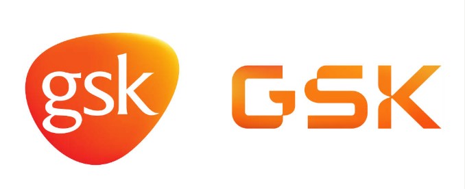
Established after the merger of Glaxo Wellcome and SmithKline Beecham more than 20 years ago, GlaxoSmithKline (GSK) is one of the world’s largest pharmaceutical companies, which is involved in customer-focused health care and in vaccine making. Aiming to express its structural changes in the recent years, the British company has updated its visual identity.

The GSK assets include such well-known brands as Sensodyne, Otriven, Voltaren, Odol as well as anti-AIDS medicines, remedies against breast cancer, and other treatments down to anti-smoking patches. As a part of a management reorganization, the corporation’s Consumer Healthcare division is designated to be managed by a separate company called Haleon.
Reflecting the changes GSK has experienced in the past twenty years, the new look of the company is now adapted to highlight this “dramatic shift” on the visual level, according to a GSK statement.
The updated GSK visual identity mirrors the company’s new goal: to bring together science, technology, and talents to be one step ahead of diseases. As GSK says, the design is based on the visual language of the life sciences and through its curved forms reminds of the adjustable nature of human immunity.

It’s the first considerable change to the GSK logo, replacing the oval emblem with a pure wordmark, all-caps now. However, the logo retains its gradient orange coloring. The letters are partly formed with roundings (“DNA Twist”) and cut-outs (“Precision Point”). The emblem was inspired by DNA sequencing and data analyzing. At the same time, the new branding, created by the design agency Wolff Olins, gives a perception of warmth and humanness.


