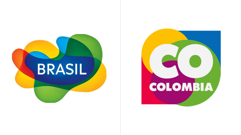
The Brazil brand comes back to the iconic design of 2005. The relaunch includes a campaign to reposition the brand and announce some plans in the new political cycle. Its main goal is to present Brazil as a multinational and multicultural country made up of different forms, ecosystems, rhythms, and colors. A country with clear prospects, which aspires to confirm its commitment to stable development.

In this new stage, the Brazil brand is abandoning “nationalism” in terms of visual identity, which has been over the last four years under the rule of Jair Bolsonaro – a fact that may become clearer if we have a look at the most recent evolution of the brand.
Speaking of branding, the return of Luiz Inácio Lula da Silva as the President of Brazil plays an important role. Among other things, this means a new strategic positioning in front of the world, and the new strategy is confirmed by the fact that the departments of tourism and export have been united under the new administration.

According to Embratur, a Brazilian state-owned tourism agency, “the Brazil brand comes back as a national brand representing the country in its products, services, and tourism sites. It will again be used for Brazilian products exported in cooperation with APEX Brazil”.
And here, one more thing comes into play. While the iconic national logo is brought back after a four-year break, it comes with the lettering “Brasil” with an “S”, as it is spelled in Portuguese, not with the English version’s “Z”. This feature is highlighted in the campaign’s slogan “It’s a sensational return. We are #BrasilConS”.

Interestingly, the Brazil brand’s logo is one of the most long-lived emblems in South America, introduced in 2005 and redesigned in 2013. It also influenced some other tourism brands in the countries of the continent, like Columbia.
Brazil is a country that can be associated with bright colors, joyfulness, modernity, and diversity. These characteristics can be found in both the people and the nature of the country. So the Brazilian logo is made up of abstract colorful layers to convey the essence, culture, and way of life in Brazil, while the wavy forms give the perception of movements of samba.

The Brazil brand appeared as a part of the Aquarela project presented in 2004. Developed by the Department of Tourism, the ambitious plan emerged as a result of a survey among more than 6,000 people in 18 countries. According to Aquarela, a logo had to be based on Brazilian heritage, and it was a serious task. Finally, inspiration came from a cover of a book by Roberto Burle Marx, a Brazilian sculptor who gained international recognition as a landscape architect. His works served as guidelines for the designers who participated in a competition to create the national brand. The winner logo designed by Kiko Farkas was based on two concepts: curving and transparency symbolizing the intersection of cultures, a crucial thing that forms the Brazilian identity.


