The logo of the New Zealand Warriors is one of the most impressive and memorable logos within the National Rugby League. It depicts the face of a carved idol.
Meaning and history
New Zealand Warriors is a pretty young rugby club, which was established in the middle of the 1990s, but has already earned its place in the Australian National Rugby League.
The club, based in Auckland, has two home arenas — Mount Smart Stadium and Moreton Daily Stadium, with a capacity of 30 and 11 thousand respectively. The head coach of the New Zealand Warriors is Stacey Jones, and the captain is Toby Harris.
What are New Zealand Warriors?
New Zealand Warriors is the name of a professional rugby club from New Zealand, which was established in 1995, and today competes in the National Rugby league Men’s Premiership, usually taking a position at the end of the tournament chart.
1995 — 1999
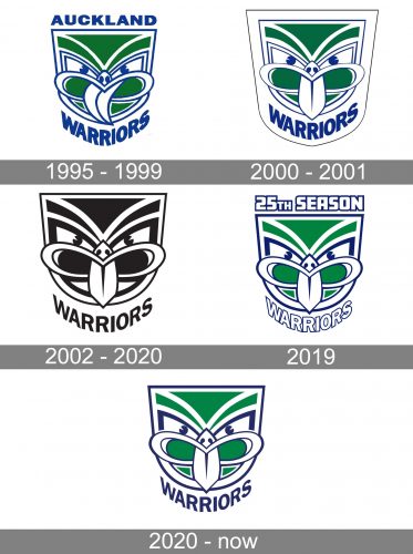
The earliest New Zealand Warriors logo was developed by Francis Allan of Colenso. The design showcased the tekoteko’s face. The word “tekoteko” is a Māori term for the a carved human form. You could see the original name of the team, “Auckland Warriors,” too.
2000 — 2001
In 2000, when the Tainui tribe and ex-Kiwi coach Graham Lowe took over the club, the emblem was slightly altered: the tongue of the tiki was straightened. This move was made because, in the Māori culture, a curved tongue was an indicator of a curse (it symbolized physical weakness).
2002 — 2020
A more obvious modification took place in 2002 when the combination of white, blue, and green was replaced by silver and black.
2019
In advance of its 20th season, the club introduced a color split logo (half of the face featured the old palette, while the other half featured the gray and black color scheme).
For the 25th season (2019), the team returned to a logo with the original color scheme and the lettering “25th season Warriors.”
2020 — Today
The redesign of 2020 kept the main part of the Warriors’ visual identity untouched, leaving the fancy mask as it was and its bright green, white and blue color palette unchanged. Though the text part of the logo was rewritten. The “Warriors” wordmark is still arched under the badge but is now written in solid blue letters of a slightly narrowed sans-serif typeface with a strong character.
Colors
During its first years, the club used blue, white, red, and green as its official colors. The logo, however, didn’t comprise any red nuances. In 2002, the team colors changed to black and gray. This modification was reflected on the New Zealand Warriors logo, too.


