The New Era Cap Company is a headwear company based in Buffalo, New York, US. It’s known as the exclusive baseball cap supplier for Major League Baseball (MLB) – the status, which it acquired in 1993.
Meaning and history
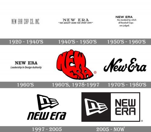
The company was established in 1920. Since then, the New Era logo has gone through a long series of transformations including around ten updates. While some of them were quite subtle, others involved a complete overhaul.
1920
The originallogo showcased the name of the brand set in a narrow sans serif type. The need for a narrow type could be explained by the fact that the wordmark was very long – “New Era Cap Co. Inc.”
The designers must have had a hard job squeezing all these letters into a small label on the cap! To provide more or less decent legibility, they used clean glyphs without any decorative elements.
Late 1940s
The name of the marque was reduced to “New Era.” As a result, the designers of the label got more freedom in choosing the style of the wordmark. It’s only natural that they decided to opt for a new type. It looked more unique and artistic than the previous one without sacrificing legibility.
In addition to serifs, the glyphs had white highlights providing some depth. The widths of the strokes varied, which added elegance.
Below the name of the brand, there was the tagline “The Quality Name for Sports Caps.” It was set in a relaxed, casual italicized script.
Late 1950s
The wordmark lost its elaborate style. Instead, you could see an austere sans serif font. The glyphs were formed by strokes of equal width.
Below the name of the brand in large letters, there was a short ode to the label set in smaller sans serif letters.
1960s
Interestingly, the designers made a step back, closer to the logo introduced in the late 1940s. Once again, there was a serif type with elegant variations in the width of the strokes. This time, though, there were no white highlights.
While the style of the font looks similar to the older logo, it is a different type, which is obvious if you compare them side-by-side.
1960s, 1978
A dramatically new design showcased the words “New Era” in red. The words were plump and irregular. More importantly, they formed a cap. In this way, the New Era logo managed to merge the pictorial part and typographical part within a single unit.
1970s
For the brand, this was the era of ultimate elegance. The wordmark was now set in a cursive script imitating handwriting. It was not just any handwriting but a decorative one, with decorative curls on the capital letters and the “w,” with strokes of dramatically different width.
In many cases, the cursive wordmark was paired with the red “cap” wordmark introduced in the 1960s.
1997
This is when the company introduced the iconic monogram that has been part of the visual brand identity ever since.
Here, you could see highly stylized letters “N” and “E.” The “E” was made up of three horizontal bars, nothing else. The glyphs were “written” inside a shape reminding a flag, so the emblem was nicknamed “flag logo.”
The monogram was paired with the full name of the brand set in a dynamic italicized type. The letters were quite simple yet unique.
There was by far more motion in this logo than in the previous ones. Also, the type looked unusual. The two parts of the logo (wordmark and emblem) better fitted one another than in the earlier versions.
2005
The “flag” was placed inside a black square. Next to it, there was a white square housing the name of the brand. The type was different than in the previous New Era logo. It was more rounded and wasn’t italicized. And yet, in spite of the multiple modifications of the shape, it preserved its sporty style.


