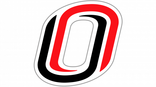
 Nebraska-Omaha Mavericks Logo PNG
The University of Nebraska Omaha sponsors 16 varsity teams competing in the NCAA’s Division I, The Summit League, and the National Collegiate Hockey Conference.
Meaning and history
In the realm of collegiate sports, the story of the Nebraska-Omaha Mavericks begins with the establishment of the University of Nebraska at Omaha. This journey into athletics was initiated alongside the university’s inception, birthing a legacy that has grown in both scope and recognition. The Nebraska-Omaha Mavericks, known for their dynamic presence in collegiate sports, have a history peppered with significant achievements. They have shown exceptional prowess in hockey, often making waves in NCAA tournaments, while their basketball and volleyball teams have contributed significantly to the university’s athletic acclaim. Presently, the Mavericks stand as a symbol of resilience and excellence in sports, continuing their pursuit of athletic greatness and maintaining a commendable position in the competitive world of collegiate athletics.
What is Nebraska Omaha Mavericks?
Nebraska Omaha Mavericks is the name of the athletic program of the University of Nebraska, which consists of 16 women’s and men’s teams, competing in Division I of the National Collegiate Athletic Association in such sports disciplines as Basketball, Ice Hockey, Swimming, and some more.
1997

The logo for Nebraska Omaha Mavericks, designed in 1997, featured an ornate and a bit aggressive badge with the red and black bull image “covered” with a stylized “Mavericks” inscription in thick red letters with a thin black outline. The main lettering was set in a black background and accompanied by a white uppercase “University of Nebraska Omaha” wordmark above it.
2004

The redesign of 2004 refined the lines of all the logo elements, making them look stronger and more professional. The black background of the “Mavericks” was removed and now both the wordmark and the emblem were set on white, which added more balance to the image, showing the confidence and willingness of the teams to win.
2011 – Today
The Nebraska-Omaha Mavericks logo is pretty abstract. It consists of two partly overlapping letters “O.” One of them is given in red, while the other is black. You can also see a white “O” in the negative space. This emblem was introduced in 2011.


