Columbus-based (Ohio) Nationwide Mutual Insurance is a large insurance organization that provides different types of financial services in all the US states and in different parts of the world.
Meaning and history
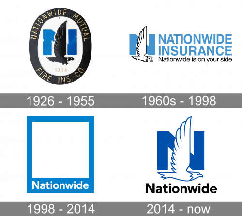
The company has its roots in 1926. Its first name was Farm Bureau Mutual Automobile Insurance Company. In 1955 the company was renamed to Nationwide Insurance as the range of services offered by it had significantly expanded as well as the geography of the business. There have been three versions of the Nationwide insurance logo so far.
As for the Nationwide logo meaning, it has always been competence, security and strength as evidenced by the color palette and the images used in the trademark.
1926 — 1955
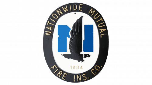
The original Nationwide logotype depicted the company’s iconic Flying Eagle. It was drawn over the big blue ‘N’ letter, and below it we can see the year when the company began to offer its essential insurance services. All of it was in a black oval frame featuring the name and other text.
1960s — 1998
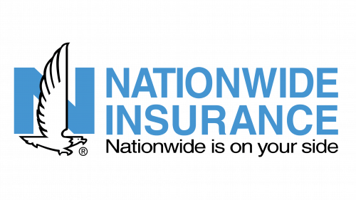
The logo introduced in the 1960s (according to some sources, in 1955) featured a white soaring eagle against the background of the capital letter “N” in blue and the full name of the company “Nationwide Insurance” to the right of it, also in blue and written in all caps. There was one more wordmark underneath ‒ the company’s slogan “Nationwide is on Your Side” in black and in a smaller font.
1998 — 2014
The Nationwide symbol that displaced the “N and Eagle” logo in 1998 was a square enclosed by a rectangle of blue color. The Nationwide wordmark was at the bottom. It was supposed that the frame would feature any images the company would want to highlight.
2014 — Present
 Though the “Frame” remained the Nationwide symbol, in 2012-2014 the eagle came back. It appeared in ads on a waving blue flag.
To find out which symbol was more recognizable, the company conducted research. It turned out that the consumers associated Nationwide with the “N and Eagle” logo 50% more often than with the “Frame” logo. So, decision was taken to put the eagle back.
There was one more reason for revamping the logo design. Till 2014 Nationwide operated under numerous brand names. In order to bring the whole business under one name and to strengthen the brand recognition Nationwide needed a new logo.
Actually, the company updated its classic “N and Eagle” logo of 1955. In comparison with the old Nationwide insurance logo, this one features a more realistic-looking eagle and a darker shade of blue.
The Nationwide logo meaning is even more evident here ‒ the imposing eagle creates a feeling of professionalism, stability and security, everything that stands behind the promise given in the slogan “Nationwide is on Your Side”.


